14.6 UI Tech 🎯
This section includes an Activity 🎯
The products you work on will likely have a user interface (UI). Some products don't have a user interface, but these are rare. UI technology has evolved from supporting very basic tasks in the 1980s to supporting contemporary tools that offer amazingly intuitive and dynamic experiences today. Nowadays, even highly specialized infrastructure tools are likely to offer a user-friendly interface option in addition to more developer-facing coding interaction.
Like the other technical areas you learned about, UI technology offers incredible possibilities, but complex dynamic features (like animation) have trade-offs. They may overwhelm processing and slow load times or prove problematic for users on specific platforms. Understanding the benefits and ramifications of UI decisions will help you work with developers and designers to make better products and interfaces for your users.
By the end of this checkpoint, you should be able to do the following:
- Confidently discuss the impact of UI technology choices on product development
Before you dive deeper into the workings of UI, check out the video below, which discusses the importance of UX and UI in product management.
Web UI tech: JavaScript, CSS, and AJAX
Earlier checkpoints discussed how web pages are created using HTML—a syntax standard that browsers use to render web pages. Some web pages are static; they show text and image content without any user interaction. Many web pages are interactive; they dynamically respond to user actions and information about the device the site is being rendered on.
This interactivity is achieved through the use of two related technologies—JavaScript and AJAX. JavaScript is a programming language that web pages use to process data and handle interaction events. For example, there could be a button on a site that changes the page colors from bright to dim—commonly called dark mode. You can see this in action in this Dark Mode Toggle web page:
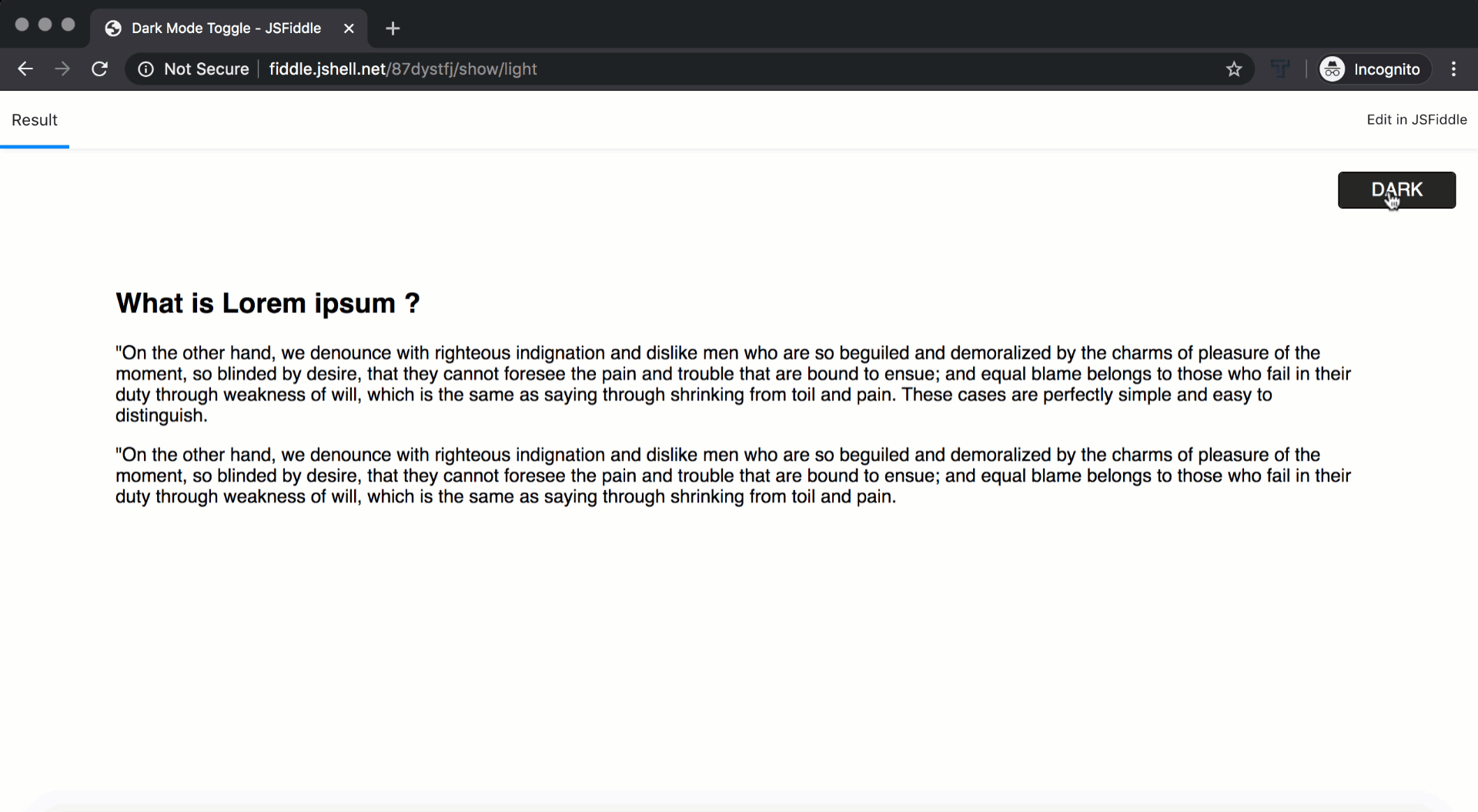
If you look at the code for this example, you'll see three parts. First, there's the HTML, which describes the structure of the page; a title (Dark and Light), a couple of paragraphs of text (Lorem ipsum), and the labels for the button (Dark/Light, contained within the <span> tag):
<!DOCTYPE html>
<html>
<head>
 <meta charset="UTF-8">
 <title>Dark and Light</title>
 <link rel="stylesheet" href="style.css" type="text/css">
</head>
<body>
 <section>
  <h1>What is Lorem ipsum ?</h1>
  <p>"On the other hand, we denounce with righteous indignation and dislike men who are so beguiled and demoralized by the charms of pleasure of the moment, so blinded by desire, that they cannot foresee the pain and trouble that are bound to ensue; and equal blame belongs to those who fail in their duty through weakness of will, which is the same as saying through shrinking from toil and pain. These cases are perfectly simple and easy to distinguish.</p>
  <p>"On the other hand, we denounce with righteous indignation and dislike men who are so beguiled and demoralized by the charms of pleasure of the moment, so blinded by desire, that they cannot foresee the pain and trouble that are bound to ensue; and equal blame belongs to those who fail in their duty through weakness of will, which is the same as saying through shrinking from toil and pain.</p>
 </section>
  <ul>
   <li>
    <span>Dark</span>
    <span>Light</span>
   </li>
  </ul>
 <script src="https://code.jquery.com/jquery-3.3.1.js"></script>
 <script type="text/javascript">
  $(document).ready(function(){
   $('ul').click(function(){
    $('ul').toggleClass('active')
    $('section').toggleClass('dark')
   })
  })
 </script>
</body>
</html>
The second part starts with the <link rel="stylesheet"…> tag. It tells the browser that it needs to download a file that contains information about the styles for this page. The stylesheet is written in CSS—the cascading style sheets mentioned in an earlier checkpoint.
A stylesheet is a standard that specifies the fonts, colors, sizes, and any other details about how the HTML content should look. Its purpose is to (hopefully) ensure that different browsers make the page look consistent across devices and operating systems. The example below is CSS code. It shows colors, fonts, spacing, and other details:
body {
 margin: 0;
 padding: 0;
 font-family: sans-serif;
}

section {
 position: absolute;
 top: 0;
 left: 0;
 width: 100%;
 height: 100vh;
 box-sizing: border-box;
 padding: 100px;
 transition: 0.5s;
}

section.dark {
 background: #262626;
 color: #fff;
}

ul {
 position: absolute;
 top: 20px;
 right: 20px;
 margin: 0;
 padding: 0;
 width: 100px;
 height: 30px;
 z-index: 1;
 border: 1px solid #000;
 border-radius: 4px;
 cursor: pointer;
 overflow: hidden;
}

ul.active {
 border-color: #fff;
}

ul li {
 list-style: none;
 width: 100%;
 height: 60px;
 text-align: center;
 text-transform: uppercase;
 transition: 0.5s;
}

ul.active li {
 transform: translateY(-30px);
}

ul li span {
 display: block;
 width: 100%;
 height: 30px;
 line-height: 30px;
 color: #262626;
 background: #fff;
}

ul li span:nth-child(1) {
 background: #262626;
 color: #fff;
}
An enormous amount of customization can be done to the same underlying HTML with different CSSs. Check out CSS Zen Garden and click on the various designs that are listed. It's all the same HTML; the only difference is the CSS used on the page. Similarly, your browser can use different CSS to show the same content in a way that's appropriate for both your desktop and your mobile browser. A CSS can automatically resize content if you widen or shrink your browser window. This is called responsive design. Look at the example below to see how Hotels.com dynamically changes its layout based on the width of the browser. If you're on a mobile device, you'll see just the essential parts. On a desktop, you'll see all the menus and options.

The third part is the code, in JavaScript, that makes the example change colors when you hit the Dark button. In this example, it's embedded in the HTML. It could also be in a separate file like the CSS reference. In both cases, you identify that JavaScript is being used if there are <script> tags in the HTML. In this example, the JavaScript uses something called jQuery to make the browser change the CSS if the button is hit:
<script src="https://code.jquery.com/jquery-3.3.1.js"></script>
<script type="text/javascript">
$(document).ready(function(){
  $('ul').click(function(){
  $('ul').toggleClass('active')
  $('section').toggleClass('dark')
  })
})
</script>
Once the HTML, CSS, and JavaScript in this example are processed, the changing of colors happens without any calls over the internet or other data processing.
AJAX
JavaScript can do more than switch colors on a web page. It can trigger API calls enabling web pages to dynamically load content into the existing page. Google Maps is a great example of how JavaScript triggers an API call. Loading the entire world of images would be more than your phone or even computer can handle. Instead, the call generated by the app only requests the needed pieces of the map. If you move the map around, new requests are made so that the map keeps loading the relevant areas. You can see the loading if you run Maps on a slow network connection, as shown below:
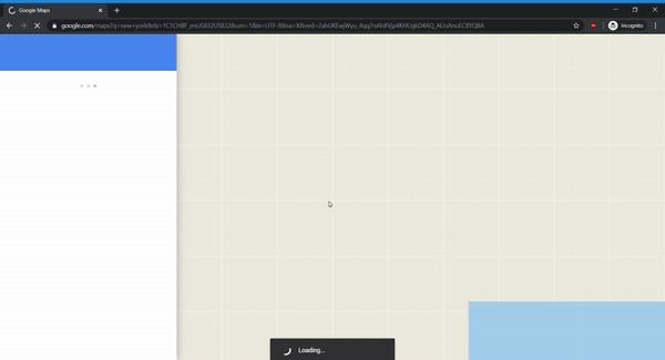
This interactive web page is created using AJAX—asynchronous JavaScript and XML. In short, the JavaScript in your browser makes an HTTP call to an API on a remote server, then that server sends back structured data that gets processed by JavaScript. When you scroll to a part of the map that has not loaded, this triggers the JavaScript to make an API call to retrieve the next piece of the map. Google servers respond with that next piece of the map, then your browser processes that data and shows the new map tile.
Remember when you learned about abstraction? This is another example of it. The combination of JavaScript and APIs allows any frontend to process the data from Google Maps. A single API for map-scrolling updates sends data that works in a browser, mobile app, or any inventive device Google Maps may be used on in the future. As long as the frontend knows what to expect from the API, it can process the data correctly.
Issues with JS, CSS, AJAX
Thanks to standardization, CSS and JavaScript can run on any browser in more or less the same way. There could be some small differences; for example, some browsers render fonts slightly differently than others. Even though they are created to be adaptable, it is important to always test web pages on all major operating systems and a few past versions. Users often have outdated versions of their browsers installed. In the last checkpoint, you learned that IT departments manage software upgrades at large companies. Sometimes, these IT departments do not update employee browsers because internal applications have not been updated to work on the newer browser versions yet.
Another challenge is that too many calls in the HTML will impact device performance, especially for mobile devices. Even for desktops, it can be problematic to have too much data (such as large tables and complex math calculations) processing in your browser. Those are better handled on a server and retrieved via an API.
The handling of errors is another significant challenge in AJAX-heavy interfaces. For example, if a user composes an email in a browser and the network connection dies as it is being sent, what does the browser do with the email? Is there enough logic programmed into the page to recognize and display an error message telling the user what happened? Did the script save a copy of the email content? If so, at what points in time? Can the script recognize that the message failed to send? Should it retry sending?
These types of connections and error handling have to be considered at every step of the design and development. To ensure consistency and better page performance, it's a best practice to shift more complex application requests over to the server to handle.
Understanding the device on which a product will be used is crucial for determining the right UI technology. Finally, you always have to take the difference between desktop and mobile into account. Spend the time to design, develop, and test your product versions (you'll likely have multiple frontends) to ensure the best user experience across devices, operating systems, and browsers.

Mobile: native, web wrapped, and wrapping libraries
Apps on Android or iOS often have a similar look and feel to other apps developed for their respective operating systems. This is because they use APIs provided by Google and Apple to build their look and feel. Mobile applications that use the built-in APIs, styles, and other features provided by that platform are called native apps. This can be beneficial because users can learn and adopt your products more easily. It can also, however, limit your product's ability to stand out. Some examples of native apps include those made by Google and Apple for their mobile devices like Gmail, iTunes, and Maps.
Developers of native apps often need to use the native programming languages to create native applications on platforms (such as Java on Android, Swift on iOS, and C## on Windows). It can be hard to find developers who know those languages. It is also difficult to maintain a product across multiple platforms when any single feature has to be built multiple times in multiple programming languages.
Developers have come up with ways to overcome this constraint for a product that will be used across platforms. One solution is to build your product as a web application, then wrap the web version into programs and apps for specific devices or OSs. This enables the core product to be built in HTML, CSS, and JavaScript; technologies that a lot of developers know well. There are still details that are specific to the devices and to the operating systems, but the customization is significantly reduced. In this approach, the product will not be or look native; it will look like the HTML/CSS/JS specified. Twitter Lite is an example of an app you can download on your phone that's actually using web technology under the hood.
The other way to support multiple mobile platforms more easily is by programming the application in a language that translates to multiple native versions. React Native is a popular new technology that readily translates into the native languages for Android, iOS, Windows, web, and other emerging platforms. Even with this technology, there are still OS-specific issues (for instance, Android and iOS menus work very differently), but those can be addressed with much less effort than it would take to develop multiple versions in each native language. Despite their growing popularity, languages like React that support this are quite new and rapidly changing, so there are still many more developers that know HTML/JS/CSS.
Deciding between mobile approaches
As product manager, you won't be deciding on the mobile technology that your engineering team will use. However, you will influence their decision in a few important ways. First, if you have a specific timeline or deadline, that deadline could limit your developers to choose the technology they already know. Learning and deploying unfamiliar technologies or hiring additional developers with new skills is extremely time-consuming and high-risk. It's important to recognize this added risk when developers are providing estimated timelines for a project using a new technology.
Second, customer or platform-specific constraints also influence technology decisions. An example of this would be if a product has to work on Sony TVs, and Sony TV apps require HTML, CSS, and JavaScript. In this case, web wrapping would likely make more sense than using a technology like React Native. It's the PM's job to communicate these constraints and business requirements and clearly articulate the why; this helps developers find the best technological approach and solutions to the question how.
Animations
Before moving on, take a quick digression on the use of animations in interfaces. All UI technologies support some way of animating the content on a page. Some common uses are showing transitions between pages, hiding processing data, and covering content that is loading. For instance, if your product is loading or processing a lot of data, showing a progress bar will make it clear to your users that the tool is working. However, tools that display progress bars that aren't tracking the actual progress (such as those that endlessly appear to be working when the tool has crashed) undermine the effectiveness of such UI tools.
Other animations can be distracting instead of helpful. They can interrupt a user's flow. For instance, videos that play automatically can distract people away from the marketing call to action (such as "Buy now"). Interactive animations also need to respond instantly. If you have a button that animates when the mouse hovers over it, the animation should trigger immediately and be very short. Otherwise, it will seem like a bug rather than a delightful interaction.
Make sure your UI animations serve a purpose. If you're unsure about whether to use an animation or not, try a quick A/B test to ensure that it is positively affecting your conversion rates.
Voice and skills
As the popularity of voice platforms like Google Home and Amazon Alexa increases, more products are being developed for these devices. These products allow users to use voice commands like, "Alexa, play classic rock." The Alexa device then uses its configured music service to start playing music fitting those search criteria. These services are called skills and are built on APIs provided by each company's voice services.
To integrate with voice assistants, a product must be configured to use a platform's backend to access the skills. Amazon requires use of their Lambda cloud services, and Google Home requires use of Actions for Google Assistant services. Having established that configuration, products can then connect to the platforms' APIs and services.
Given this additional complexity, product managers need to consider whether or not it's worth the effort to build these additional products. Does your target audience have Amazon Alexa or Google Home? Is there something about an audio interface that works especially well for your product? Many times the answer is no. Do your research to figure out the answer that's right for your product and users.
Activity 🎯
Identify a software product you've used recently (such as an app, website, or Alexa skill) that had a particularly great—or horrible—user interface. Using the knowledge you gained from this checkpoint, analyze this product's UI by answering the following questions:
- Can you guess what decisions were made when developing the product? How might have those decisions contributed to the great/horrible experience?
- What details could have been changed to improve the user interface/experience?
- How do you think technology limitations influenced design decisions? What design choices do you think were simply about user flow, and what decisions may have been influenced by some of the limitations of the technology choices?
Capture a few screenshots of this UI and write a brief (less than one page) summary addressing the questions above in your notion page