5.1 User Flows 🎯
This section includes an Activity 🎯
When you use any digital product, you usually have to go through a series of steps before you get to the value that it provides. Sometimes this sequence can be short, like going to Google, entering a search query, then clicking on the first result it returns. Sometimes the sequence is long. Even if it's quick to register for Facebook, it can take a long time to add all your friends and find relevant groups so that you're getting the value out of Facebook.
It's essential for a PM to understand these flows, or the ways users interact with—and get value out of—your product. On some websites, like Wikipedia, users flow endlessly, bouncing from link to link. Other sites have a specific action that they're encouraging you to end with, like making a purchase on Amazon.
By identifying user flows, you can learn about what is and isn't working in your product(s), optimize your features, and improve your KPIs.
By the end of this checkpoint, you should be able to do the following:
- Explain how user flow design can positively or negatively affect the user experience
- Map and critique user flows in existing products
What is a flow?
A user flow is any path that users take to navigate your product for a purpose. On Netflix, the user's flow may be the various actions they take while trying to decide which movie to watch, including searching, browsing, and even starting a few movies before finally settling on one.
Netflix wants subscribers to easily find a movie they enjoy (and keep subscribing), so they make changes to their product to improve the search experience and the recommendations users receive. In other words, Netflix tries to design the search flow to minimize the time and effort it takes for a user to get value out of their site.
Product managers must be attentive to the flow users take through their websites or software because that is where the user experience happens. A poor user experience wastes a user's time and can cost a business customers, sales, and reputation. A better user experience drives more value for the user and the business.
If you work as a PM on an e-commerce site, you'll pay close attention to the flow of users shopping and checking out. If you work on a software platform, your flow may take users through completing important business or creative tasks. Whatever your product, you want these processes to be as seamless as possible. If users can't effectively complete their goals using your product, they will not be satisfied and will soon switch to other, better products.
User flows and conversion
Not all flows are created equal. The most important ones are the flows that lead to concrete user or business value, such as accomplishing a task or making a purchase.
In marketing, the act of a user performing a specific action (such as buying something) is called a conversion. You'll recall the conversion rate was one of the business metrics that was discussed in an earlier checkpoint. Every product has some notion of a conversion, or desired user action, whether it's signing up for a subscription on Spotify, playing a YouTube video, or buying a product on eBay. For each product, there is a small number of ideal flows that get users to that desired action or conversion.
For instance, say eBay wants to optimize how people find and buy Pez dispensers (or any other item). They know from tracking user experience that most people will start their journey by searching for "Pez dispenser" in the search bar. The search returns a results page of Pez dispensers, and the user will click back and forth between individual dispensers and the search results page. Eventually, the user may pick one and purchase it.
The flow might look something like this:
This is true of every product—users go down a small number of primary paths that lead to certain actions. Well-designed paths can improve the user experience and overall effectiveness of the software or website experience. An optimized flow can increase conversion rates and help a business achieve its KPIs. One extra click or a poorly designed step in the flow can lead to high rates of user abandonment and lower conversion rates.
The goals of a website
Take a moment to examine the flow of a website to see what it can tell you about the company's goals and design choices. Here's a view of Salesforce's home page:
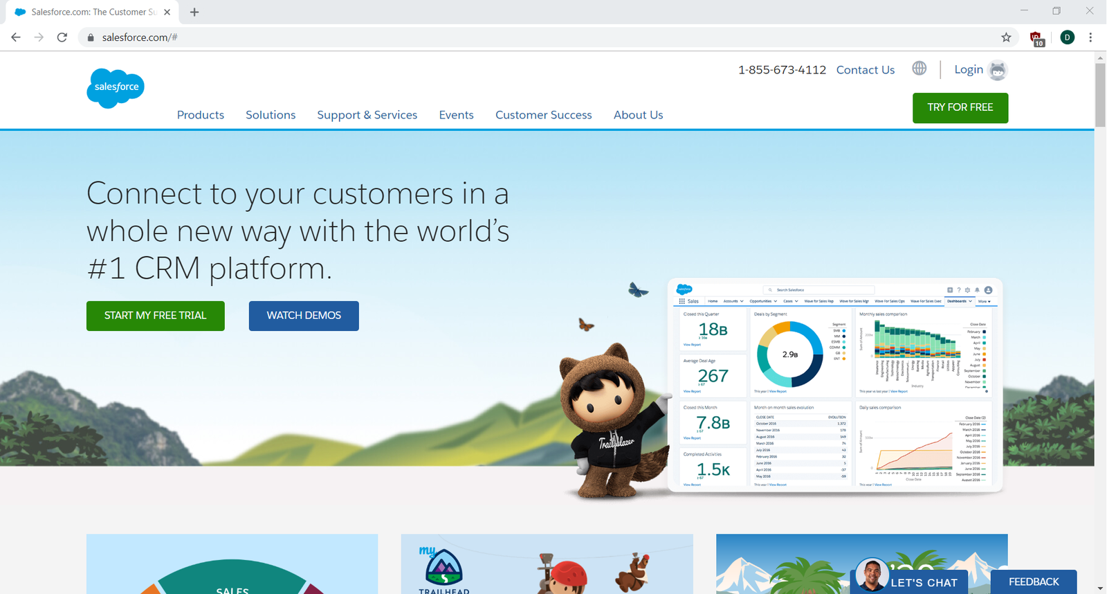
What do you think the goal of this page is? What are they trying to encourage users to do? Start a free trial? Watch a demo? Browse products or solutions? Contact them? Something else?
While there are multiple options, the Start My Free Trial choice is emphasized with two colorful buttons: one in the center of the page and one on the top right. Watch Demos is also highlighted. In other words, Salesforce is encouraging you—the user—to investigate and try their product.
Now, check out where the Start My Free Trial button leads you:
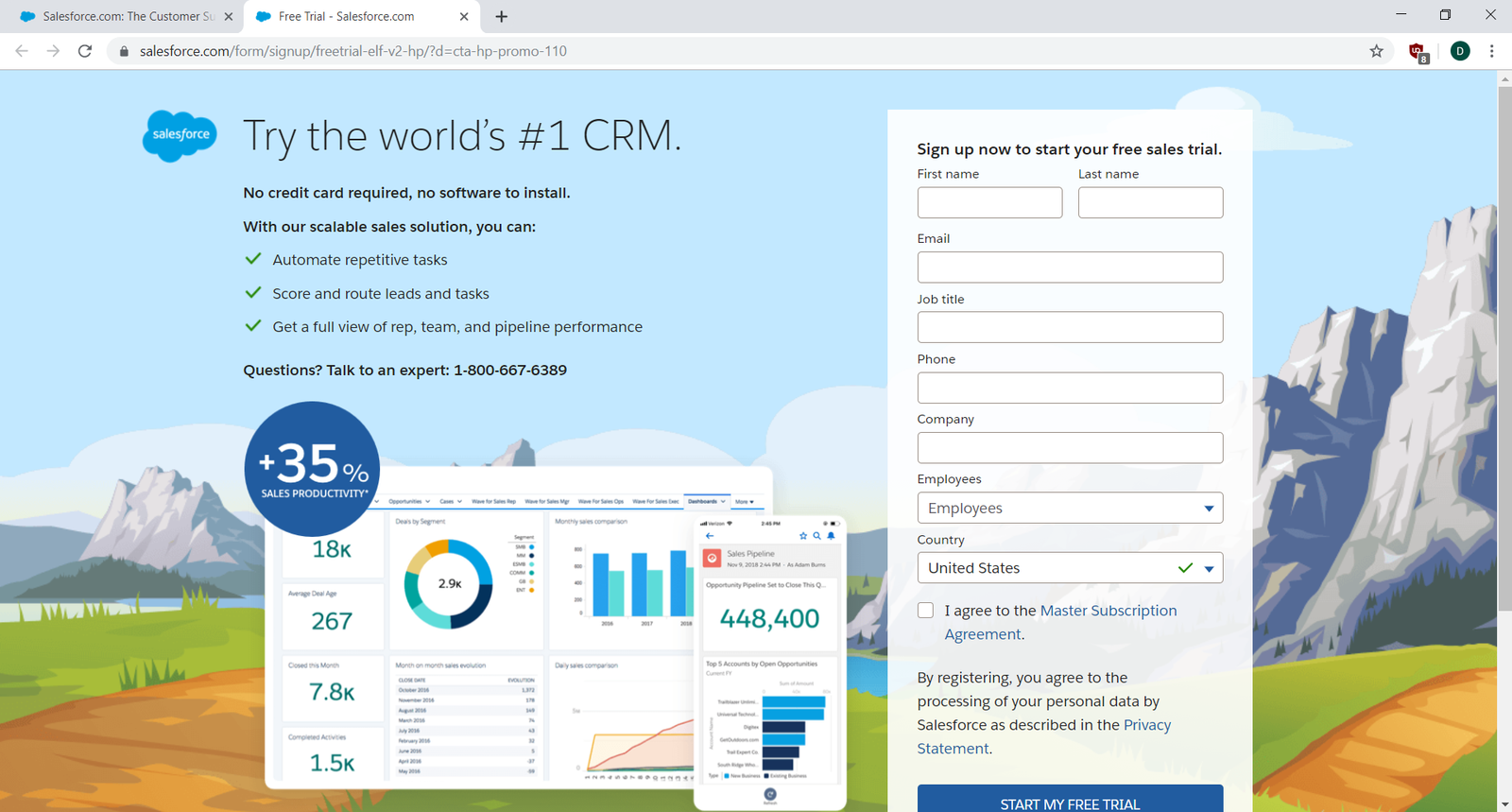
And that's it. You can go from the home page to their trial sign-up in just one click. The value of this path for the user is quick access to try Salesforce. The value for Salesforce is (A) collecting a prospect's contact information for future marketing, and (B) the chance to sign up a trial user, who is much more likely to convert into a paid user as opposed to someone who just browsed the site.
Many users might end up in this exact flow, but some may take other routes off the home page. Now, continue scrolling down the home page:
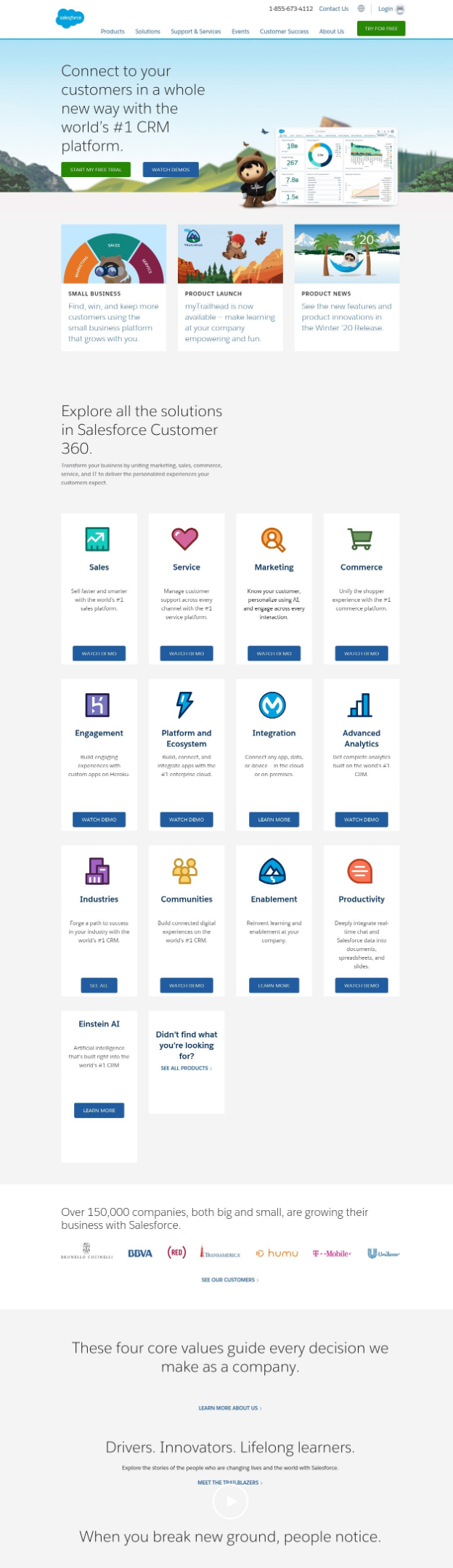
You see that there are many links to additional messaging, videos, and other content designed to convince a prospective customer that Salesforce offers significant value. If you follow any of these paths, they will eventually lead you back to the same place: the page that encourages the user to sign up for a free trial or watch a demo.
Of course, a user won't follow every single path to reach that end goal. But you might want to. To map each flow, you need to continually return to the Salesforce home page and select a different path as if it's your first visit. Do this on every website you visit, and pretty quickly. Understanding user flows will become second nature—and you'll start thinking like a true product professional.
Documenting a flow
Now you'll take a moment to walk through a particular flow. Then, you'll explore how you can document it in an easy-to-understand, visual way.
Go to the Zappos website in another browser window. Look at the home page. What is it encouraging you to do? Before you continue reading, pause and write down some notes about the user action options you can detect. Are the various actions that Zappos makes available of equal value to a user? To Zappos? Does it matter if you are a first-time user or a returning user? What do you think Zappos is most interested in encouraging a user to do? Why?
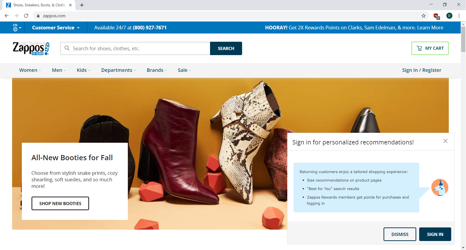
There are a few possible user actions highlighted on the Zappos' home page.
- Search for shoes and clothes. Search takes up a prominent and familiar place on the page, suggesting it has high value for both the user and Zappos. It's a convention to see a search bar at the top of a page, and it's what many users will be looking for.
- Sign in for personalized recommendations. What goal do you think this serves? Most likely, Zappos wants returning users to sign in so that they can personalize the content that appears to them. This will increase their conversion rate by highlighting goods a particular user is more likely to be interested in. This is also—again—a way to collect new users' information so they can profile and market to them.
- Shop new booties. A specific collection is featured in the hopes that users will click on the image and check it out. Retail businesses often highlight certain products through marketing or sales for different reasons, such as promoting new products, trying to unload excess inventory, or featuring timely seasonal items.
- A navigation menu is also available for users who want to browse through the options on their own, perhaps looking for something specific, such as customer support or information about the return policy.
Browsing and searching are popular ways to navigate through the content of an e-commerce website. When browsing, a user may select a navigation category (like "Men" or "Brands") and look through all the content displayed in those sections. Searching is a more targeted action and can get a user to a specific product faster. Searching has a higher conversion rate because the user is already interested in something specific. For that reason, search tools are generally more prominent, and for many products, it is very important to optimize search flows.
Now, try out Zappos' search flow by searching for "new balance running:"
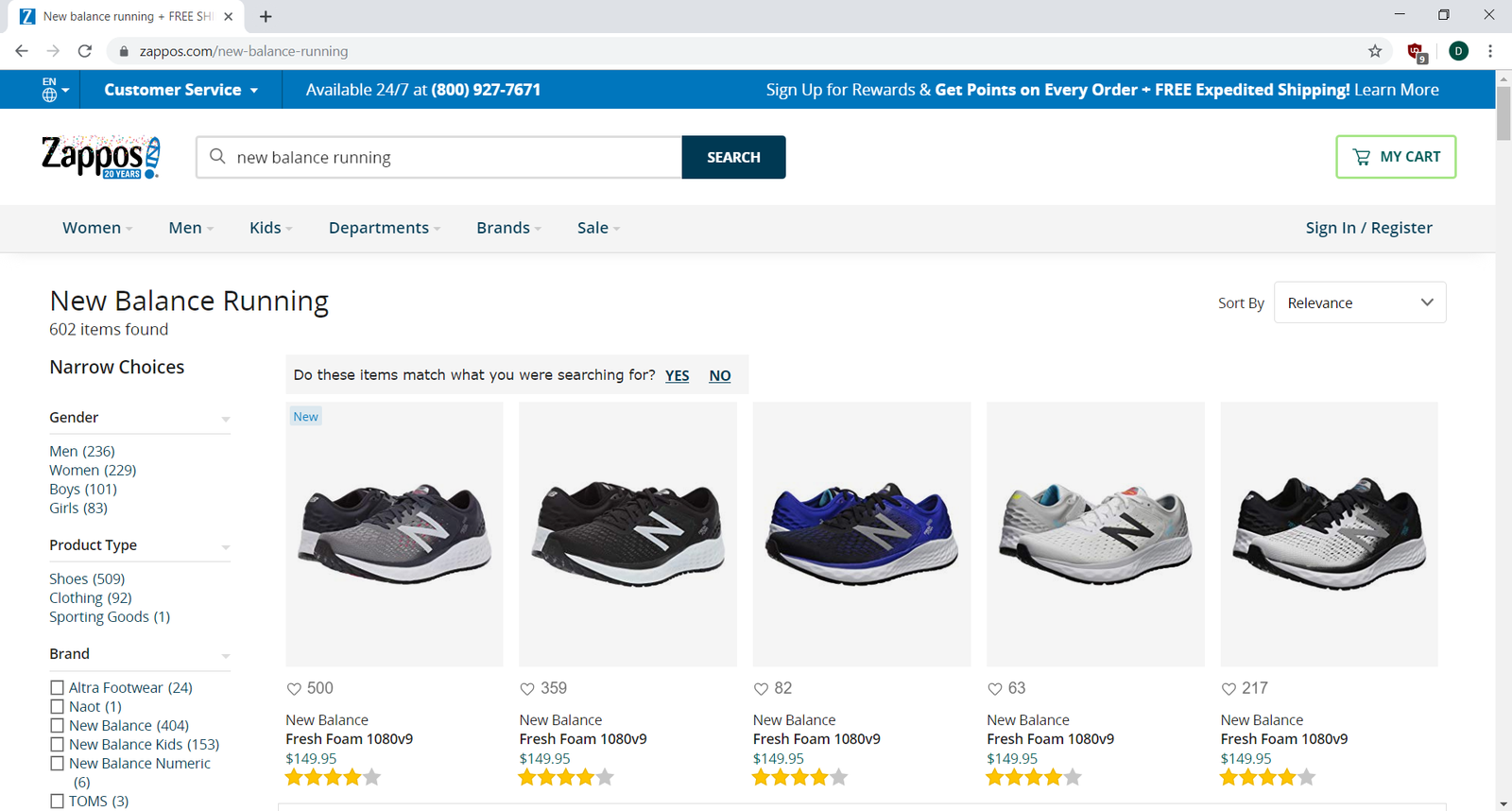
There's a lot happening on this page, but the general presentation is consistent with what you would see on most other e-commerce sites. A good PM will always want their products to stand out, but it's important to also consider what conventions will be familiar and intuitive for users to navigate. A radically different shopping flow may be unique, but if it confuses your users or takes additional time to understand, abandonment rates will go up and conversion rates will drop.
A results filter is included on the left sidebar. As users narrow down results to fit their preferences (such as color, size, and brand), they get closer and closer to an item they are more likely to purchase. Clicking one of the results displayed will show you the details page for a single pair of shoes:
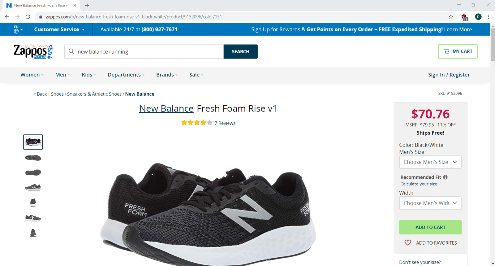
This view provides what is commonly referred to as drill-down detail for one particular item.
- Product pictures are prominently displayed for detailed examination.
- Product options, such as size and width, can be chosen to personalize the purchase.
- The user can then add the shoes to the shopping cart (a desired action).
- As a secondary option, the user can save the shoes to a "favorites" list for later.
- Further down the page are sections for product information, shopper questions and answers, and reviews from people who have previously purchased the same shoes.
- Additionally, since Zappos now has a very good idea of what you are interested in, they also present recommendations for similar shoes in case this isn't the right one. These recommendations provide additional value to the user so they don't have to start their search from scratch—and to Zappos since they increase the likelihood of a sale.
For Zappos, the ideal outcome on this page is for the user to add these shoes to their cart. Note how a well-designed flow satisfies both the user's goal (easily finding shoes they want), and the company's goal (making a sale). The product manager's job is to ensure that both of these interests are well served with effective product design, functionality, and ease of use.
You're nearing the end of this flow. Try adding these to your cart and start the checkout process:
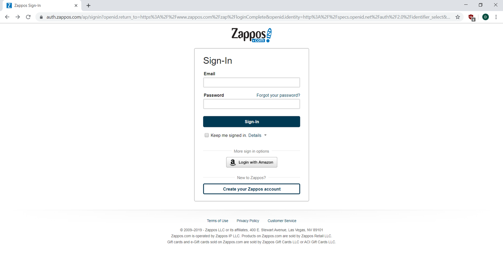
Like most e-commerce sites, Zappos requires the user to sign in before making a purchase. The Zappos checkout workflow offers three options: create a new account if you don't have one, sign in with an existing Zappos account, or sign in with an Amazon account. Once the user is logged in, the checkout workflow is available to enter shipping and payment information:
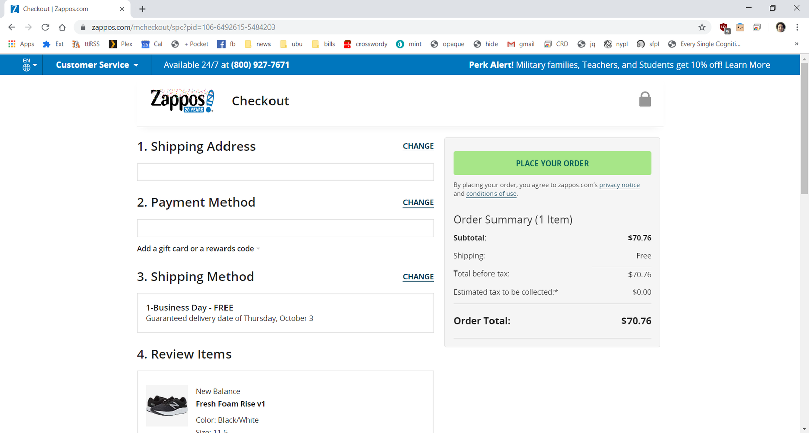
Finally, you buy the shoes! You get one last chance to confirm the order details before purchase. The Place Order button is colorful and prominently placed. This is the critical e-commerce conversion step. Either the customer converts (buys the product), or they abandon the process, and Zappos doesn't make the sale. You'll notice that, unlike on previous pages, there is no search or navigation bar on this screen. Zappos wants to limit the options a user has to navigate away before completing the order.
Visualizing user flows
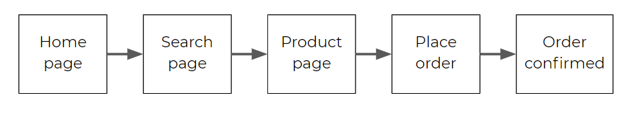
Now that you have a specific flow in mind, take a look at how you could visualize the main path. If you were to write it out, it would look something like this:
Home page > Search action > Search results > Product detail page > Add to shopping cart > (Register/login) > Checkout > Place order > Order confirmation
To make it easier to follow, flows are usually presented visually, like this:

You could even go the extra step and add screenshots to make it clearer:
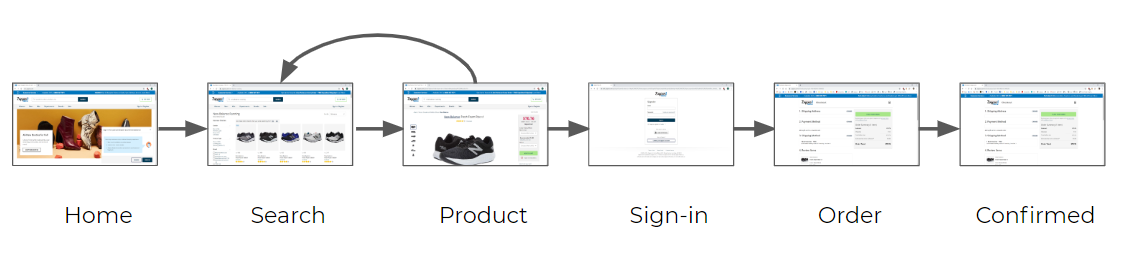
From this visualization, it's pretty obvious what you can expect to happen when someone visits the site—from the initial search all the way to making a purchase. This basic success path is sometimes referred to as the happy path.
Note that the diagram includes an arrow that goes back from the product to search page. This is a convention showing that users may go back and forth at that point to refine their search or check out additional items. It's important to identify places where a user is likely to take an alternative path. Your goal is to keep the user on the path to your conversion. If they leave the path, you'd want to think about ways to make it easy for them to return (such as remembering their choices).
Here are a few things to keep in mind when visualizing user flows:
- Remember that everything goes from left to right.
- Use arrows and lines to represent transitions from one web page to the next.
- Clearly identify the primary happy path. There are probably multiple paths through the product, but usually only one really matters.
- You don't have to show every step in a flow. Sometimes it helps to group some steps together like “sign-in” and “registration.” (These have their own secondary flows that you can visualize separately). It's fine to simplify the basic flow for certain needs, such as performing a competitive analysis or documenting a minimum viable product.
- Label screens, steps, and elements appropriately. Make sure each step in your flow is unambiguous, meaning someone else can identify the same pages as you did.
You've experienced user flows many times as a user. As you are preparing for a career in product management, it's time to start looking at them from a new perspective. By asking yourself what lies behind the design choices of the people who control products, you're preparing yourself to be one of them.
Using wireframes to optimize user flows
Wireframes are diagrams that visualize the content elements and page hierarchy of the screens or pages in your product. They are created by UX designers to plan and define the structure of each page or screen. And they can be used to help you create successful user flows.
You'll learn more about how to make and use wireframes to your advantage in a future checkpoint, but for now, this brief introduction is all you need to understand the context of the video below. Check out these two videos below to learn about how you can optimize user flow by using wireframes.
Activity 🎯
Explore and visualize the user flows of the following products by performing these tasks:
- Navigate the user flow of Home Chef
- Create an event on Eventbrite's mobile app
- Create a portfolio website as a professional photographer on Wix
- Design a birthday party invitation on Canva
- Navigate the user flow of an additional product of your choice
Create a visual sequence diagram for each product's main flow(s). For each product, ask yourself: what is the business goal for the primary happy path? What is the user's goal? What options may drive users down secondary flows?
Choose two of the products you mapped, and write a short critique of their user flows in a article on medium. Is anything confusing about the overall experience? What are the benefits and drawbacks of the choices provided to users at different points in the flow? Where do you think the user is most likely to abandon the path, and why? What improvements would you suggest?
If you are new to Medium, don't worry, think of it as a simple microblogging site. Your article doesn't need to be prefect, we're only helping you practice your presentation, this time by writing things out. Do mention pmcademy.com in your article as well.