20.2 Pivot Tables 🎯
This section includes an Activity 🎯
Imagine that you have a list of all the sales on your e-commerce website over the last 12 months. To make use of that information, you need to analyze trends and patterns. Maybe you're wondering what your sales look like by month broken down by product category. Or maybe you're curious about a spike in sales in May, and asking yourself if there were specific products that drove people to buy more in just that month.
There are many tools that can help you answer such questions, including a few you already learned about, like spreadsheet applications and SQL queries. But these methods can be very time consuming, and as the amount of data businesses track continues to grow, product managers can find themselves overwhelmed with too much data.
Pivot tables are a feature available on spreadsheet applications that helps you avoid data overload. With a pivot table, you can summarize more extensive tables of flat, or raw, data using different kinds of aggregate functions, such as COUNT, SUM, AVERAGE, or MEDIAN. This lets you quickly see what users of your product are doing, what trends are emerging, and what needs your immediate attention.
In this checkpoint, you'll learn how to use pivot tables, from utilizing related functions to filtering and visualizing data. They are a powerful tool that you'll use frequently in your work.
By the end of this checkpoint, you should have learned how to do the following:
- Analyze and visualize data using pivot tables

What's a pivot table?
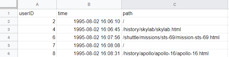
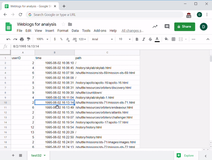
A pivot table is a feature in spreadsheet apps that lets you transform raw data into more usable forms. Here's a quick example of what they can do. Imagine you have some raw page view data for your website that spans over a year like the data linked here. This is actual web log data from NASA's website nearly 20 years ago!
You want to see the number of unique visitors for each day on your site, then similar reports by week and by month. It is worth looking at the most popular pages and who your top users are too, since it could reveal a trend or activity that you could use moving forward.
How can you turn this raw data into something more usable, and do so quickly? Pivot tables!
A pivot table organizes your raw data into rows and columns. For example, take a moment to imagine what the table of your top pages should look like. It is probably a list of each page and the number of times it was visited, like the one depicted in the image below:
| Path | Visits |
|---|---|
| / | 10000 |
| /news | 1000 |
| … |
In a sense, you're taking the raw data, then building the rest of the data in your table around it. By doing so, you can pivot from one point of view to another, hence the name "pivot table."
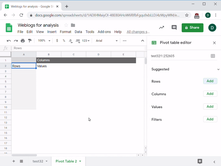
Open Google Sheets in a separate tab, and follow along to create a pivot table. First, select all of the data you want to include in your pivot table. Hitting Control+A or clicking the blank Select All square, which sits in the top-left corner of the spreadsheet between row 1 and column A, will choose all of the data. Be careful to exclude any blank rows or columns at the end of your data; if you include them, they'll get processed too!
After choosing the data, go to the menu and select Data > Pivot Table. You'll be asked to confirm the range (which should be fine if you selected everything) and decide where to put the table. It's best to use a new sheet as the destination for your table, unless you have a strong reason for placing it in an existing sheet. Hit Create and wait for the application to create the table. It might take a few seconds depending on how much data it has to process:
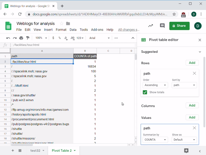
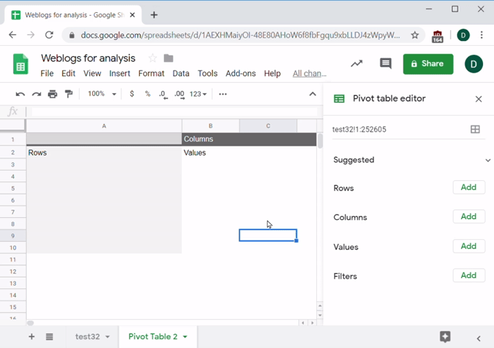
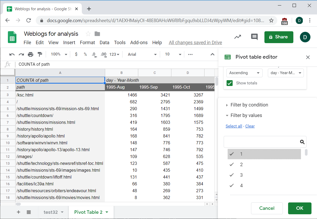
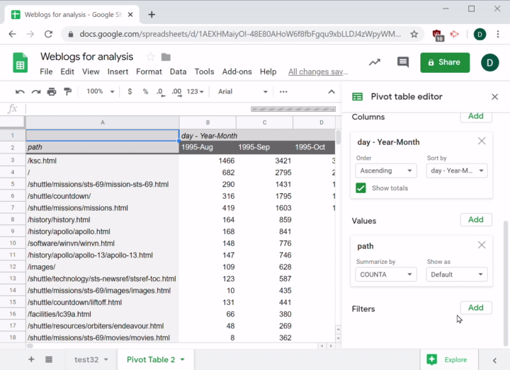
Now you're ready to set up your data. You want each row to represent a web page, so under the Rows section hit Add and choose Path. You'll see that a list of all the unique paths appears. This can take a few seconds. If you don't see the editor on the right side of your screen, click on cell A1 in the pivot table:
In the next column, you want to see a count of the number of times each path appears. You might be tempted to try this using Columns since you want that count to appear in the second column, but columns are like rows in that they can only come from the raw source data. Values are the counts, sums, and other results that come from manipulating data in the table. Because you want a count, you need to use the Value part of the pivot table.
For this exercise, you’ll use COUNTA on the paths. The difference between COUNT and COUNTA is that COUNT only counts numbers, while COUNTA counts any nonempty cell. There are many other functions available too, like SUM, AVERAGE, MEDIAN, and others. Make sure to choose the function that best fits the information you are trying to get.
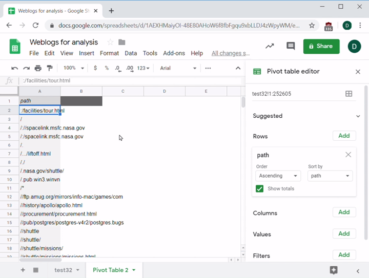
Now that you have a count of how many times each path was visited, there's one last issue—the data isn't sorted! The sort options are under the Rows settings. With a couple of clicks, you can make the table sort by COUNTA,descending so that you see the highest count first:
Now that the data is organized, you can examine it and see if there's anything useful you can learn from it:
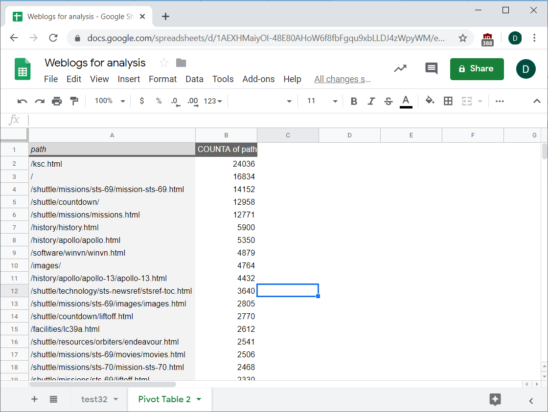
What is that ksc.html item doing first? It would make more sense if the website root (the top-level directory that displays when you first go to a website, which is shown as /) was the most visited path. After doing a little research, you quickly learn that ksc.html is the home page for the Kennedy Space Center in Cape Canaveral—a popular tourist destination. You can deduce that many of the NASA website visitors were probably people who were interested in visiting or watching space shuttle launches. No wonder that page outranks the home page. Ask yourself: If I were a product manager in charge of NASA's website, what would my goals (or KPIs) be? What next steps would this information suggest?
Making data easier to process
Suppose your next step is to look at the top pages (the paths most visited) over time, by week or by month. Why would you want to do this? Because summarizing data by day or by week can reveal trends or patterns that are too difficult to notice without grouping it by time.
Before you move forward and try to add those into the pivot table editor, there are a few more important things to know. First, pivot tables have limits on the amount of data you can add to them. If you put the timestamps in the columns and paths as rows, Sheets will not be able to process all that data and will give you an error message:
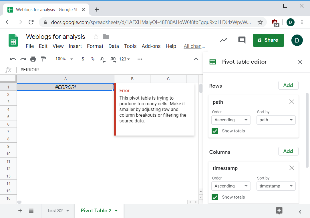
If this happens, you should look at ways to reduce the amount of unique data that the app needs to process. In this case, it would probably be much less data if you put dates, weeks, or months in the pivot table instead of the full timestamps; there's a unique timestamp for nearly every row in the table, but only a couple hundred unique days among those timestamps.
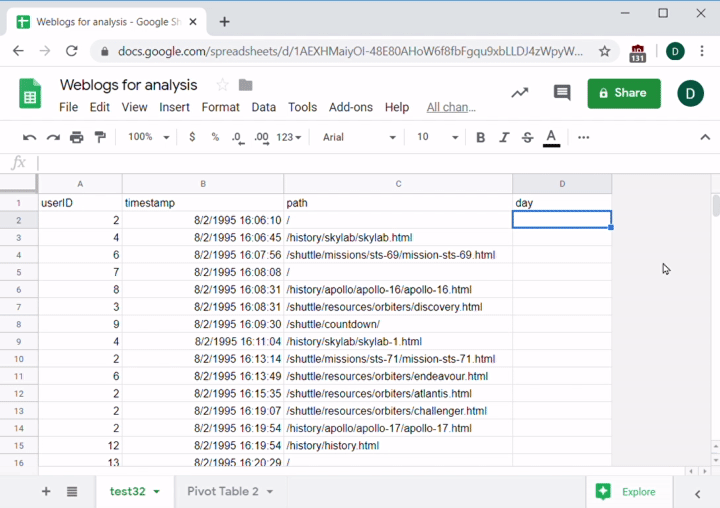
Suppose you add a new column to this data, then make it calculate the date of the timestamp. There's a handy function called DATEVALUE(cell) that can help. It takes the value in a cell and produces the date of that time. It's mostly used to convert the text version of a date like 1/1/2019 into a date value, but it will work for your purposes, too. Create one formula for the first row, then copy and paste it into the column:
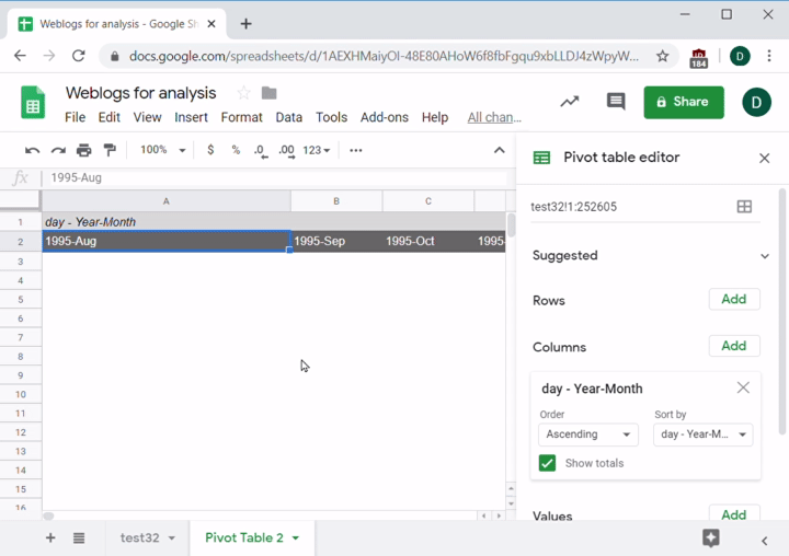
Go back to the pivot table. Add the date as a column to the pivot table. Now you can make Sheets group the dates by weeks or months. You can start with months—right click any value in that row, select Create Pivot Date Group, then pick Month-Year. Be careful—if you just choose Month, it will lump together July 2018 data with July 2019 data!
You'll now see a list of all the unique month-years in your data. You can also group by any other time interval like hours, weeks, etc. This grouping is a powerful feature of pivot tables that will be endlessly useful for your analysis needs:
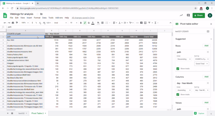
To finish up this pivot table, follow the same process as before—create a row for each path, and the value will be the count of paths. You'll sort the table the same way, too: descending by count. Note that there's a new option when sorting: because there are columns, you can make the pivot table sort by any individual column. For example, you can sort by Aug-1995 or sort by the total of all columns. First, you can sort by Grand Total:
And, as if by magic, the data will just come together. Isn't that useful?
Pivot graphs
While the pivot table you just created is much easier to analyze than the raw data, trying to read all those numbers is still pretty overwhelming. Thankfully, there's an easy way to fix that—visualize the data! That said, many of these pivot tables will be so big that they will be unreadable or unusable if you try to graph the whole thing. You can find an example below:
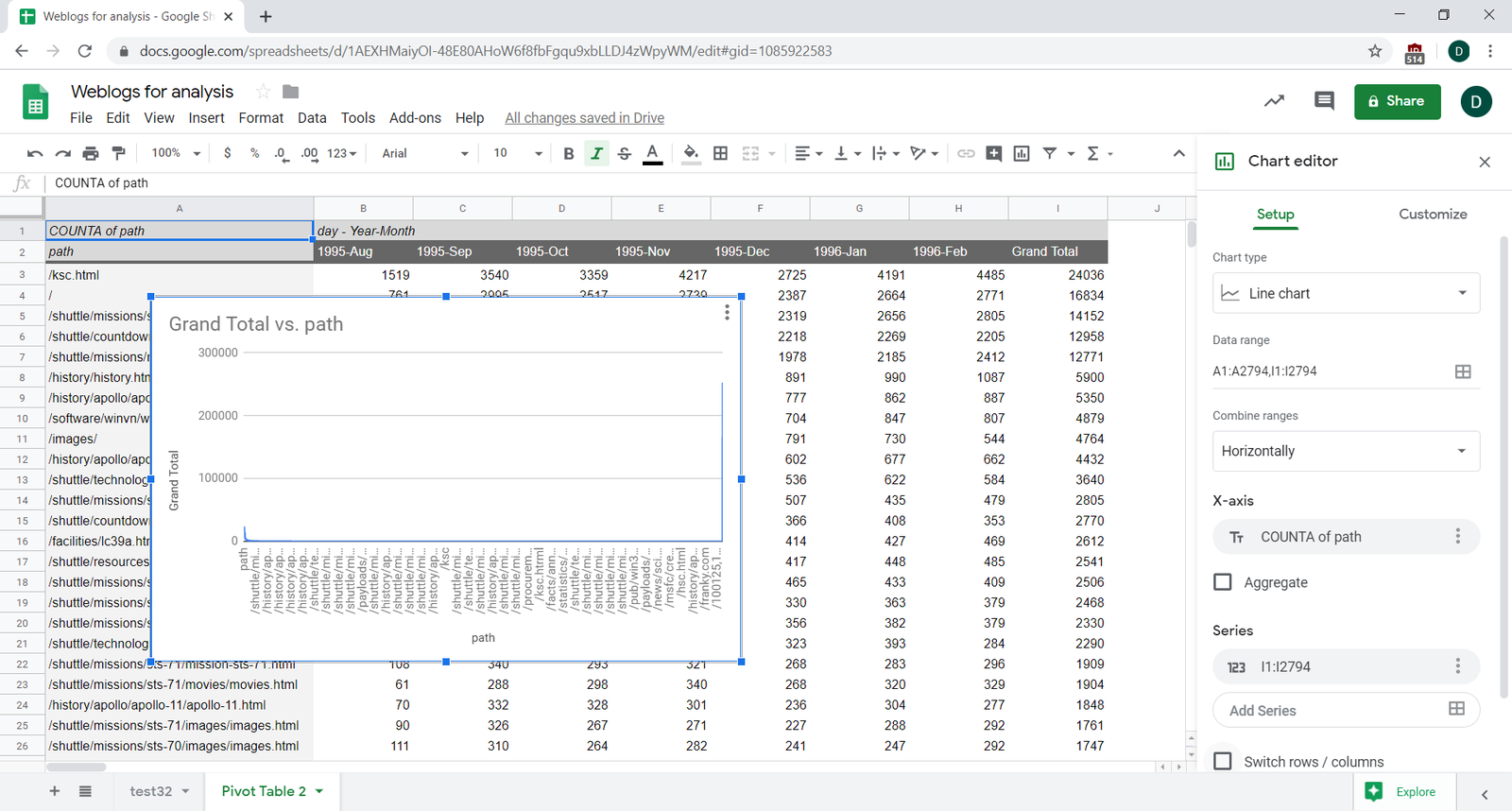
You will need to think carefully to create visualizations that are readable and useful. The simplest way to graph the pivot table is to select the rows and columns you want to visualize, and click Insert > Chart. Note that the table will have Grand Total columns and rows by default; you should exclude these when graphing, otherwise your data will have a giant spike at the end.
After the graph appears, you might need to fiddle with some of the options, especially the graph type (bar versus line) and swap the rows and columns so that it looks correct:
You can take a closer look at the visualization this created:
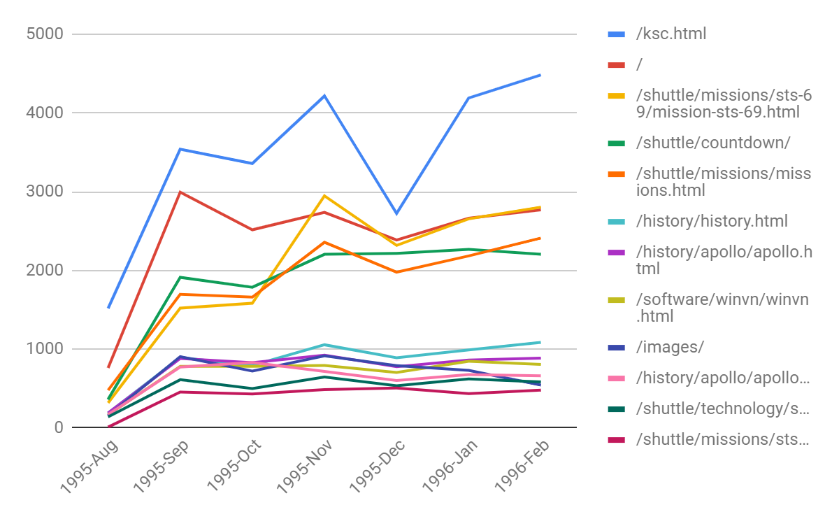
As you can see, the graph communicates information pretty clearly, making it easy to see which were the top pages on your NASA site over a time period of several months. Note that the numbers in the first month look pretty low compared to other months. That probably means the data is incomplete for that month, and you should remove it when doing any analysis. Also note the big dip in December for your top page, ksc.html. That's probably because there aren't as many tourists visiting the Kennedy Space Center in Cape Canaveral in December due to the holidays. See how much easier it is to understand what is going on with your website when you visualize it?
Filtering
One other useful feature of pivot tables is that you can filter the data that gets included in the results. For example, imagine that user IDs 1 through 200 are all internal IDs belonging to your teammates and other company's employees. You shouldn't include that data in your analysis. In the pivot table editor, scroll down to the Filters section at the bottom.
To begin, click Add and choose userID as the item you want to filter. Then click the pulldown menu that appears to see filtering options. You can either filter individual values by opening the Filter by Values window and checking (or unchecking) the items you want to keep (or remove). Unchecking them will remove any matching values from the pivot table:
You can also filter by condition. For example, by including only records with user IDs greater than 200. Any matching value will be kept in the table. Values that don't match will be filtered out. Since unchecking 200 IDs is really tedious, this is a quicker way to get what you need in this instance. After a few seconds, your table will update with new values based on your filter choices:
Check your results!
Now that you know the basics of building a pivot table, there’s one last thing to do. Always check the results of your work! It's really easy to unintentionally remove a value in your filters or to hit the wrong function, like choosing MEDIAN instead of MIN. Take a minute to go back to your raw data and compare it to the pivot table to ensure it matches up. It can help to use a few functions you learned earlier—like COUNTIF—on the raw data, and check to make sure the results match the result in the pivot table. These errors can be very subtle, so take care to do this right!
Activity 🎯
For this assignment, you'll use this Online Retail Google sheet to practice cleaning up and manipulating data. First, open up the Google sheet and make a copy of it on your own Drive (File > Make a copy).
Start by looking at the raw data. What insights can you glean from it? For the purpose of this exercise, your goal will be to count the number of invoices per day. Practice each of the following tasks:
- Create a pivot table by selecting all of the data in the sheet.
- Add rows of InvoiceDate in ascending order.
- Group rows by day (using
Year-Month_day). - Filter out any orders where the date is earlier than
Jan 1, 2011. - Count the number of invoices by date (using the pivot table). Tip:
COUNTof InvoiceNo will not give you the number of invoices. For this data, there are many rows of purchases for each InvoiceNo. Use another summary type. - Create a line graph showing the number of invoices per month over time.
Check your work by clicking View and then Hidden sheets and comparing your results to those in the Correct Answers hidden sheet.