20.5 Visualization
You've already learned about basic data visualizations in one of the earlier modules. Now, you will expand on that knowledge and learn how to create advanced data visualizations. These can include multiple scales and dimensions of data; you'll even learn about creating your own bespoke product dashboard. In the next module, you will dive into Tableau, a popular data visualization tool.
Why all this focus on visualizing data? Since most companies today think of themselves as data-driven, being able to understand, manipulate, and communicate with data is quickly becoming a very important skill for prospective PMs to demonstrate. As a PM, knowing these skills will help you understand your product and share insights and accomplishments with your stakeholders in a visual and compelling way.
By the end of this checkpoint, you should be able to do the following:
- Describe several advanced data visualization techniques
- Create your own dashboard to reflect business needs

Visualizing data with different scales
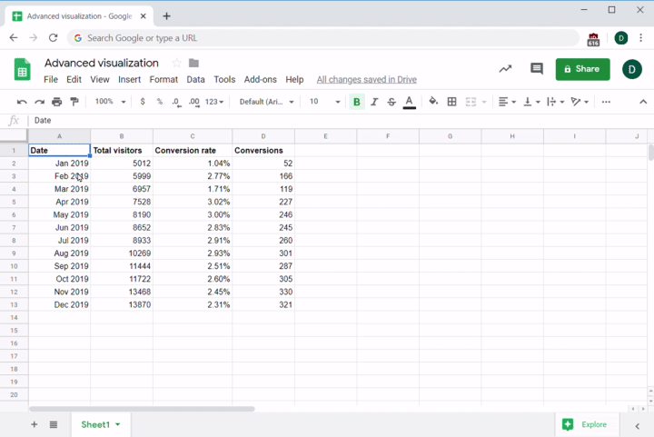
Imagine that you're trying to create a graph of your product's conversion rates. Your raw data looks like the following table:
| Date | Total visitors | Conversions |
|---|---|---|
| Jan 2019 | 5012 | 52 |
| Feb 2019 | 5999 | 166 |
| Mar 2019 | 6957 | 119 |
| Apr 2019 | 7528 | 227 |
| May 2019 | 8190 | 246 |
| Jun 2019 | 8652 | 245 |
| Jul 2019 | 8933 | 260 |
| Aug 2019 | 10269 | 301 |
| Sep 2019 | 11444 | 287 |
| Oct 2019 | 11722 | 305 |
| Nov 2019 | 13468 | 330 |
| Dec 2019 | 13870 | 321 |
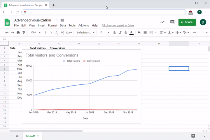
Copy and paste the data above into a spreadsheet in an app of your choice, which might be Excel, Google Sheets, or another software program. To create a graph, use the software's graph building and formatting features. In Google Sheets, for example, you'll use the Insert menu to find Chart. Though this process might be different depending on the software you're using, you should see an end result like the one below.
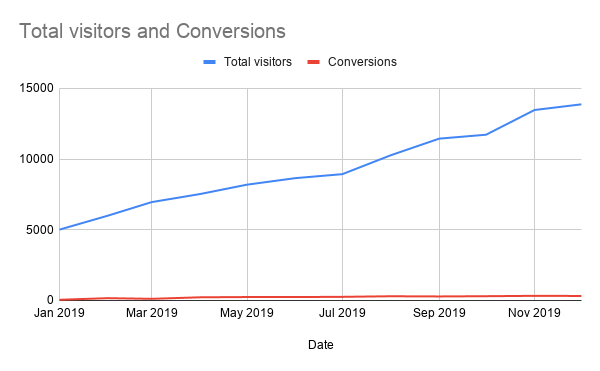
You look at the raw conversion data again. You can clearly see that the raw data shows an upward trend, steadily rising from around 50 converted customers in January to a number in the 300s by the end of that year. But in the graph, the upward trend is barely noticeable. Why? Because the scale for that data (50 to 300) is so much smaller compared to the scale for total visitors (5000 to 13000). How can you make the graph do a better job of representing the trend?
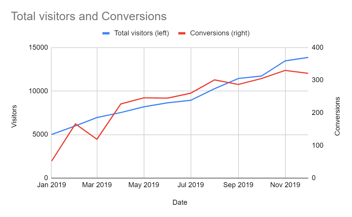
One way to handle this problem is to use multiple vertical axes—that is, to use one graph that has two scales. The total visitors data will use one scale, while conversions will use another. To do this, double click the bottom data series. Then in the editor that appears, change the Axis option on the Conversions series to Right Axis. This will change the chart so that the scale for the total number of visitors appears on the left side of the graph, while the scale for conversions appears on the right:
Suddenly, the trend is much more obvious; by using a different scale for each kind of data, it is easy to see that both the total number of visitors and conversions have been trending upwards.
Using this method can help you see correlations that you might otherwise miss, especially when the gap between the datasets is very large. On the downside, multiscale graphs can be harder to read, especially for stakeholders who don't work with a lot of data. Make sure to add legends and labels to explain how the graph works and help people read it. You can see an example of how to label the graph below:
As an alternative, you could also graph the total visitors versus conversion rate, where the conversion rate is a percentage, not a number. Note that in this case there's no way to have the two scales (percentage and raw number) use the same vertical axis.
One way to do this is to use a line and column graph, where columns represent total visitors and a line represents the conversion rate. The decision about which data goes where is not arbitrary; in this kind of visualization, the convention is to graph percentages on a line and total numbers data in columns. You can see the steps for creating such a graph below:
- Select the data you want to graph.
- Choose the option of a column or line chart.
- Set the dates as labels for the horizontal axis.
- Configure the conversion rate data series to use the right axis.
Follow along with these steps in the screen capture below:
When will you use these visualizations? Multiple vertical axes or a line and column graph can be useful when the data includes values that are on two very different scales, or when you're graphing two different types of data—like dollars versus percentages.
Bubble plots (multidimensional data)
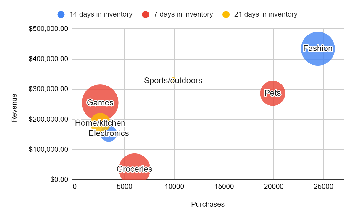
Sometimes you need to graph several kinds of data at once. For example, imagine that you're trying to get a message across to your stakeholders about how your e-commerce sales are doing. The information you want to share, in raw data, can be seen in the following table:
| Category | Purchases | Revenue | Days in inventory | Margin |
|---|---|---|---|---|
| Electronics | 3409 | $152,834.77 | 14 | 7.93% |
| Fashion | 24430 | $434,356.22 | 14 | 25.53% |
| Groceries | 5997 | $34,664.49 | 7 | 22.50% |
| Games | 2549 | $255,135.23 | 7 | 30.04% |
| Home/kitchen | 2558 | $187,332.00 | 21 | 10.44% |
| Pets | 19887 | $286,475.31 | 7 | 14.53% |
| Sports/outdoors | 9885 | $327,855.96 | 21 | 5.44% |
That's a lot of information to include in one graph, and in a raw data table the trends and comparisons are harder to see. How can you visualize this complex, multidimensional dataset and help your stakeholders absorb it all?
One way of visualizing this type of data is to use a bubble plot. A bubble plot is a multidimensional graph that can show multiple levels of information at once. It does this by using four different indicators for each point it plots:
- The vertical axis
- The horizontal axis
- The size of the bubble
- The color of the bubble
See below for an example of what a bubble plot looks like:
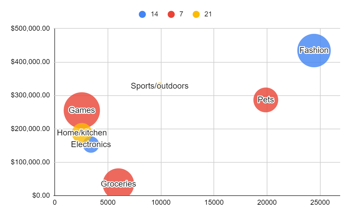
Because a bubble plot conveys a lot of information at once, it can be difficult to read. If you're sharing or presenting this type of information, you'd want to make sure your audience understands what they are looking at. Adding a few labels and legends can go a long way toward making the bubble plot below clearer:
Now you can practice creating these types of advanced visualizations. Open up Google Sheets in another tab. Start by pasting or typing in the information from the table above. Then, follow along with the video to set up a bubble plot.
Got it? Well done! The ability to create these types of complex data visualizations could make all the difference when you are trying to impress a potential employer or communicate complex information to a stakeholder on the job.
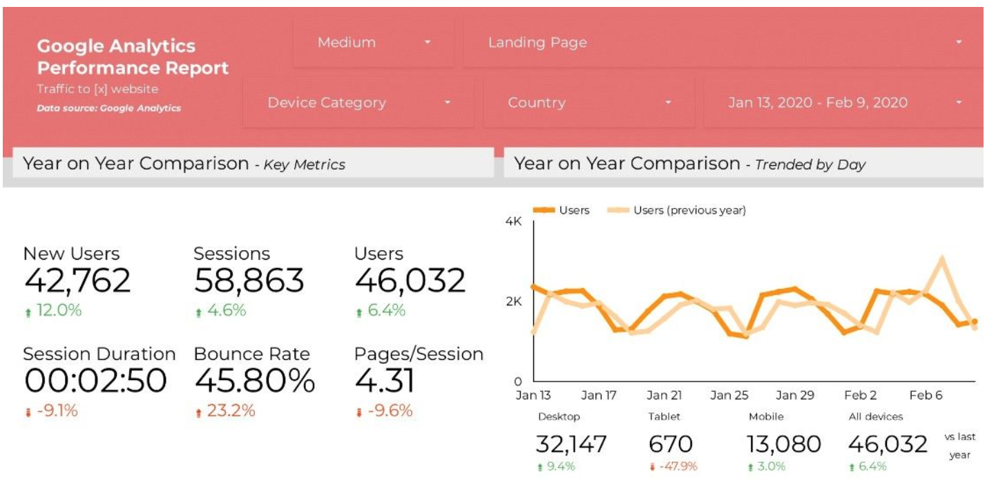
Dashboards
Dashboards are an aggregation of different data visualizations into one central location where lots of information can be viewed at once. For example, here is a dashboard view of that sample Google Analytics data that you analyzed a couple of checkpoints ago:
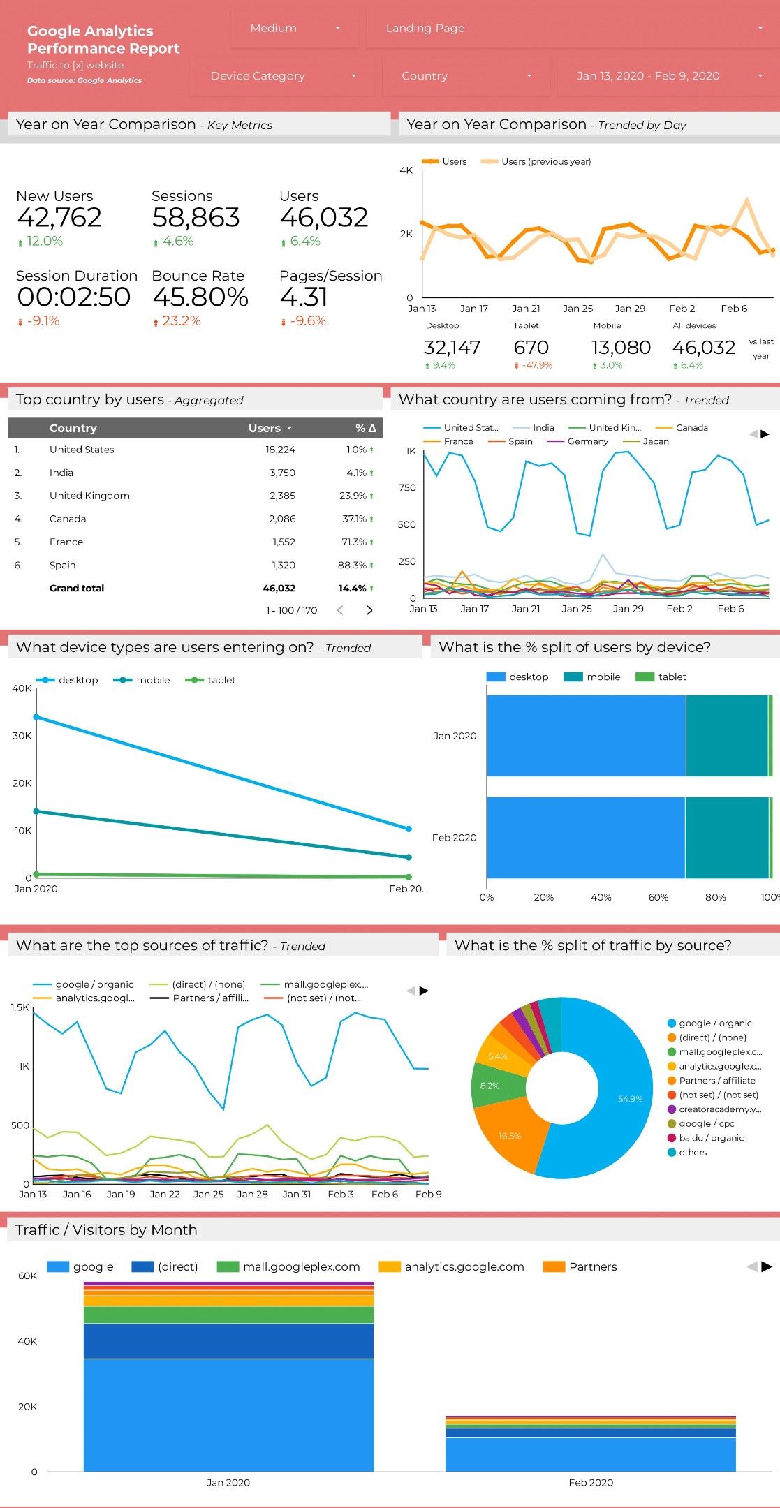
Why do product managers use dashboards? Most importantly, because dashboards summarize large amounts of data and make it easy to view. See how the dashboard above answers several important questions about your users, such as their country of origin, device, and referring site (source of traffic)? It could take you hours to sift through Google Analytics to get all that information. With a dashboard, you can easily keep track of the most important metrics for your product. Thankfully, many analytics products have dashboards that are built in, and often you can configure those dashboards yourself to get just the information you need.
Dashboard best practices
When creating a dashboard, there are several best practices to keep in mind. Consider all of the following points to make your dashboards that much more effective:
Your audience
A dashboard should have a specific audience in mind. Is this dashboard mainly for you to keep track of your product's top KPIs? Is the goal to track web activity, like page views and bounce rates, so you can share those with company leadership? Is it going to be used by your marketing team to see which ad campaigns are driving the highest conversion rates? Just like when you are designing a product, you should design your dashboard with your users in mind. Not all data will be interesting or relevant to all stakeholders; make sure to have clarity on how a dashboard will be used as you decide what visualizations to include in it.
Actionable insights
A dashboard is only as good as the information it provides. Consider what information your dashboard is telling you. What should you do next? If you've chosen good metrics and graphs, your dashboard should give you indications for next steps, such as investigating a drop in your conversion rate, looking closely at a page that had a huge spike in visits, or exploring why traffic from the US went down recently. Is your dashboard full of overwhelming data that does not lead to action? If so, it is not achieving its purpose. It should be giving you actionable insights and bringing to light issues and opportunities that you should be focusing on.
Quick scanning
You should be able to read your dashboard at a glance. When you scan it visually, big numbers, clear colors, and easy-to-read charts should all make the most important information jump out at you. Your KPIs should be front and center. In particular, be careful about your choice of which graphs and which colors you use. If you're assessing the health of your product through your dashboard, you should only need to check for metrics that turned red or significant spikes up or down in your charts. Customize your dashboard with the goal and audience in mind, and avoid the pitfalls of bad color choices or including too many graphs or other useless information. Investing some time in setting up a great dashboard can save you a lot of time and effort later on.
Drill down
A good dashboard lets you go from the dashboard directly to specific sets of data within it. For example, if you see a big drop in visits on your total visits graph, you should be able to click on that graph and jump to a more detailed report about your site visits. Another way to drill down on a dashboard is to use filters. You can see this in the sample Google Analytics data at the top of the dashboard you looked at earlier in this checkpoint:
Notice how the red header section includes drop-down menus for filters like country, landing page, and device category? If you want to see if there are significant changes in the data for your US users, you can use a filter to transform the entire dashboard to reflect only US data. This speeds up your analysis and is much better than having to build a new custom dashboard every time you want to drill down on a specific segment of your users.
Shared widely
Your product dashboards should not be a secret within your company. The more people at your company pay attention to the data, the more likely it is they'll have good ideas to either explain what's happening or how things can improve. Share links to your dashboards with anyone who wants access, and help collaborators understand how to interpret the data in your dashboards.