7.6 Presenting Data ⭐
This section includes a mandatory Assignment ⭐
Once you collect data from surveys and other research activities, you'll need to communicate it to others so they can understand the results and insights you've gathered. But creating great data visualizations is no trivial matter. While many software tools can help you create charts and graphs, it takes considerable skill to use these tools effectively.
In this checkpoint, you'll focus on honing basic data analysis and visualization skills. Later in the program, you'll dive deeper into both data analysis (using SQL) and data visualization (using Tableau). Becoming a master of communicating with data will make you a far more effective PM and allow you to convince others of your point of view by clearly showing evidence.
By the end of this checkpoint, you should be able to do the following:
- Choose the right kind of visualization for an intended outcome
- Create effective visualizations of data
- Analyze data and use it to answer questions
Why visualize?
Data visualization is the process of turning raw data into useful information by presenting it graphically. Your insights are only valuable if they can be (easily) understood. Showing people raw tables of numbers is cumbersome and ineffective. It's your job as a PM to make it easier for your stakeholders to understand your conclusions.
If you use data visualizations well, you will help your audience focus on the most important information. However, if you use data visualization inaccurately, you could actually confuse your audience—or worse, communicate the wrong results.
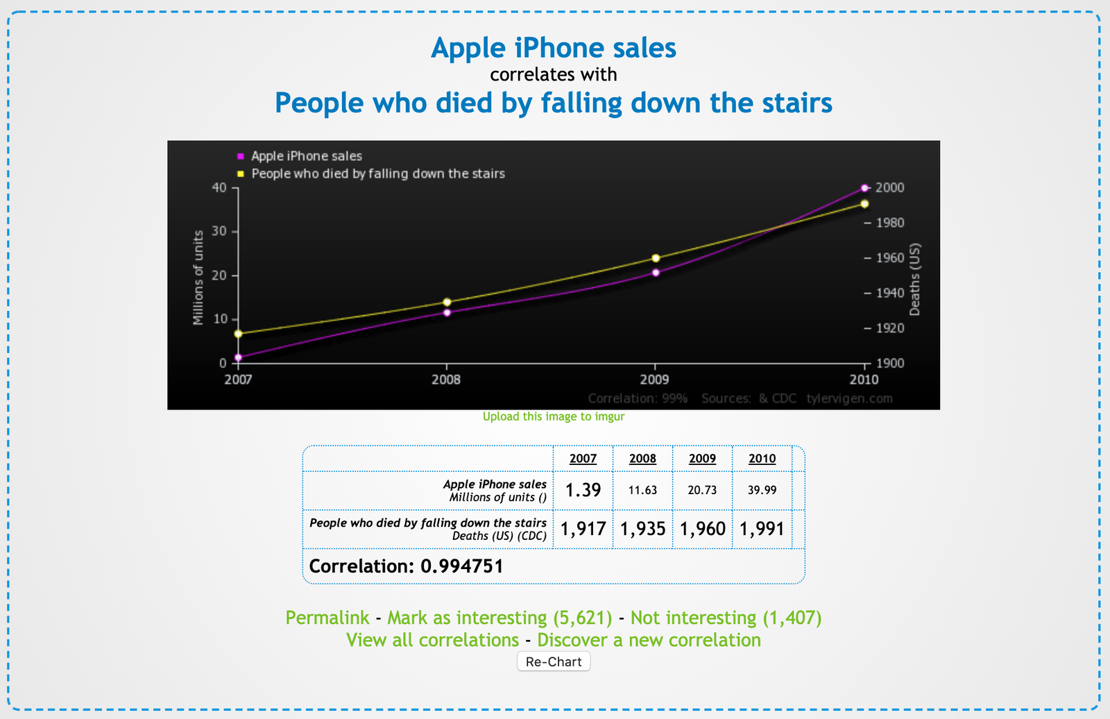
Sometimes, the patterns in the data may be interesting while, at the same time, random and not actionable. For example, the chart below (taken from Tyler Vigen's Spurious Correlations website) shows a correlation between iPhone sales and people who fell downstairs. While amusing, would this correlation suggest any actions to the PM in charge of the iPhone?
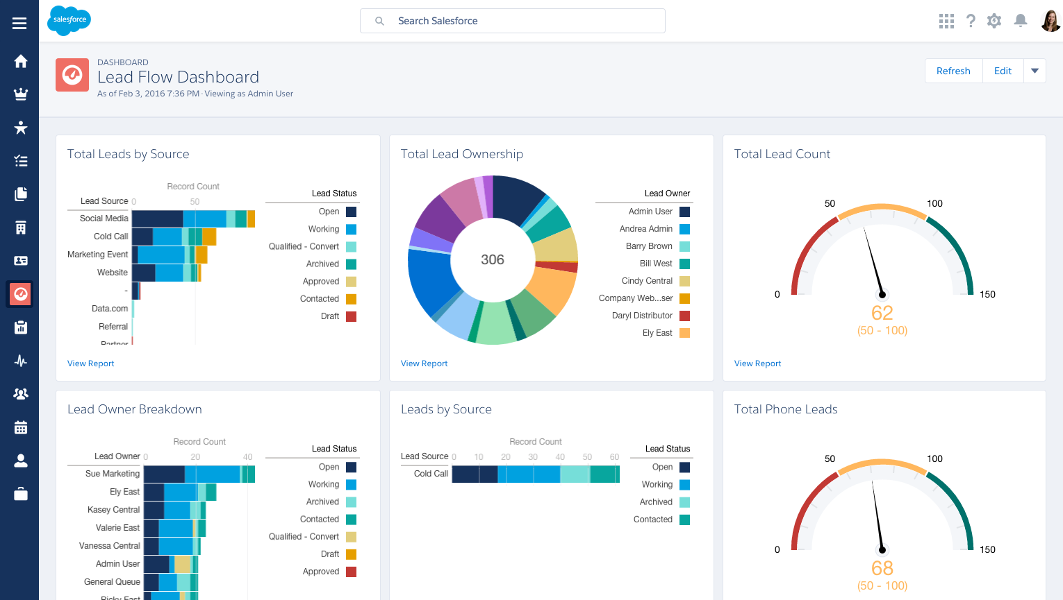
Data visualizations are also important for PMs to understand because many products include data visualization features, like dashboards or graphs. For example, sales team managers use reports and dashboards on Salesforce to visualize how well each salesperson is doing. Salesforce would be much less valuable without the ability to create these visual reports.
Similarly, if you were the PM for an educational technology application, your product may include a dashboard for teachers to track student performance, identify strugglers, and track test scores over time. And if your product were software for healthcare professionals, you may need to build a dashboard feature for hospital admins to visualize data about their patients—the number they treat each week, their length of stay, and their outcomes. In short, data visualizations play a big part in how most modern businesses work. You will need to use them yourself. And, at some point in your career, you will likely need to build them out as features for others.
Basic data visualization
When you're trying to visualize data, you have many options for how to display it. But how do you decide which visualization type to use? Read about some basic visualizations and their ideal use cases below.
Bar graph
A bar graph is the most versatile and commonly used data visualization. You can use it to display changes over time, compare results between a small number of groups, show frequency of distributions, and more. Choosing a bar graph is a reasonable default option.

Line graph
Line graphs are similar to bar graphs in their versatility but are especially appropriate for showing the effect of change over time. Because data points are connected in a line, line graphs give viewers a sense of progress that bar graphs do not. It's also easier to see small changes on a line graph. Choose a line graph over a bar graph when you're comparing the same metric across several groups; bar graphs can be overwhelming with too many series.
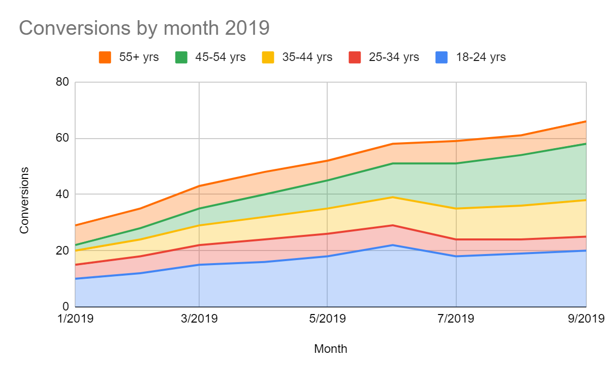
For example, look at the bar graph below comparing conversion rates over time and by age group:
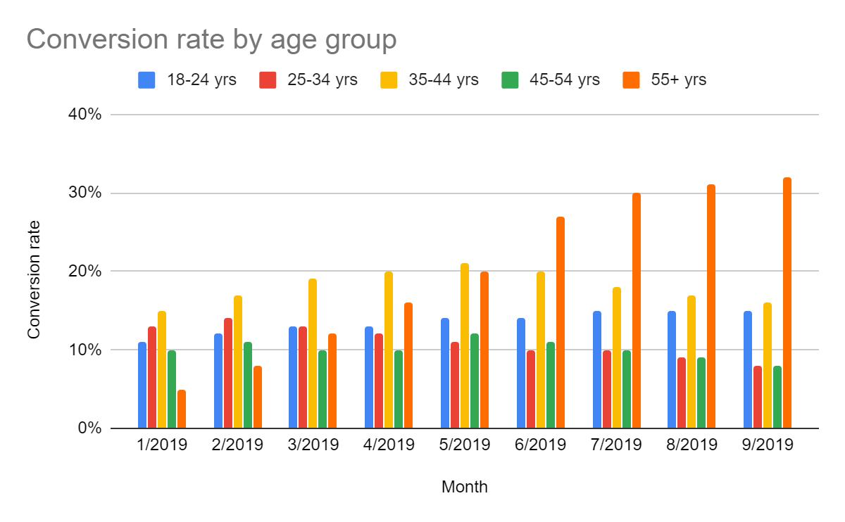
Pretty difficult to understand, right? Conversely, here is the same information presented as a line graph:
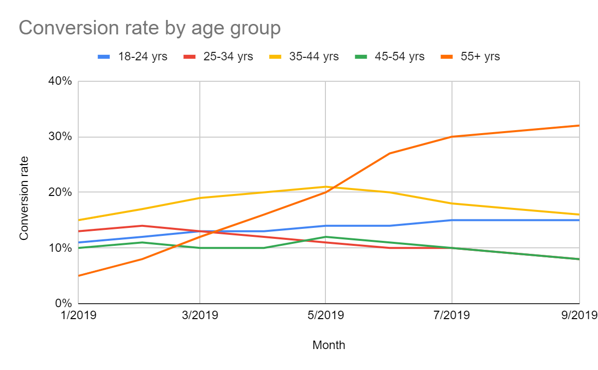
As you can see, this same data set is much easier to comprehend if you choose the best visualization for it.
100% scaled graph
A scaled graph answers the question, “What percent of …?” Whenever that is the question you are visualizing for, you should think of a scaled graph. In it, you show each value as a percent of the total. Showing information as a scaled graph can reveal trends that may be hidden by the raw data. For example, here's a line graph with its corresponding 100% scaled version below:

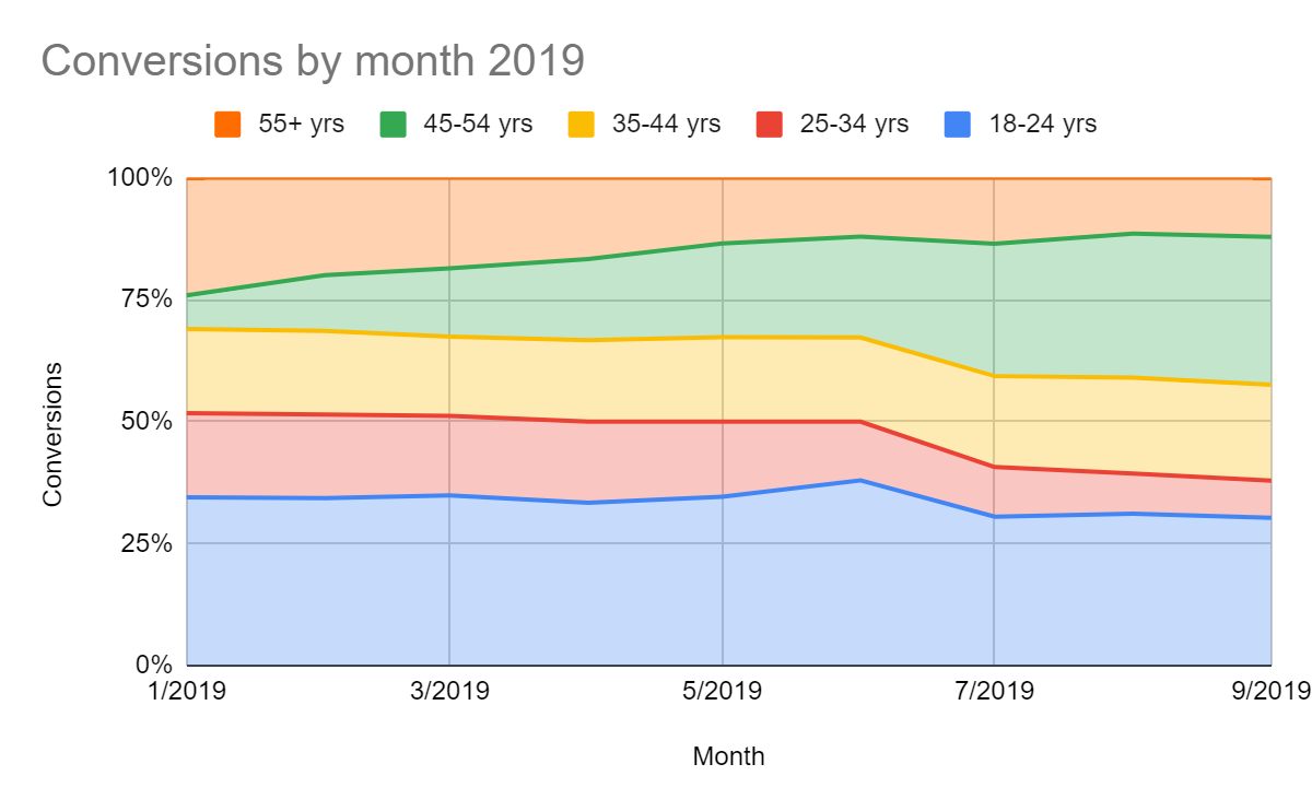
With a scaled graph, it is much easier to see not just the conversion rate, but also the relative importance of each age group. For example, the scaled graph makes it easy to see how much the "25-34 yrs" group has shrunk over the course of 2019 relative to the growth of the "45-54 yrs" group. While inspecting the line graph carefully will also make it clear that one group is shrinking and the other growing, this information is much easier to see in a scaled graph.
Scatter plot
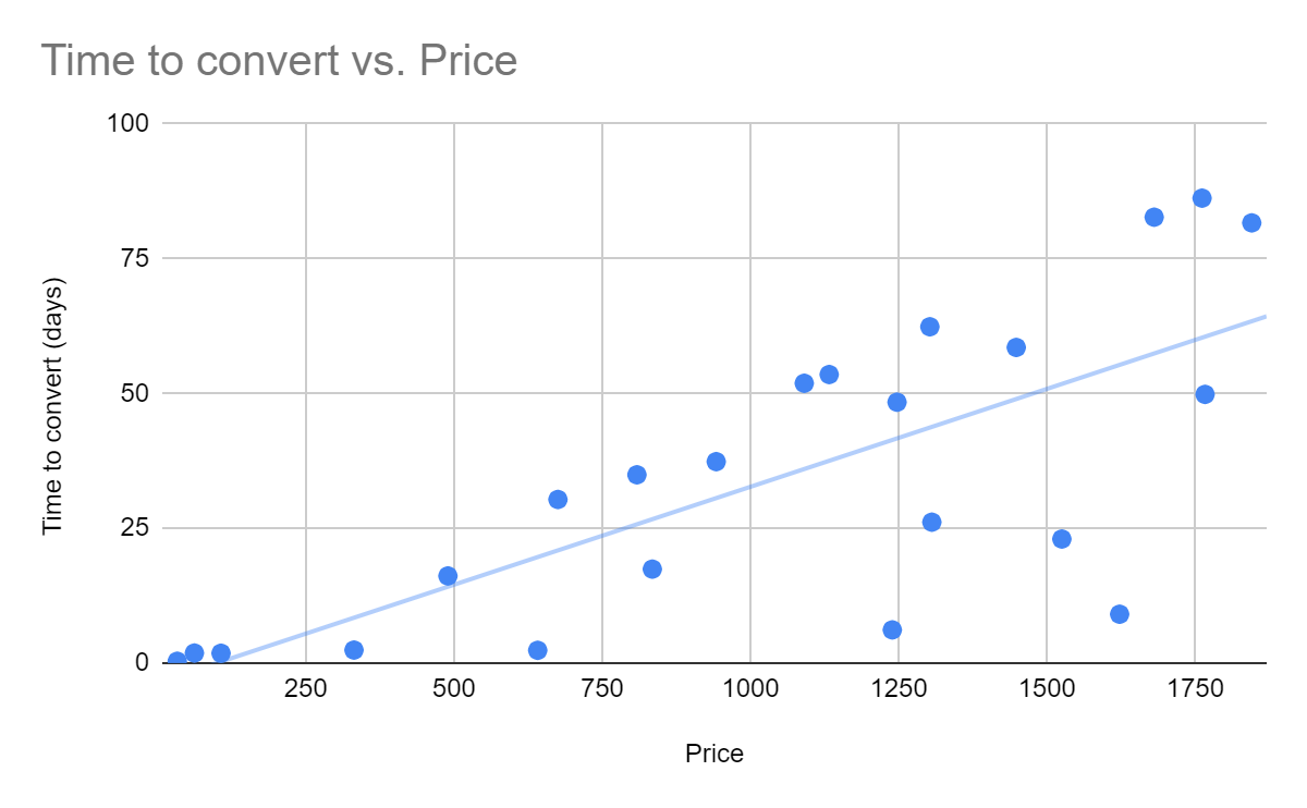
A scatter plot is a visualization used to show how two variables relate to each other. For example, if you sell products at a variety of prices, you could visualize the time to purchase compared to the amount of the purchase to reveal a trend that people take longer to make big purchases. A best practice for scatter plots is to show a trend line to make the correlation clear. Keep in mind that not all trends are linear, and sometimes a trend line may show a spurious correlation rather than a real one.
Visualizations to avoid
Some commonly used visualizations do a poor job communicating the type of information PMs care about. Here are some types of graphs to avoid and the reasons why.
Pie and donut chart
Although pie charts are very common, they have a critical flaw. It is incredibly hard for the human brain to compare radial sizes. The same goes for a donut chart, which is a pie chart except with a hole in the middle to make it look like a donut. The information in any pie chart is much more clearly visualized as a bar graph. Even better, you can present the same information as a line graph if you have data over time. If the percentages matter, show them as labels on your graph.
Here's a pie chart and a corresponding bar chart. Examine both:
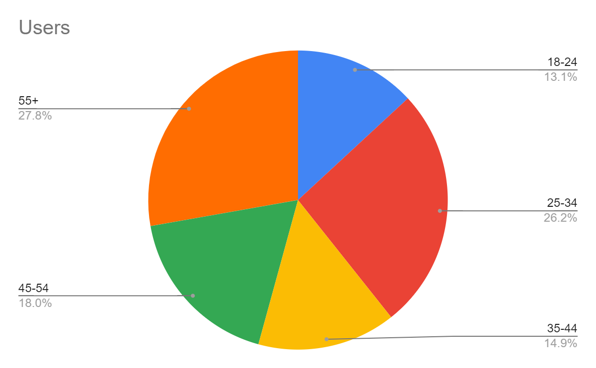
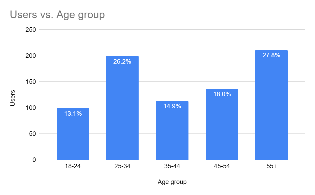
As you can see, it's much easier to compare the values in the bar graph than it is to compare those in the pie chart. And if you took the labels off the pie chart, you wouldn't be able to guess the percent values they represent. The bar graph clearly communicates the information, with or without the labels, making it much easier and faster to understand.
Stacked graphs
Stacking bar charts or line charts without scaling them introduces a similar problem to pie charts—it's very hard for the human brain to compare series of data. Review the two graphs below. One is a line graph of data, and the other is the stacked graph of the same data. Try answering the question: how much has the "25-34 yrs" group shrunk between March and August?

While answering the question is pretty easy using the top graph (about three conversions), the bottom stacked graph makes it look like the "25-34 yrs" group grew or stayed mostly the same. But that's only because the "18-24 yrs" group beneath it grew, pushing up the "25-34 yrs" group.
You should now have a clearer understanding of why using stacked graphs is problematic. The best practice is to show two graphs—a line or bar chart of the raw data and a separate 100% scaled graph to show the trend in the comparison between the groups. If you want to show the total, display it as a separate line on the same graph or in a separate graph altogether.
3D charts
Don't be tempted to use 3D charts. The 3D effect distracts from your message and makes the graphs harder to understand. Most people in your audience will have lots of experience reading 2D charts, but will find 3D charts hard to read. Remember, your point is to communicate data effectively, not to impress people with your chart-making skills. If you have multiple dimensions of data to visualize, there are plenty of methods for doing that effectively using 2D visualizations. (You will learn more about those advanced methods in a future lesson.)
Segmenting your data
When you're visualizing data, you'll often want to show how the same metrics vary based on different criteria. For example, Spotify's conversion rates vary by country, and Amazon's revenue is different between Prime and non-Prime buyers. The process of grouping users into smaller groups is known as segmentation, and the groups themselves are usually referred to as cohorts. When segmenting your users, you'll usually group them by these categories.
Time
You can segment your data by time in a few ways. First, you can always look at how a metric has changed over time, like how your conversion rates or your weekly active users have been trending. You can also look at cohorts by time—say, conversion rates of the group of people who started using your product in April compared to those who joined in June. If you made a significant change to your product in May, this segmentation might be a useful way for you to see the impact of that change.
Audience characteristics
You can segment by various demographic or psychographic characteristics of your audience. Looking at demographics like age, location, income, or job title can help you understand your core audience better and find gaps in your product adoption and retention. Segmenting by psychographics like lifestyle choices, activities, or interests can help you find opportunities to improve your marketing and your ability to target specific groups of users. Segmenting by audience characteristics is essential if you create advertising products (or run products that generate their income via advertising) since advertisers are interested in targeting specific groups of people.
Product use
Another way to segment your users is by how they're using your product. For example, you can look at segments of users who regularly use your product or one-time users who bounce and don't return. For e-commerce, you can segment based on how much your users spend or how often they buy from you.
Segmenting your users by these various criteria may yield trends that cannot be gleaned by simply looking at other data points. It's important to experiment with segmentation to see what insights you may be missing that could improve your product.
Communicating with data visualizations
Now that you have a basic understanding of data visualizations and how to use them, it's time to build your skills in using them. Well-crafted data visualizations will be far more convincing than poorly constructed ones. And your ability to communicate your product vision will improve drastically if you know how to tell stories with your data. Here a few suggestions for making any data visualization better.
Tell a story
Data is only as good as the information it conveys. And the best way to convey information is to tell a story about the results. Don't just tell people that your conversion rates have been climbing for the last three months; tell them that the rates have tripled since you simplified the registration process. This story is more memorable and more explanatory than just "our conversion rates are increasing" because it puts the data in context and gives it meaning.
Watch this TED Talk for a spectacular example of using data to tell a story:
Only include what's important
It's tempting to add several segments into your charts or to label each of the twenty groups that you included in your graphs. Instead, be critical of any piece of information. Your goal is to only include what's important so that your audience can easily focus on the right things—say, just the two largest groups. If the other groups are important, you could lump them together into an "other" group. It will be far less distracting than trying to examine eighteen other lines on your graph.
Be honest
Review the bar graph below. What do you notice?
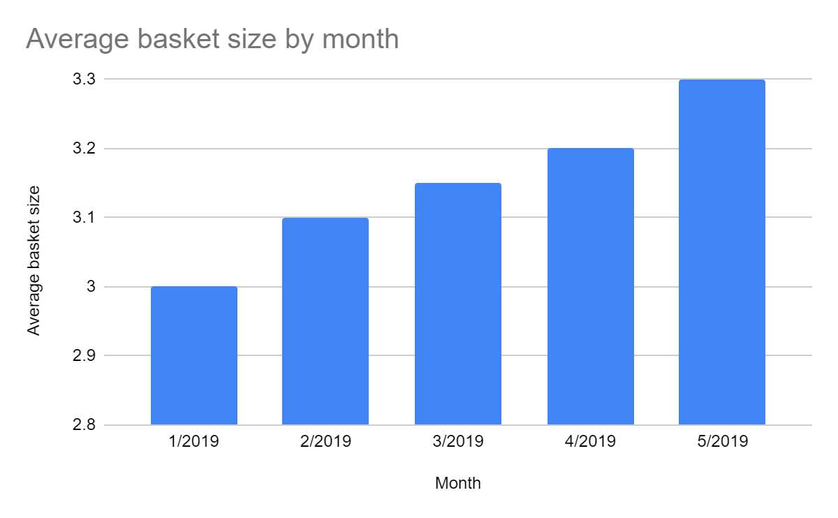
Take a look at the y-axis representing the average basket size. Did you notice something weird? The changes you're seeing month-to-month are, in fact, very small, but they look significant because of the detailed scale on the y-axis. If the graph used whole numbers as the average basket size scale, the graph would look more like this:
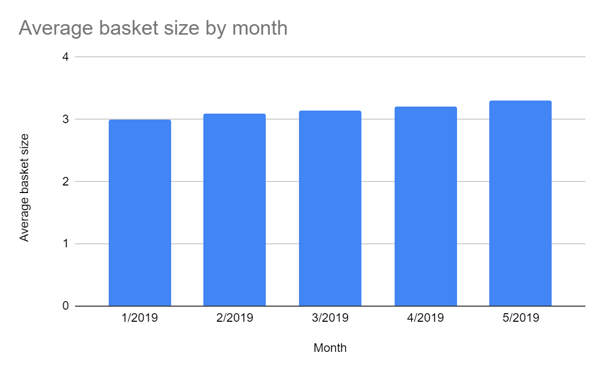
As this example goes to show, it's fairly easy to manipulate data visualizations to tell a story that doesn't really exist. But that's a sure way to lose your credibility with your stakeholders (who know something about data visualizations themselves). Make sure to use the correct axes and scales for your graph to tell an honest story. If a small change is meaningful, by all means, tell that story, but don't pretend it's bigger than it is by using visualization tricks.
Flat design
The best graphs and charts use a flat design. In other words, the design is as invisible as it can get—solid colors, no 3D effects, and little to no imagery. If you do want to use images in your graphs, make sure they're not distracting. Your graphs are there to tell a story. Distracting images draw the viewer's attention to your images, not to the story the data tells.
Using spreadsheet graphs
Thanks to the features built into modern spreadsheet applications, the work of visualizing your data has been made easy. You'll now learn how to use Google Sheets to create data visualizations. Google Sheets is a freely accessible tool (you only need a Google account) that is widely used by many companies. And similar tools, like Microsoft Excel, work in much the same way, making the skills transferable.
You'll learn more about using Sheets for data analysis in a later module. But for now, all you need to focus on is using it to create simple data visualizations. To start, watch the video below. Try to follow along to create simple visualizations in Google Sheets.
If you're new to Sheets (or spreadsheets in general), it's highly recommended that you spend some time now familiarizing yourself with the application's basic functionality, as PMs use spreadsheets on a daily basis. Google maintains comprehensive support documentation for Sheets, and there are plenty of other resources online, like this spreadsheet guide from Zapier and video tutorials on YouTube.
In addition, there are some best practices to keep in mind: carefully consider the best type of visualiztion, use proper labels for your rows and columns, and check that the units are correct (percentages, dollars, etc.). If you properly input and label your data, the built-in visualization tools will be able to quickly and effectively visualize it.
Assignment 06 ⭐
Time to visualize some data. First, find sample data in this spreadsheet. Make your own copy of the spreadsheet by clicking File → Make copy. Note that there are two tabs in the spreadsheet, each with a different data set.
Next, create data visualizations to represent:
- Total users per month
- Total users by region by month
- Percent of users by region by month
Finally, make use of your visualizations to answer the following questions:
- Which group of users is growing the fastest?
- Which group is growing the slowest or shrinking most?
- If these were your users, which group would you want to focus on, and why?
Make sure your visualizations are clearly visible (using a slide deck in presentation mode and sharing your screen is recommended). Be explicit about what you want viewers to see in each visualization and why it's important.
You'll be evaluated by the community using the following criteria:
- Choosing the right type of visualization for each type of data
- Creating clear, accurate visualization (such as using flat design, including useful labels)
- Using data visualizations to tell a compelling story about users
- Providing correct answers to the analysis questions defended by the data
Submission
Submit your links to your visualisations in a slide deck/notion page and share the public link in the slack channel #assignment-06