21.4 Visualizations 🎯
This section includes an Activity 🎯
Tableau is well-known not just for its ability to help you do data analysis, but also for its powers of data visualization. In the previous checkpoint, you connected to the Superstore dataset. Now, you'll be using that dataset to build out your first Tableau visualizations.
By the end of this checkpoint, you should be able to do the following:
- Create several types of visualizations using Tableau
Tableau vocabulary
Tableau has a unique vocabulary. It uses terms like pills, shelves, and dimensions. A typical workspace includes several arrangements of data with these Tableau concepts. This checkpoint will dissect the Tableau workspace below. What does each element do or mean? And what should you call them? Follow along with the numbers in the visual below to get a sense of each element:
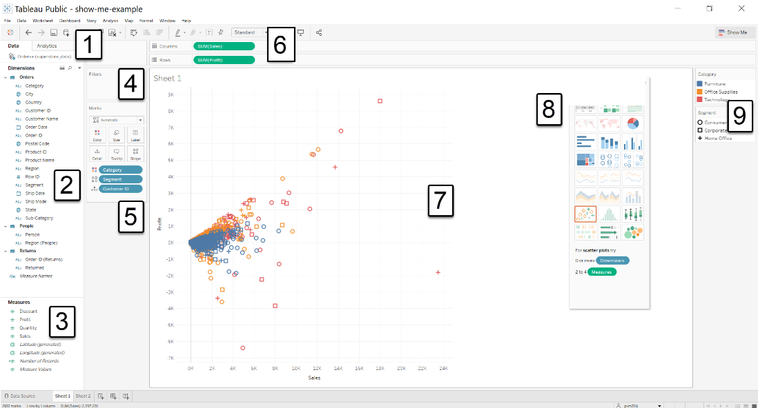
- Data sources: This shows all the data connections made for this workbook.
- Dimensions area: This lists all the fields in the data that are classified as dimensions (more about that below).
- Measures area: This lists all the fields in the data that are classified as measures (more about that below).
- Filters shelf: This will list any fields that you filter a view by.
- Marks card: This card has a series of buttons: Color, Size, Label, and so forth. You can drag a field to one of the buttons, and that will control how the field's data points are marked on the view.
- Rows and Columns shelves: Placing fields here will create rows or columns, respectively, on the view.
- Worksheet/view: This is the output of your work. It is the resulting visualization of your data setup.
- Show Me: This menu will recommend a visualization, and it will suggest a way to build it given the fields you are interested in. You'll use Show Me later in this module.
- Legend: Depending on the elements you've used in the Marks card, you'll see several legends appear here to illustrate how marks are encoded.
Tableau is a powerful, yet complicated, product. There are even more elements to explore, but you will stick with the basics for now. An understanding of these common terms in Tableau will help you make sense of how visualizations come together.
Opening your workbook
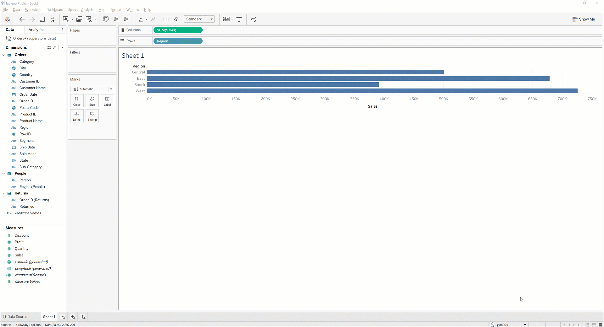
First, you'll need to open the workbook with your Superstore data. Start by opening a new Tableau Public session on the desktop app. From the initial screen, you should see the workbooks you uploaded to Tableau Public in the Open panel. Double-click on the icon for your Superstore workbook, and you'll be taken to the Sheet 1 tab of that workbook. This contains the throwaway visualization you initially created to give Tableau something to save:
Go ahead and zero out this visualization. To do that, click on the drop-down menu for Region in the Columns shelf. Then, select Remove. Do the same for the item in the Rows shelf:
On the Data pane in the side bar to the left of the sheet, you'll see the headers of your data columns. These are grouped into two sections: Dimensions and Measures. A dimension is a category that you can group by, like rows or columns. Dimensions are usually discrete values like a set of product categories or days of the week—there are a fixed number of potential values for a dimension.
A measure is a value that you can apply formulas to (like sums or averages) that is found at the intersection of a row and column. Most measures are continuous values—for example, they can be any number, and it's not possible to list every single possible value.
Rows and columns
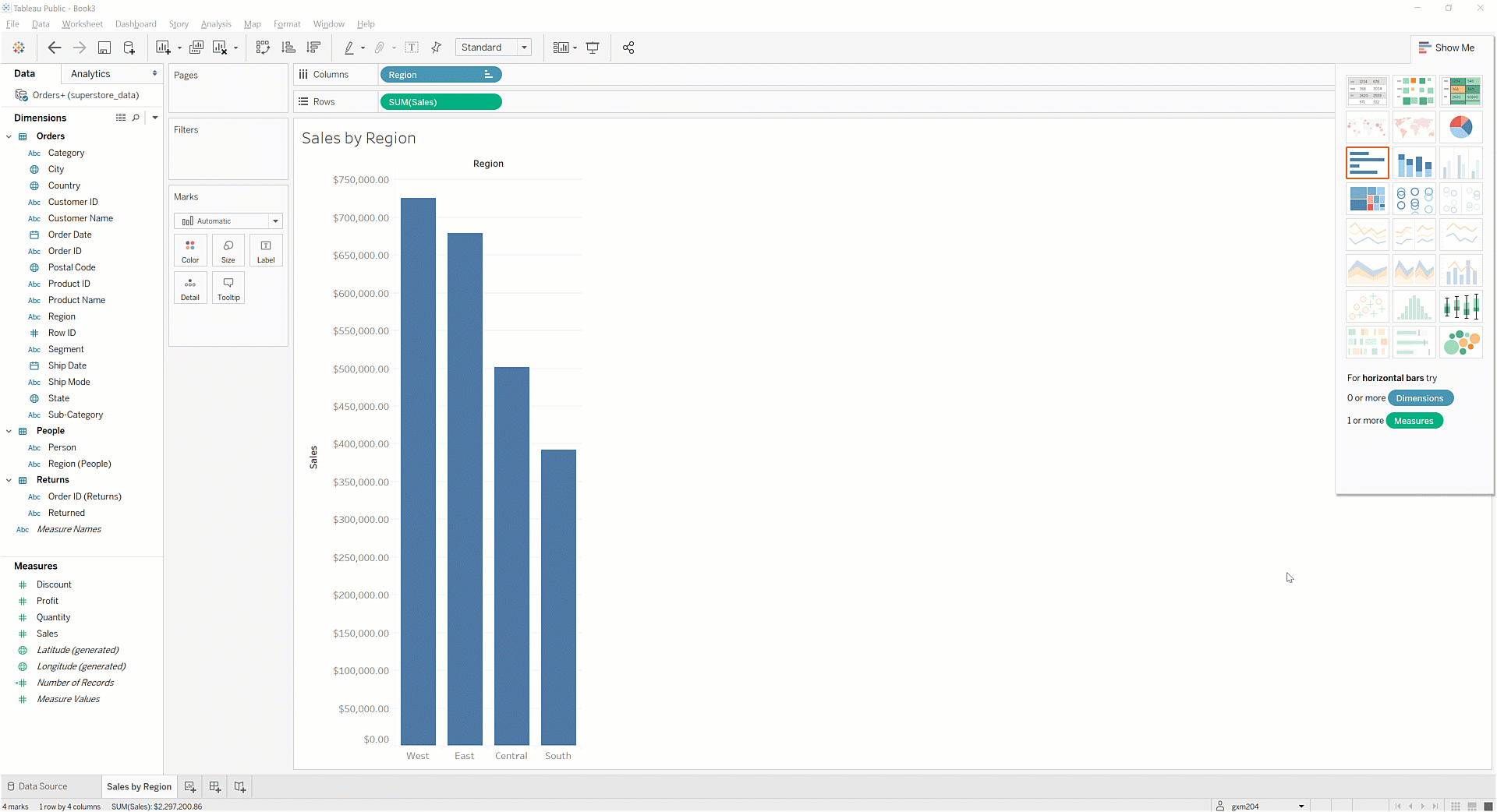
At the top of the page, right above the Sheet 1 title, you'll see a Rows shelf and a Columns shelf. As you've done before, drag Region to the Columns shelf. You will see the image below:
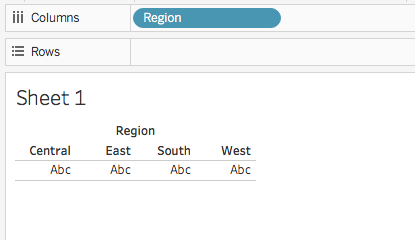
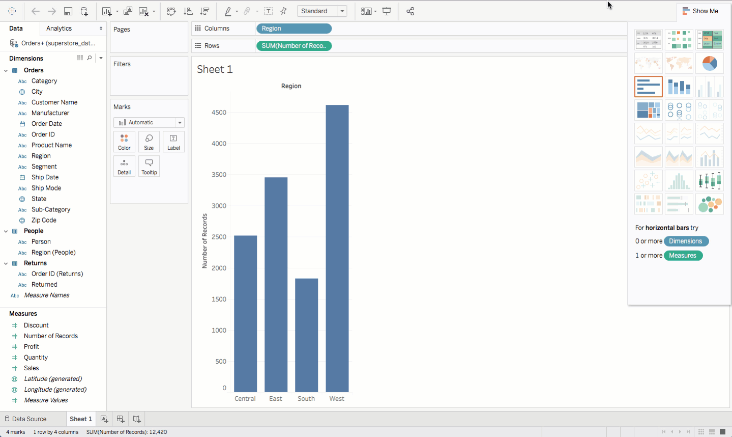
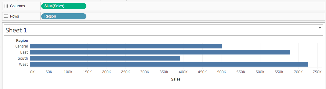
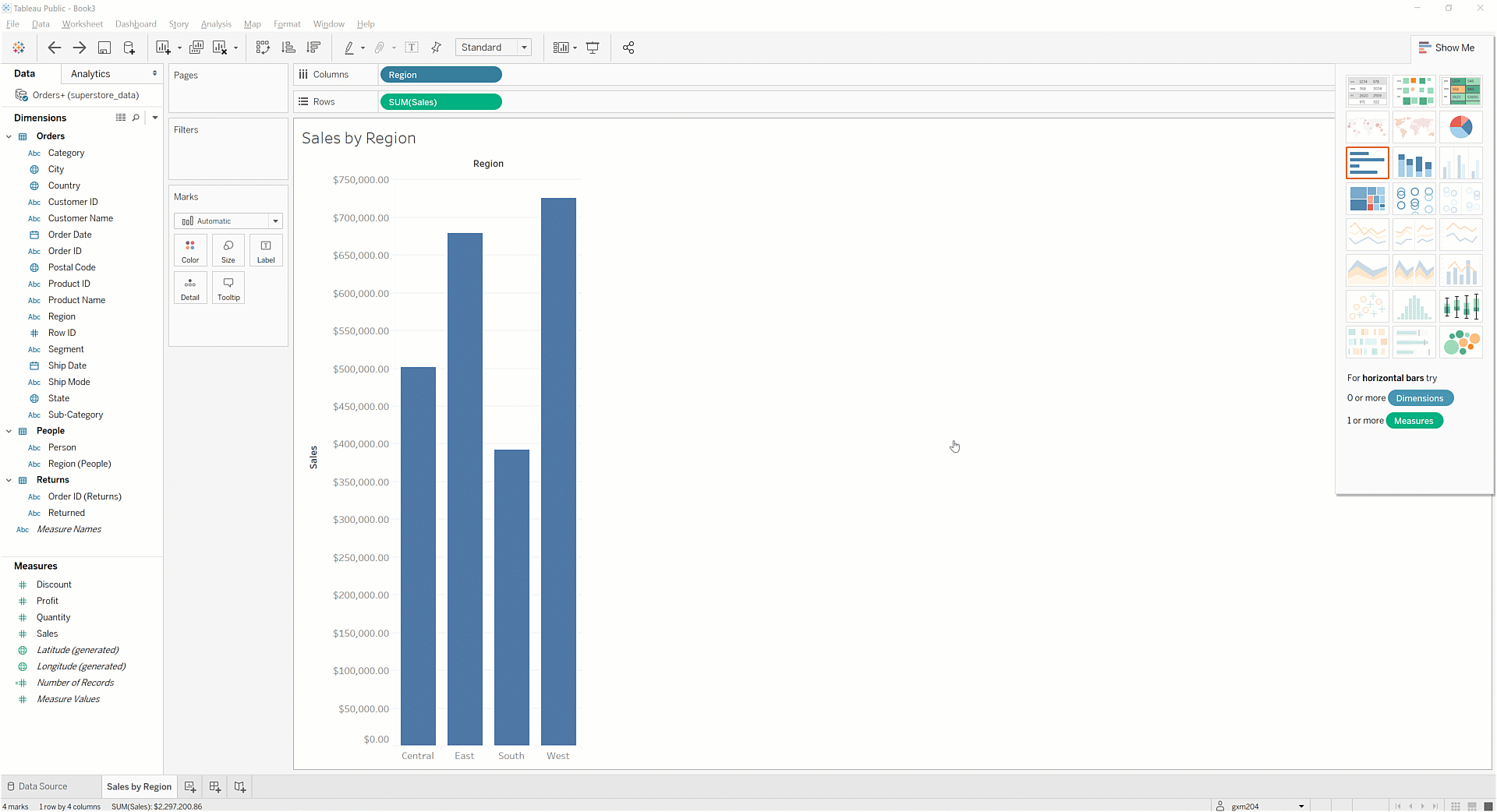
Tableau groups unique values in the variable Region into columns. Now, try dragging Region into the Rows shelf. You will see the image below:
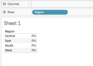
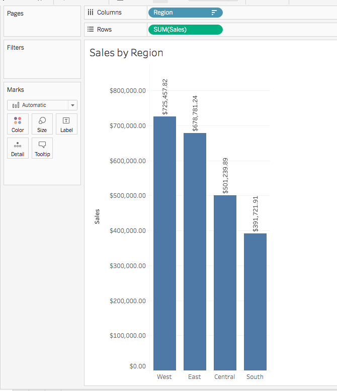
Tableau now groups unique values in the variable Region into rows. Leaving Region in the rows, drag Sales into the columns. This is your first deliberate visualization! Tableau knows to aggregate sales because it is a continuous measure. It creates a bar chart of sales by region. You should see something like the chart below:
Cleaning up the visualization
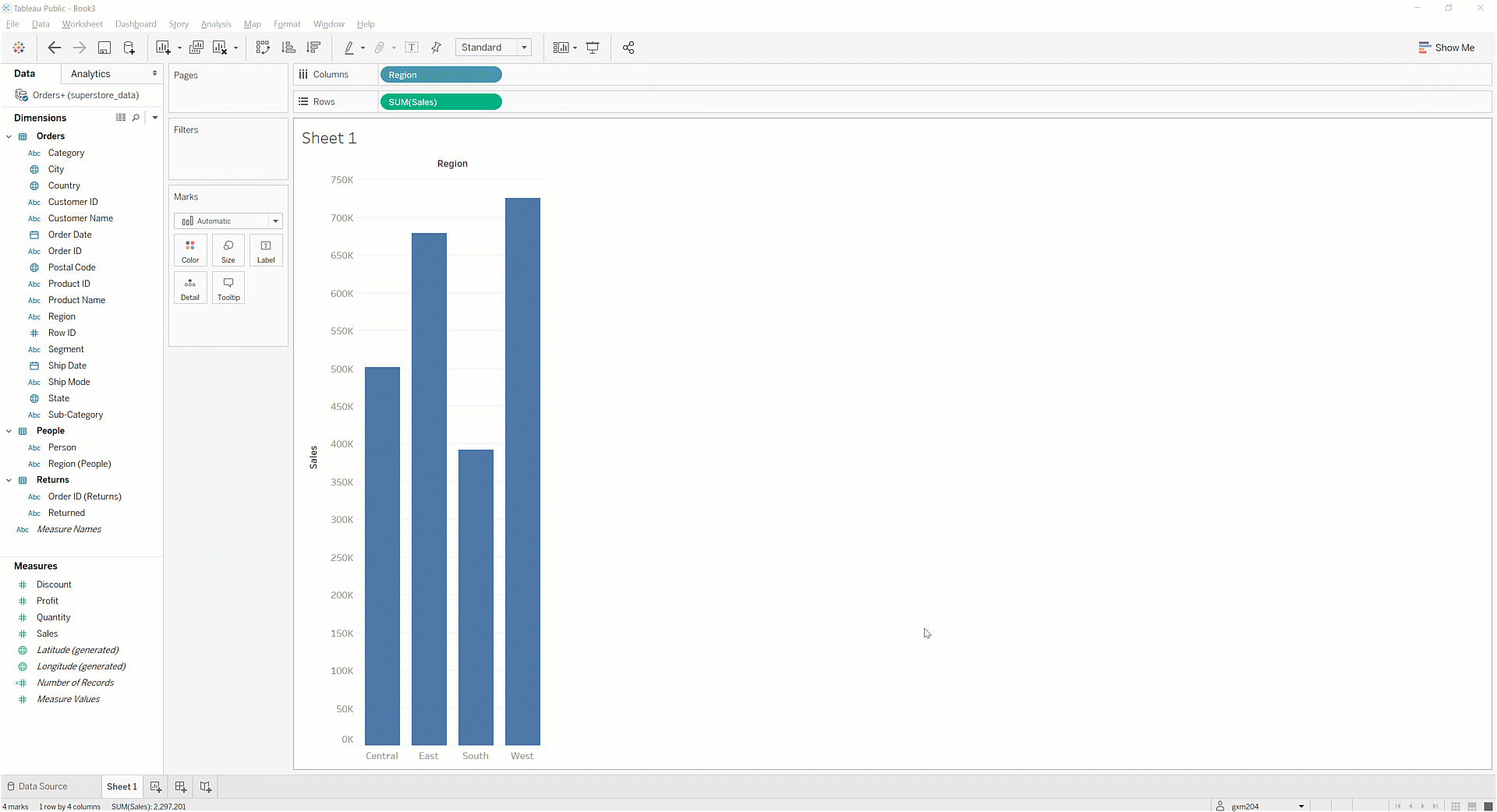
Now, you can do some cleanup. First, imagine that you want to switch the x-axis and y-axis so that the result is a column chart. To do that, find the Swap Rows and Columns button. This button can be found in the toolbar directly above the Columns shelf. By hitting this button, Tableau will swap the Rows and Columns shelves, as seen below:
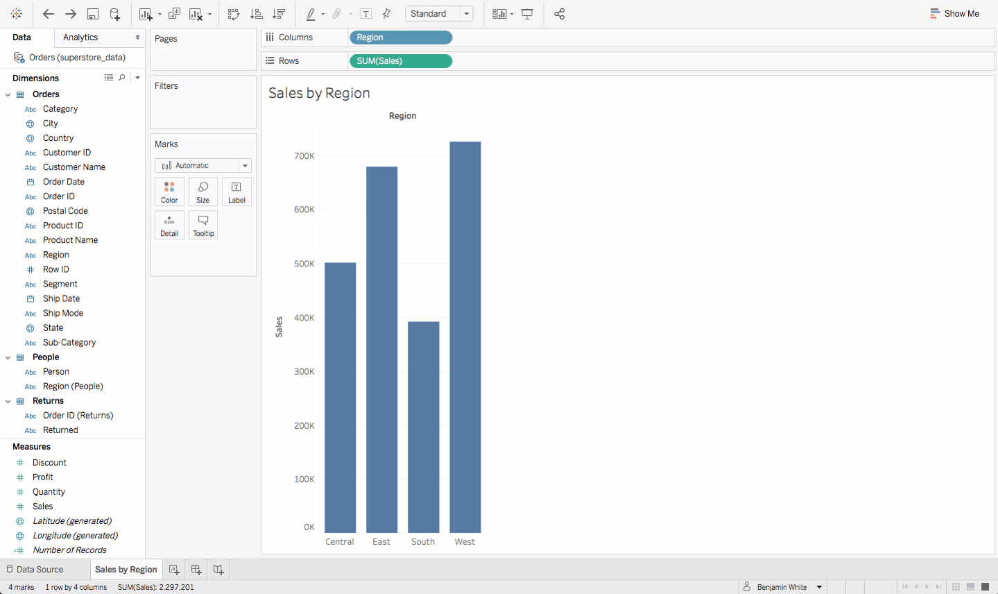
Now, add a title to your visualization. You can call it Sales by Region. Double-click on the current title, Sheet 1, and overwrite the title with Sales by Region:
Next, update the number formatting. The sales data represents dollar amounts, and you should display those numbers accordingly. To do that, find Sales in the Data pane in the side bar. Click the drop-down menu, and choose Default Properties > Number Format. Select Currency (Standard), and then click OK. The y-axis on the bar chart will update to display the numbers as currency.
Although you're not yet working with the profit data, go ahead and update the number format there as well. Follow the same steps as above to update the Profit measure.
Sorting
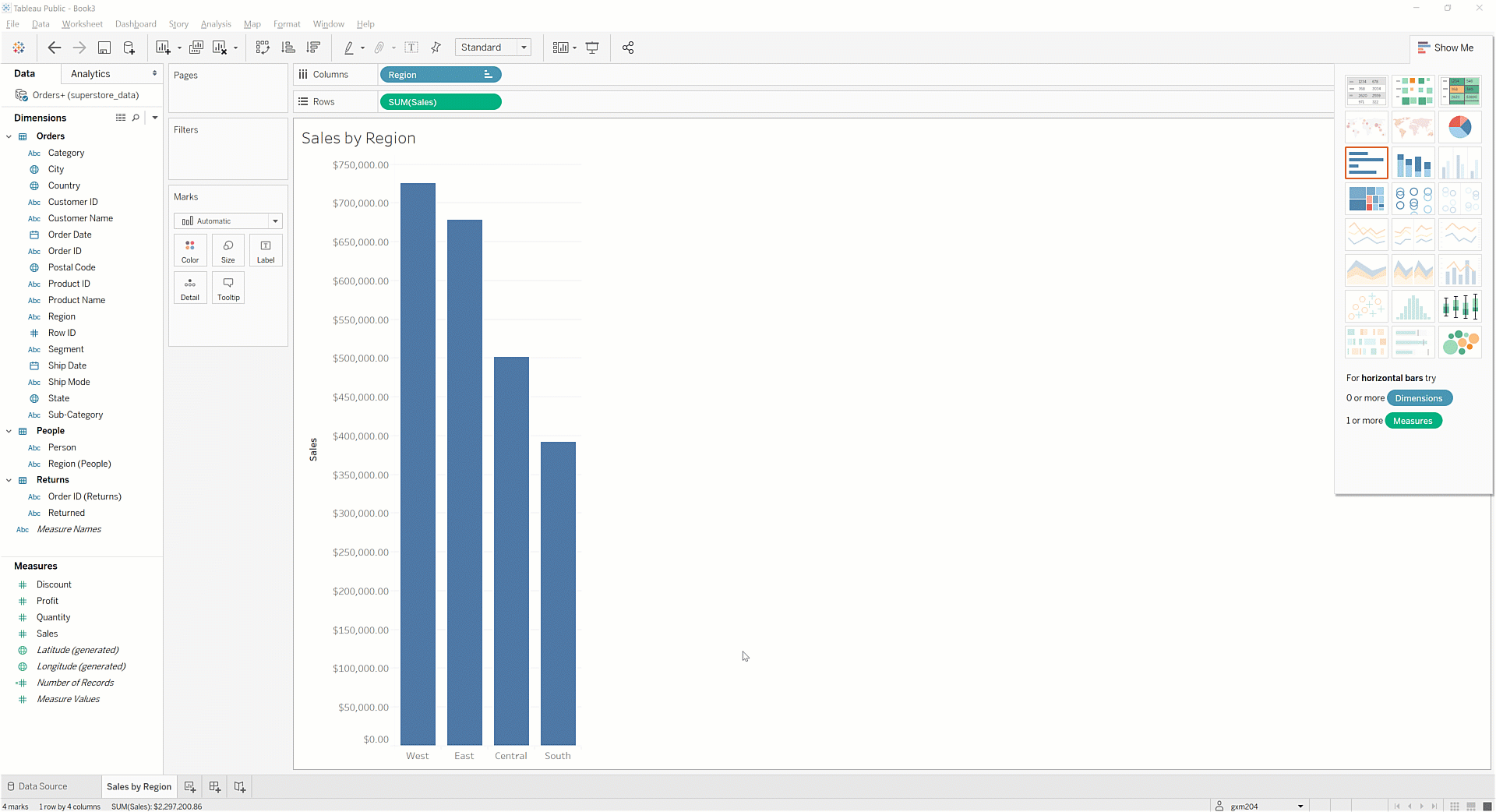
Right now the regions in your visualization are sorted by region name, which is not visually compelling. Sort the data in descending order by sales so that the top-selling region is on the far left. In the Rows shelf, right-click the Region field or click the arrow in the field. You will see the screen below:
Click Sort. Then, sort by field Sales, order Descending, and aggregation Sum, as shown below.
There is an easier way to do this. Click one of the two the Sort buttons on the toolbar:
Because the title already indicates that the bars represent regions, you can hide the header. Right-click the word Region above the bar chart. Then, select Hide Field Labels for Columns as seen below:
Finally, add data labels to your chart. On the Marks card, there is a button called Label. Press that button and check the box that says Show mark labels:
You should now have a chart that looks like the one below:
Huzzah! You've successfully created a visualization in Tableau! Continue reading to learn more about the types of visualizations you can create.
A tour of Tableau's chart types
Tableau lets you create various visualizations. Keep reading to learn more.
Bar charts, stacked bar charts, and side-by-side bar charts
First, make a copy of your Sales by Region sheet (the one you just created in the last section). To do this, right-click on the Sales by Region worksheet tab, and then select Duplicate. You should see a copy of the sheet, and it will be called Sales by Region (2).
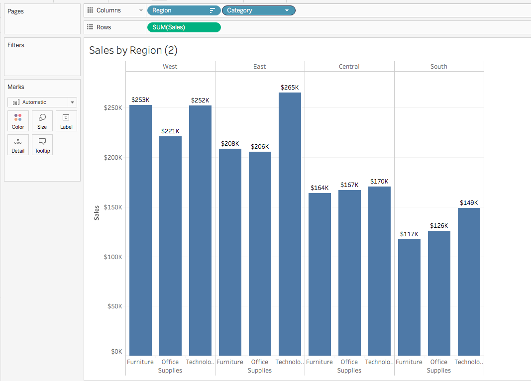
Next, you will add another layer of complexity to the visualization. Imagine that you want a stacked bar chart to show how much each category drove sales. Select Category from the Data pane. Then, drag it over to the Color button on the Marks card. You'll now see something like this:

Congrats! You now have a stacked bar chart that shows how each category affected sales relative to the other categories. That said, there's some bad news. The bars for the West and South regions aren't displaying any labels. And what's more, the labels for East and Central are hard to read, as they span across the colorful bar. And do you really need to be displaying cents?
You can fix this. To begin with, you need to understand why this is happening. You're not seeing labels for West and South because Tableau, by default, will not display overlapping labels. So one option for solving this would be to take the following approach. First, click on Labels in the Marks card. Then, in the Options section, check Allow labels to overlap other marks. Try this, and you'll get a sense of why Tableau stops this behavior by default:

Yes, you have labels for each stacked bar, but the overlap between them makes them unreadable. You'll need to figure out another way to get readable labels. Go back to the Labels interface, and unselect the option for overlapping marks.
Take another approach instead. First, reconsider your number formatting for Sales. Click the drop-down menu for Sales in the Data pane, and then click Default Properties > Number Format. Update the formatting type to Currency (Custom). Then, change Decimal places to 0 and Display Units to Thousands (K). Click OK.
The chart will instantly update. Voila! It's now much easier to read. There are no overlapping labels, and the y-axis values have updated. Overall, this chart is clearer and cleaner:

But there's another way you could improve this chart: by changing it from a stacked bar chart to a side-by-side bar chart. One issue with the stacked bar chart is that the reader's eye has to move between the bars themselves to the legend on the top right to understand which sales category they're looking at. With a side-by-side bar chart, you can avoid this.
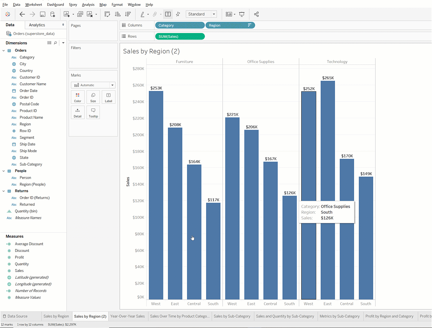
To change the chart to a side-by-side chart, move Category from the Marks card. Drag it to the Columns shelf, to the right of Region. You can now easily compare how each category is doing for each region, as shown below:
Alternatively, you can drag Category to the left of Region, which reverses the order. This will allow you to compare regions to one another within a certain category, like this:

So, which one is better? The answer to that is it depends. To pick the best option, you should ask yourself this question: What is my end user trying to understand or do?
Say you're preparing this chart for a discussion that is focused on comparing sales by region. The goal is to identify strategies for improving performance in the South. In this case, you might want to choose the first option, in which Region comes before Category in the Columns shelf. This arrangement makes it easier and more intuitive for the reader to visually compare performance by region. On the other hand, if the conversation is going to be focused on sales categories, the second option might be better.
Next, give your chart a more descriptive name. Right-click on the Sales by Region (2) worksheet tab, and then update the name to Sales by Category and Region. This should also update the chart title.
If your chart title does not change when you rename the worksheet tab, double-click on the chart title and confirm that the title is set to <SheetName>.
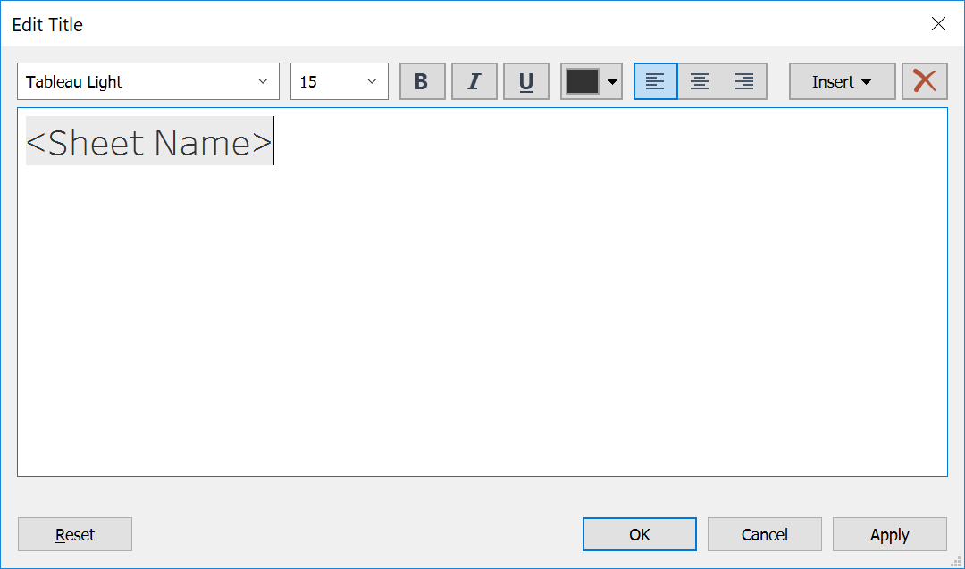
If it is not set this way, then the chart title will not rename based on changes to the worksheet name. You can "reconnect" the two titles by typing over what's in the title field currently with <SheetName>.
Now, take a moment to save your workbook. In general, you'll want to save regularly as you work on a Tableau project to ensure you don’t lose work. To do this, you can click the Save icon in the toolbar that you can see directly above the Analytics tab in the visualization above (it's the one that looks like a floppy disk). Or, from the menu bar, you can select File > Save to Tableau Public. Note that this will save your workbook under the name it's currently saved as. If you want to save it as a distinct, separate workbook, you should do File > Save to Tableau Public As and choose a new name.
Line charts
As you might recall, line charts can be used to show trends over time. For example, if you wanted to view year-over-year sales, a line chart would be a good choice. To make a line chart, you should first add a new sheet by clicking the New Worksheet button. This button, which looks like the image below, is to the right of the Sales by Category and Region tab.
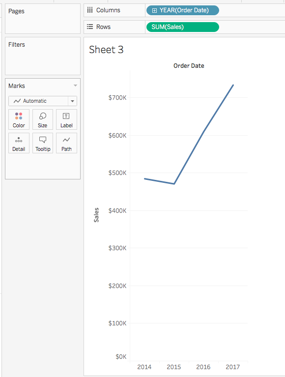
To create the chart, first drag Order Date to the Columns shelf. You'll see that Tableau automatically groups the data by year. Drag Sales to the Rows shelf. You should see something like this:
Changing date intervals
Data can look different depending on the timeframe. For example, data measured monthly might look very different from data measured annually. This is especially true for a retail store like Superstore. Viewing by month might be helpful, even if it means you lose the concision of an annual number.
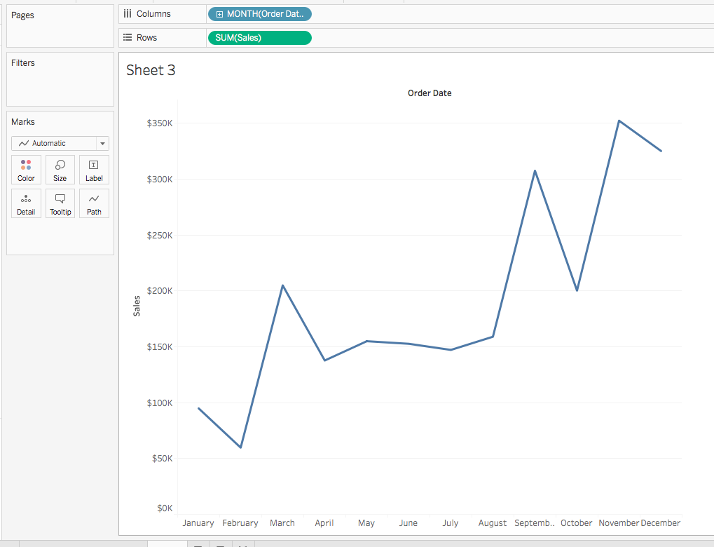
This chart gives you sales by year. But suppose you want to easily compare year-over-year results by month. Change the date type to month by clicking the Order Date field in the Columns shelf. Select the Month option. Notice that there are two month options: May and May 2015:

For now, select the first one: May. You'll see that year is no longer in the chart. The sales are being aggregated across all years by month:
Next, create distinct lines for each year. To do that, drag Order Date from the Data pane to the Color button in the Marks card. Now, you can see all four years in the chart and compare monthly sales by year. Your chart should look like the image below:
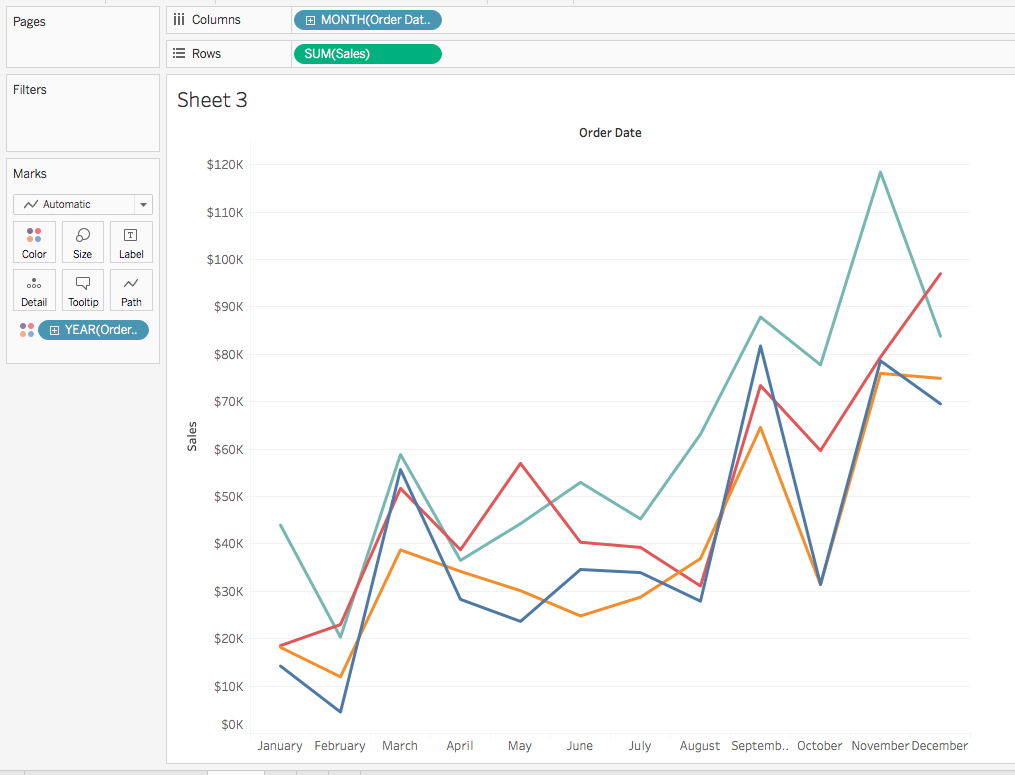
Rename your sheet to Year-Over-Year Sales. Hide the Order Date label at the top of the chart because it's self-evident. To do so, right-click on the label. Then click Hide Field Labels for Columns. Before moving on, take a moment to save your work again.
Show me!
Want a faster way to see visualizations? You can use Tableau's Show Me feature at the top right corner. Start a new worksheet to demonstrate this. Select the fields Sales and Sub-Category by pressing and holding command (on a Mac) or control (on a PC), and then click both fields. When you click on Show Me at the top, you'll see the menu shown in the image below. It has a horizontal bar chart selected by default:
Notice how Tableau grays out the chart types that it thinks are a bad match for the data points you've selected. The non-grayed out ones are recommended for your selection. This can be a very useful feature if you know what data you want to visualize but don't know the best way to show it. Just be careful to choose an appropriate visualization—some of them, like area visualizations or treemaps, can be very difficult for viewers to comprehend.
In this example, you would select the treemap in the fourth row down and first column. Tableau will automatically shade this from the Sales variable, so you'll need to manually place Category on the Colors instead. You'll explore the Show Me feature in more detail later in this section.
Go ahead and close out of this demo sheet. Before moving on, rename this worksheet to Sales by Subcategory and save again.
Scatter plots
Suppose you want to visualize multiple metrics instead of just sales. Specifically, you want to take a look at the subcategories that have the highest sales as well as the highest quantity sold. How can you do this? By using a scatter plot.
Start by creating a new worksheet. Then, drag Sales to Rows and drag Quantity to Columns. This will give you a single mark: the sum of the total sales and the sum of the quantity. However, this doesn't answer your question: Which subcategories have the highest sales and volume? Drag Sub-Category to Detail in the Marks card. With this, the chart will update with 17 marks, one for each subcategory.
Next, add some labels and color. Drag Category to Color in the Marks card, and drag Sub-Category to Label. When you're done, your chart should look like this:

Update the worksheet name to Sales and Quantity by Sub-Category and save your work.
Text tables
There will be occasions in which you'll want to see a table of summarized data. Next, you'll explore how you can look at all the metrics by category and subcategory. Create a new worksheet. Then, drag Category to Rows. Drag Sub-Category to the right of Category. You'll see a nested table, like the one below:

At the bottom of the Data pane, there's a line in italics called Measure Values. Drag Measure Values to the Columns shelf. You'll see that it automatically populates as a horizontal bar chart. To fix this, go to the Show Me section and click on the Table option, which is the first option on the top-left corner. You'll now have a table that looks something like this:
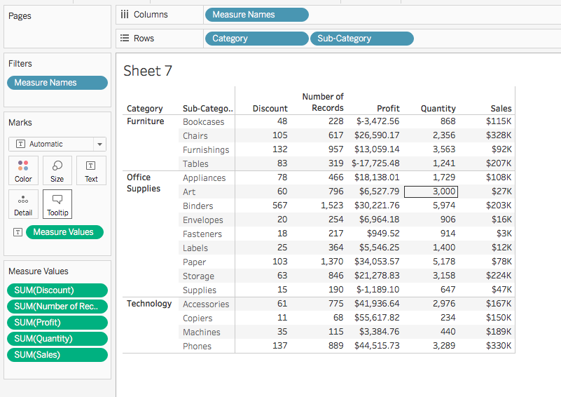
You'll see that Measure Values captures every measure available that is unhidden in the measures section. If you didn’t want to include a certain measure, you could drag it off the Measure Values shelf. Rename your worksheet Metrics by Subcategory and save your work before moving on.
Show me (more)
As you saw earlier, the Show Me feature looks at the combination of measures and dimensions you've selected and recommends chart types based on your data. Show Me contains 24 chart types. The most recent additions are the dual-axis combination time series chart and the box-and-whisker plot.
At the bottom of the Show Me menu, there are descriptions of the data elements required for the chart. As you hover over other chart types, these descriptions change. Next, you'll learn more about all the chart types facilitated by Show Me.
Other visualizations
There are several other visualizations that you'll use throughout future checkpoints. They're described below.
Heat maps
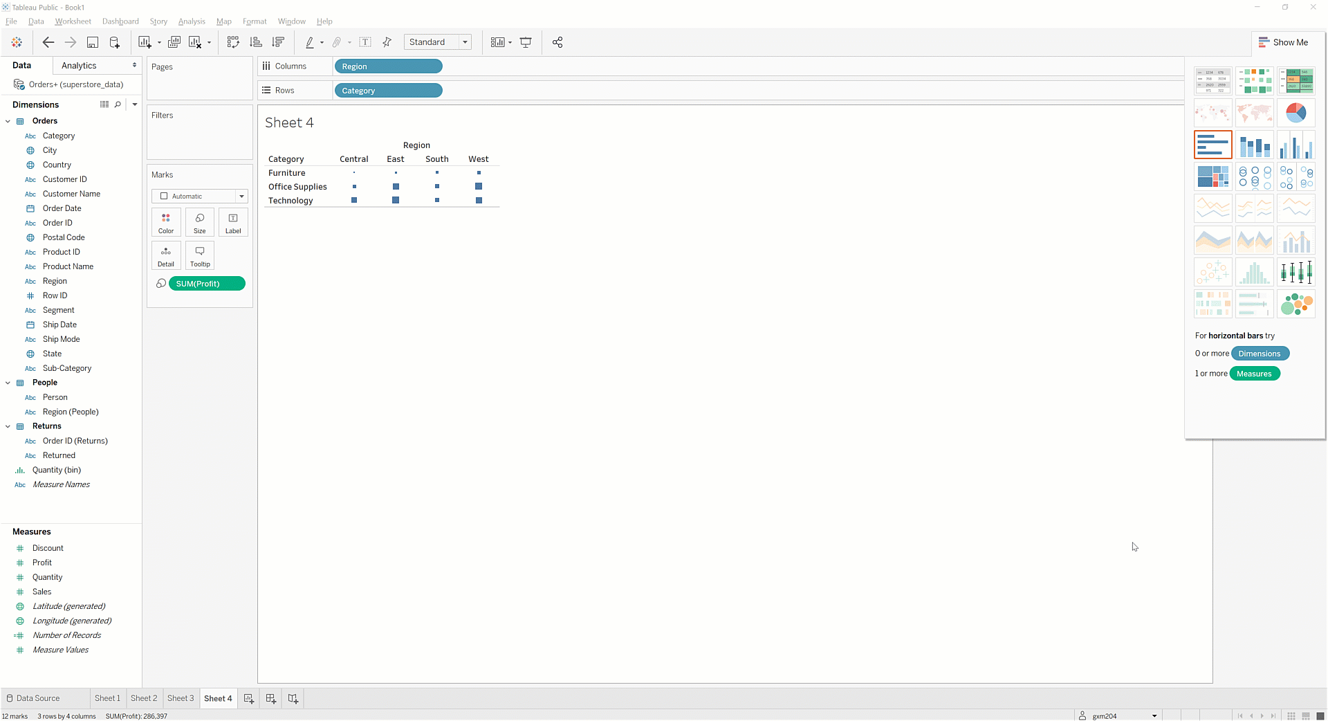
Heat maps show the dimensions that are high and low on a scale for a certain measure. For example, you can use a heat map to quickly identify the regions and categories that have the highest profit. The heat map uses the Size mark to show which dimensions are high and which are low in a measure.
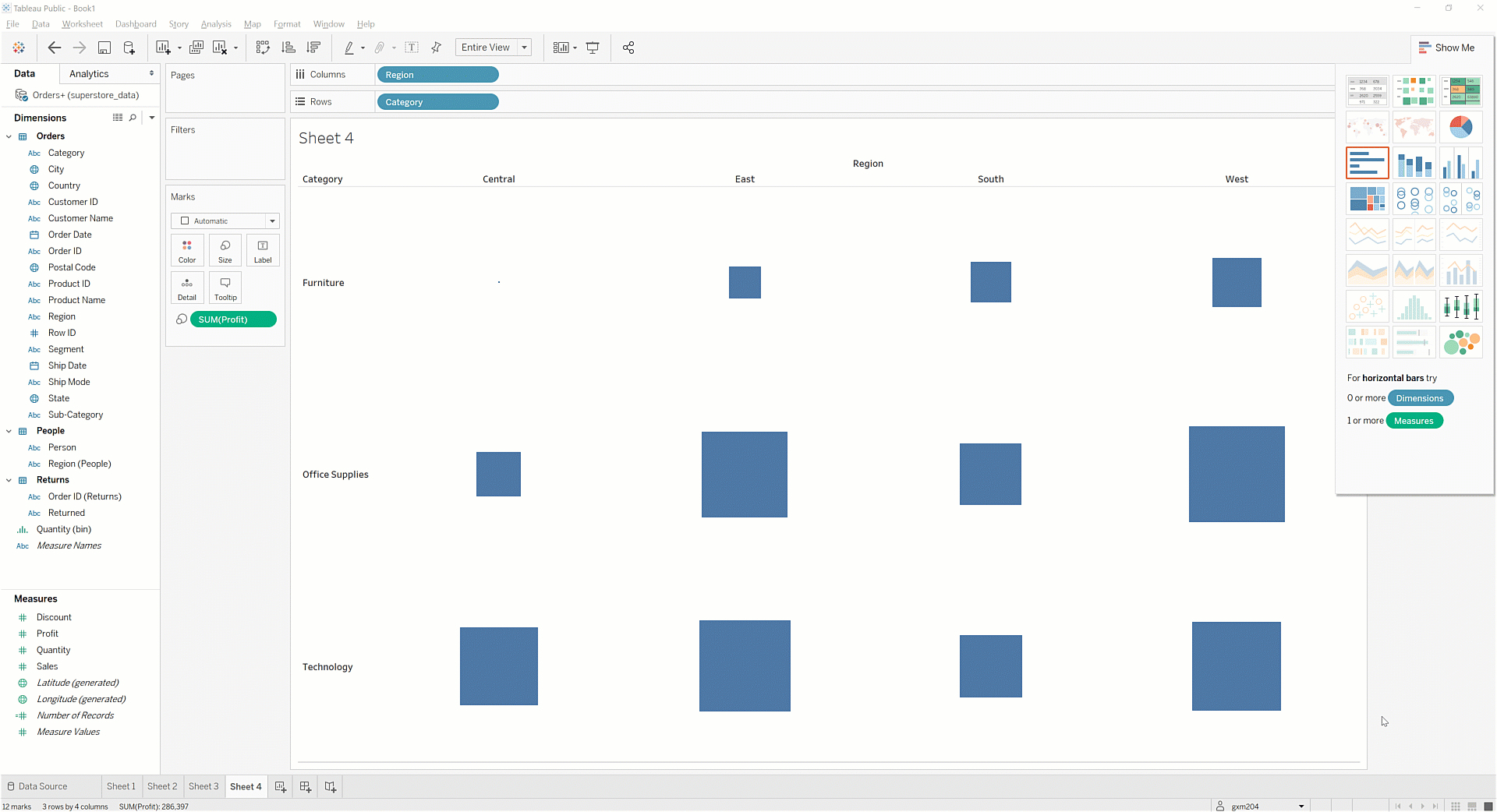
Try it out. First, create a new worksheet. Then, drag Region to Columns, Category to Rows. Add Profit to Size, which is in the Marks card. Next, in the toolbar, switch the Fit drop-down menu from Standard to Entire View. This will expand the visualization to fit the window and make it easier to read.
Heat maps are meant to use color to illustrate relative intensity. So, you should add some color to this chart! One great feature of Tableau is its ability to use the same measure easily across multiple marks. Leave the SUM(PROFIT) size mark where it is. Now, drag the Profit measure to Color.
Rename your sheet Profit by Region and Category. Save your work before moving on.
Highlight tables
Sometimes, you'll want to see your data in a table form, but you'll want to shade the table based on a dimension. One quick way to do this is to make a highlight table. You can try it out! Create a new worksheet, and drag Sub-Category to Rows. Then, drag Profit first to Color and then to Label. Finally, change the Marks card's drop-down menu, change the setting from Automatic to Square.
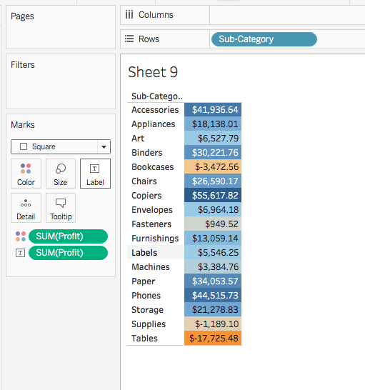
Rename this sheet Profit by Subcategory, and save your workbook.
Histograms
Histograms are used to display distributions of a single measure over a binned range of values. In other words, they provide insight into the number of values contained within a specific range of values. Tableau also makes it easy to parameterize these value ranges so that you can alter the size of the bins. You'll learn how to create parameters in a future checkpoint.
Next, put this into action. First, try to understand the distribution of item counts for orders. Create a new worksheet. Drag Quantity to the Columns shelf. Then, click Show Me and select the Histogram icon. You should see something like this:
How do you read this chart? The leftmost bar tells you that there are a little more than 1,000 orders that have only a single item. The second bar tells you that there are around 6,000 orders that have two or three items. The third bar tells you that there are around 3,000 orders that have four or five items. And the chart continues with the rest of the data.
You could make this histogram easier to interpret by changing the width of each bin to a whole number. For example, you know that a sales quantity of 1.66 does not make sense. But unfortunately, Tableau doesn't know this. Rather than using this as the bin separator, you can change it to widths of 1. To do that, click on the new calculated measure, Quantity(bin), and select Edit from the drop-down menu. You can now resize the bin interval to 1:
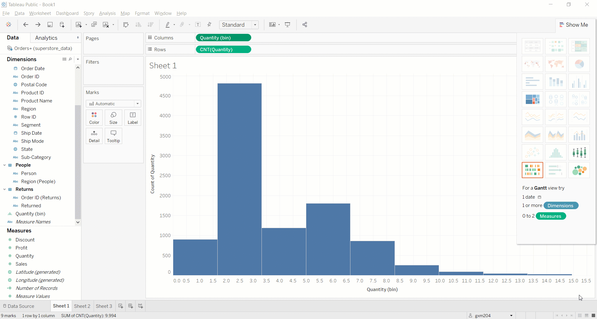
Last but not least, you can clean up the x-axis. You also want this axis to be displayed in whole numbers, rather than with decimals. To do this, click on the axis and then right-click. Select Format from the menu, and a Format Quantity (bin) menu will appear on the left. Select Number (Custom) from the Numbers drop-down menu. Format the axis to 0 decimal places:
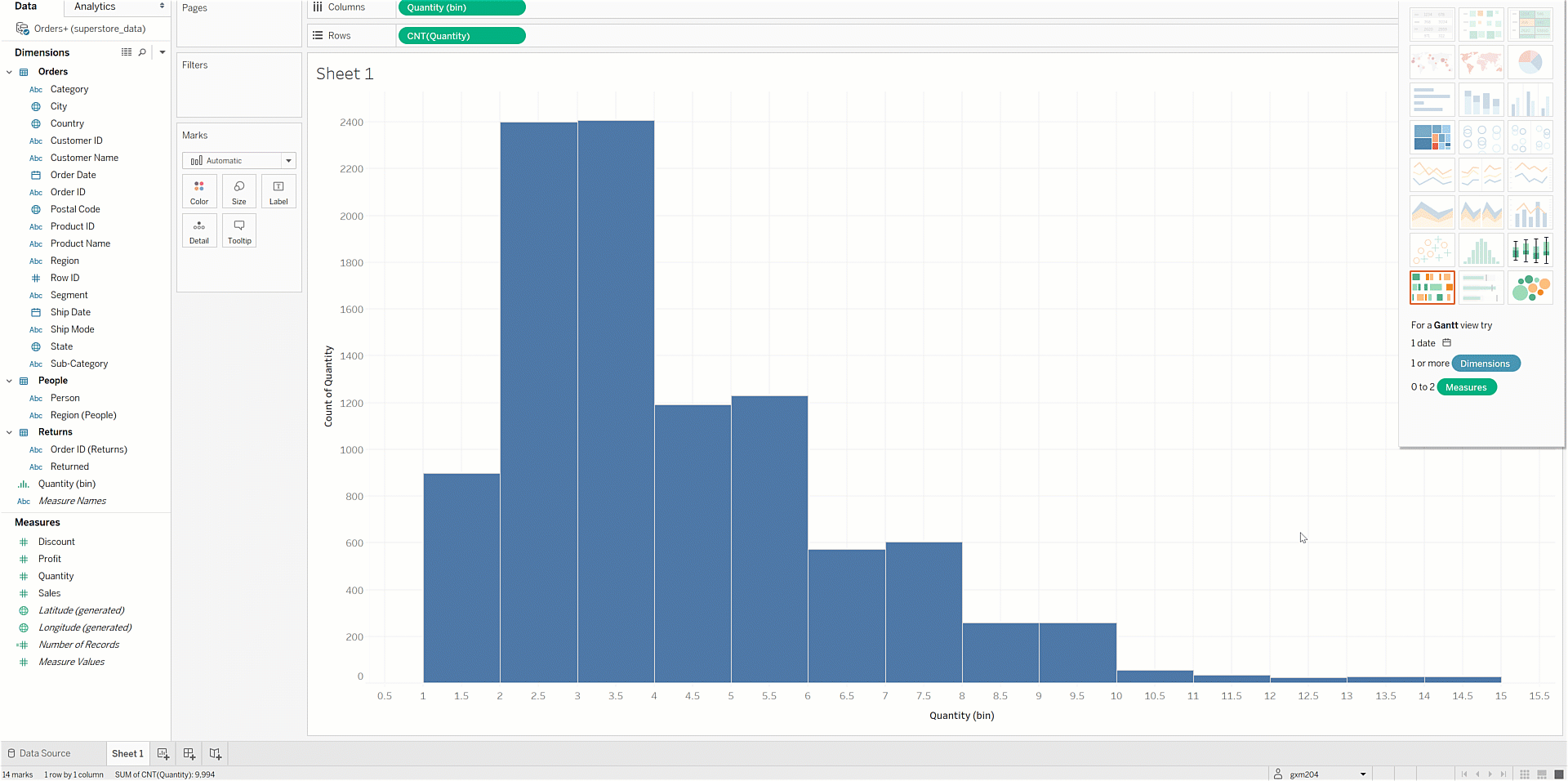
Name this worksheet and chart Distribution of Order Item Counts. Save your work.
And there's more!
This checkpoint covered many, but not all, of the charts you can create in Tableau. For example, you didn't practice box-and-whisker plots, Gantt charts, bullet graphs, or bubble charts, all of which can be useful in certain contexts. That being said, you are now familiar with the most commonly used, and most intuitive, chart types. At this point, you're well equipped to tell stories with visual data using Tableau.
Activity 🎯
Practice creating the new charts you learned about in this checkpoint. To do this, you'll use the World Indicators workbook you created in the previous checkpoint.
Before moving forward, open that workbook in the Tableau Public desktop app. Then, save a new version by taking your current name and appending "first visualizations." For example, you might save it as PMcademy | World Indicators | first visualizations.
Remove the sample chart from the workbook. (Remember, you only created that to have something to save.) Then, create the charts as described in the prompts below. You should end up with a single notebook that contains five worksheets, with each worksheet displaying a single chart. When you've completed your workbook, save your finished version. Share a link to the workbook at the bottom of this checkpoint.
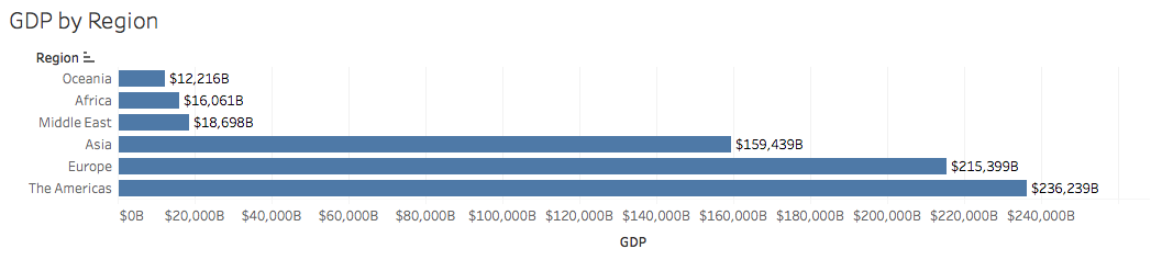
GDP by region bar chart
Create a horizontal bar chart that does the following:
- Shows the GDP for each region in the dataset
- Has labels for each bar, with each label formatted as currency ($), displaying billions as the display unit
- Is sorted by GDP value, in ascending order
Your final chart should look like this.
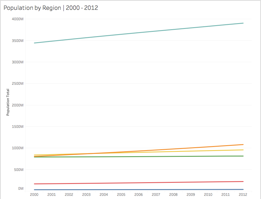
Population total by region line chart
Create a line chart that shows the population of each region for each year in the dataset. Each region should have a separate line. Your chart should look like the one below, but note that the line colors might differ:
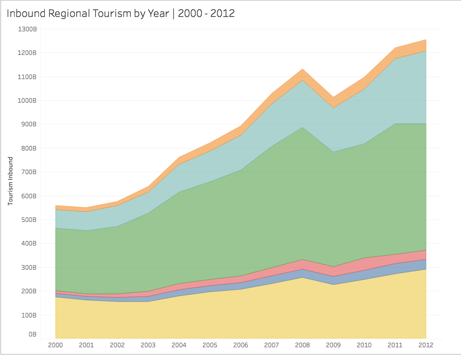
Inbound regional tourism by year area chart
Create an area chart that displays inbound tourism for each region for each year in the dataset. Your chart should look like the one below, though the colors might differ:
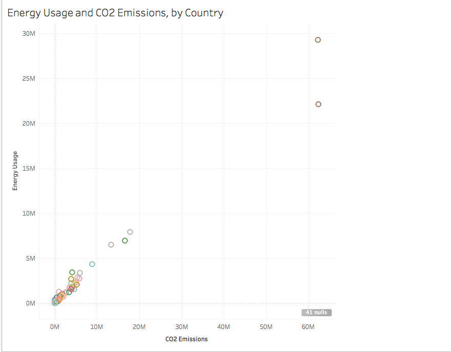
Energy usage and CO2 emissions by country scatterplot
Create a scatterplot that plots energy usage on the y-axis and C02 emissions on the x-axis for each country in the dataset. Your chart should look like the image below, though the colors might differ:
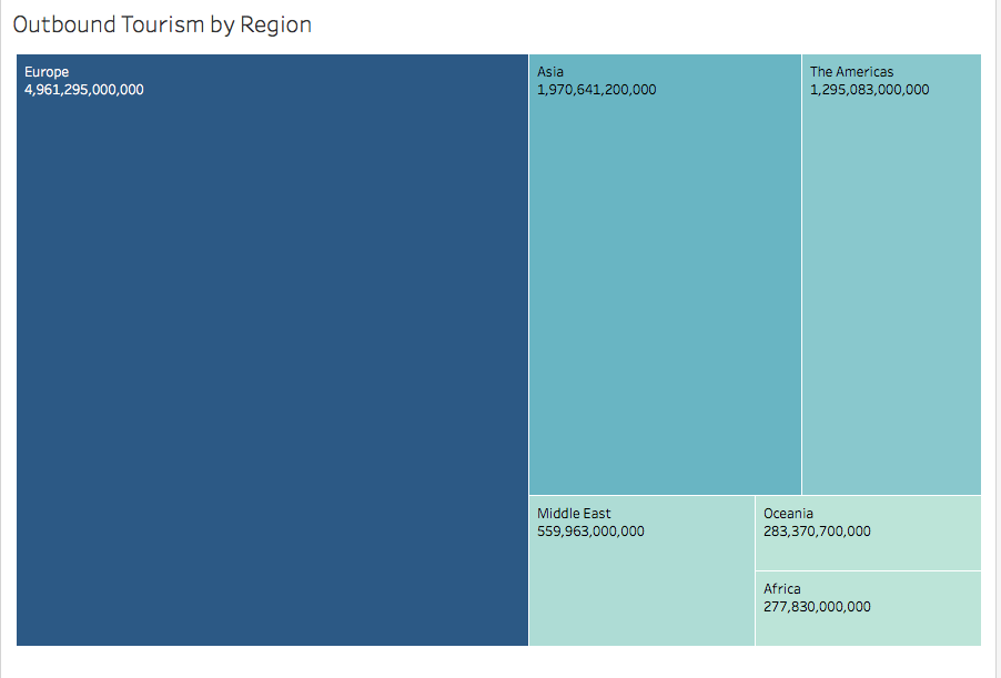
Outbound tourism treemap
Create a treemap that displays outbound tourism data by region and contains labels for each region. Your chart should look like the one below:
After you've submitted a link to your workbook below, feel free to take a look at this workbook, which contains the answers. Check your work to ensure that you are grasping this content and making progress on learning how to use Tableau.