21.6 Storytelling
One of the main advantages of knowing Tableau as a product manager is that you can use your ability to analyze and visualize data to tell your stakeholders insightful stories.
According to Tableau, a story is "a sequence of visualizations that work together to convey information." Tableau suggests that you use visualizations to create a data narrative, which is a tool for storytelling with data. It sits somewhere between a presentation deck and a document. The story is the third and last worksheet type in Tableau.
A story consists of an ordered sequence of visualizations and/or dashboards, and it can include additional text comments and captions. Whereas a dashboard provides an at-a-glance, big-picture view, a story can operate more like a guided tour of key data insights and relationships. This is a great tool to help product managers tell a data-driven story explaining product decisions and priorities to company leadership and collaborators.
By the end of this checkpoint, you should be able to do the following:
- Create a story in Tableau to share data insights

From a dashboard to a story
Below are a few potential stories. At the moment, they're phrased as questions.
- Should Superstore reorient its product assortment? Superstore operates in three categories. Is each category pulling its weight in profitability? For instance, furniture seems to have healthy sales, but it's a much lower source of profit than other categories.
- What makes the Central region so unprofitable? The Central region seems to be struggling. What's that about? Is there anything we can do to bring this region up to parity with other regions?
- Is there anything we could do to grow the South's sales? The South appears to be a strong performer in all the metrics, but on a smaller scale than the other regions. What can we do to solve that?
To explore each of these business questions, you'll build out specific visualizations. Then, you'll combine them into a story.
Clearing your workspace and adding a story
To clear things out a bit, hide a few of your worksheets by right-clicking on them and selecting Hide. You can hide multiple worksheets by holding down Control (on Windows) or Command (on Mac) while clicking individual worksheets. You then right-click and select Hide. Go ahead and hide all of the worksheets except for our dashboard.
Next, insert a story using the New Story button seen in the screenshot below.

After you hit the New Story button, you can choose a size for your story in the Size area in the lower-left corner of the screen. There are predefined sizes you can select, or you can create a custom size in pixels.
The title of the sheet name is also the title of your story. You can change it by right-clicking the sheet tab and selecting Rename Sheet. If you're using Tableau Desktop, you can also rename a story by double-clicking the title.
To provide support for your story, you will first build your individual views on worksheets. Then, you'll use them to populate the story.
Exercise: Take a moment to consider the business questions described above. Which visualizations will help you explore these questions? Jot down a few ideas before you continue reading—this is great practice for the kind of work you'll do as a product manager!
Visualizations for business questions
Next, read and follow along in Tableau to create visualizations for each of the business questions discussed at the beginning of this checkpoint.
Is Superstore as profitable as it should be?
For the question "Should Superstore reorient its product assortment?," you can use a simple stacked bar chart to compare sales and profits by category over time.
To do this, follow these steps:
- Create a new worksheet, and call it Product Line.
- Drag Order Date to the Columns shelf.
- Drag Profit and then Sales to the Rows shelf.
- Drag Category to Color in the Marks card.
- Finally, change the default chart time from automatic to bar.

You can gather some insights from this visualization. It appears as though furniture is maintaining a consistent, and growing, share of the business. But its profits are shrinking at best. Should the company even want to keep making furniture if it's not driving profit? That's a worthwhile talking point for your story!
What is going wrong with Central's profit?
In the case of this question, you want to drill down precisely into the data. To identify exactly where the losses are coming from, use a heat map (which you learned about in a previous checkpoint). Use the filter to get just orders from 2016 and 2017 in the Central region.
Follow these steps:
- Create a new worksheet called Central Profits.
- Create a filter to limit data to the Central region.
- Create a filter to limit data to the years 2016 and 2017.
- Drag Order Date to the Columns shelf. Change the display format to quarter + year by clicking on the dropdown for Order Date in the Columns shelf. Then, select the correct option. Also, make sure that Discrete is selected and not Continuous in the same dropdown menu.
- Drag Category and then Sub-Category to the Rows shelf.
- Change the chart type in the Marks card from Automatic to Square.
- Drag Profit to Color in the Marks card.
- Drag Profit to Label in the Marks card. Click the dropdown menu for Profit in the Marks card. Change the number formatting to display currency with zero decimal places and negative numbers to the automatic setting.
- By default, Tableau's heat map includes a lot of color, so you can tone it down a bit. Click on Color. Select Edit Colors > Red-Black-White diverging.
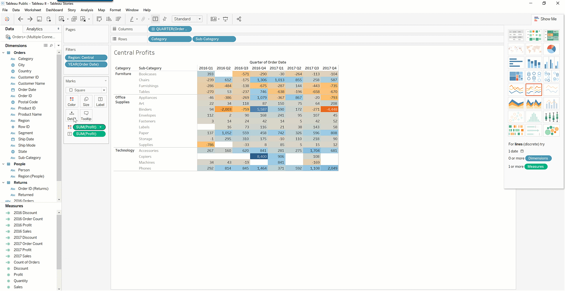
Now you'll want to add a subtotal to help identify the contribution of each subcategory to total losses.
Follow these steps:
- Click on the Analytics tab, which is next to the Data tab.
- Click and drag Totals to the worksheet, then drop it on Subtotals.
- Click and drag Totals to the worksheet, then drop it on Column grand total.
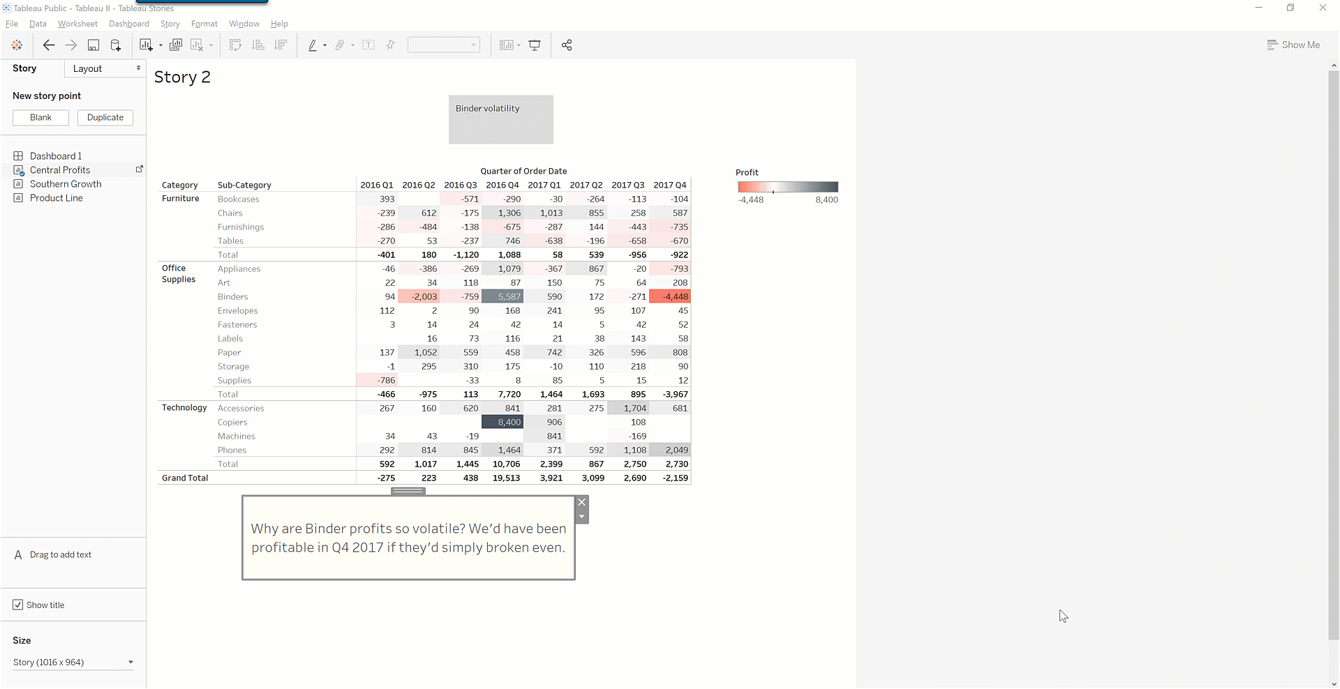
Your chart should now look something like this:
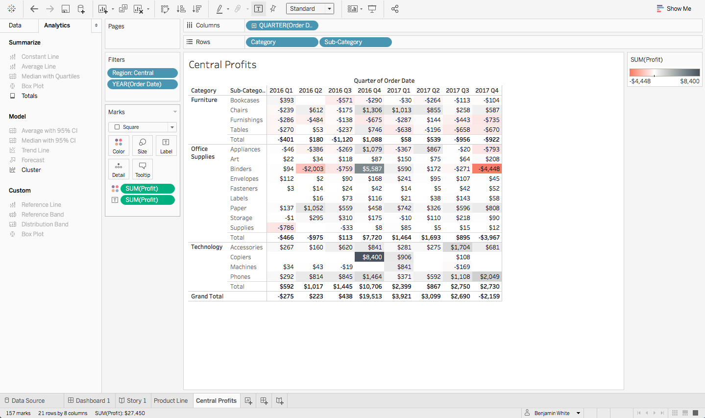
Here, you can see that binder profit is extremely volatile. In the most recent quarter, the loss was enough to drive the entire Central region into the red. Is there anything the company can do to end this volatility? You can make a story out of it to find out!
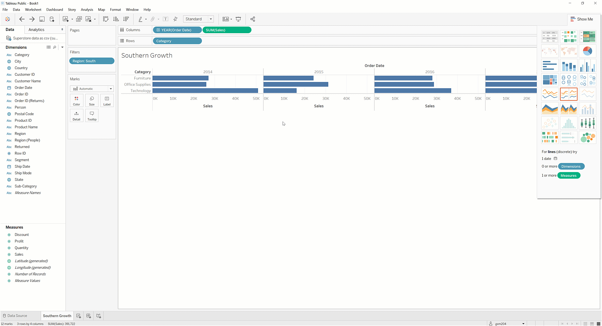
How can we grow sales in the South?
Tableau makes it quite easy to look at both whole numbers and percent differences. Using a panel of bar charts, examine how sales for each category are growing year over year.
Follow these steps:
Create a new worksheet, and call it Southern Growth.
Create a filter to limit data to the South region.
Drag Order Date and Sales to the Columns shelf. You'll see a series of horizontal bar charts like the one below:

4. Drag *Category* to the **Rows** shelf. 5. Create a table calculation to show off the differences *across* rows for each category by year. To do that, click inside the `SUM(Sales)` pill, and select **Add Table Calculation**. Choose the default: *Table (across):*
6. Because you're calculating year-over-year differences, there should be no calculation for the first year of data, which is 2014. This area should be left blank. Hide it by right-clicking on the **2014** label. Then, select **Hide**.
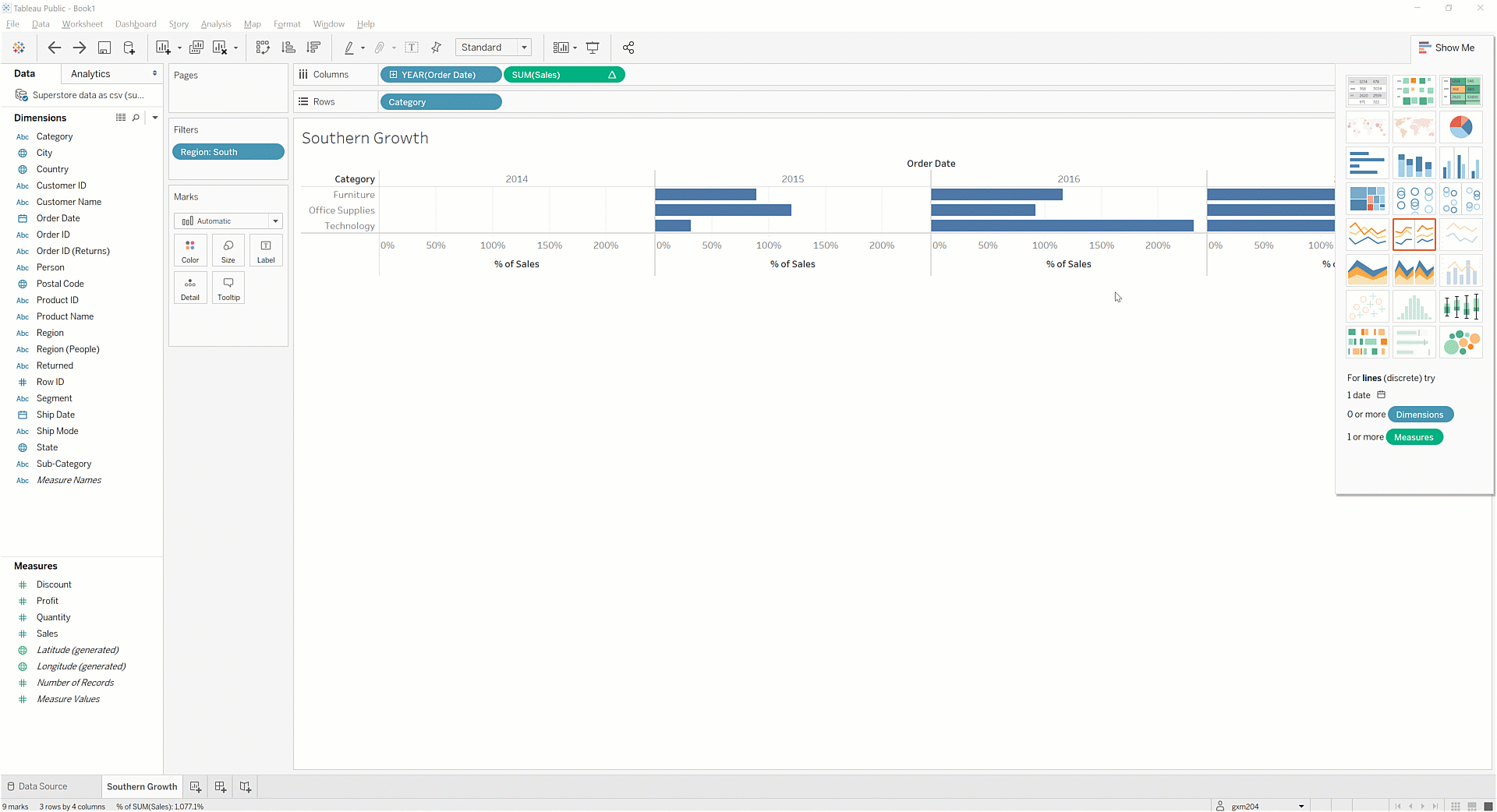
With this chart, you can now see that technology has been a volatile area of growth for the South. This could help or hurt the region's overall growth strategy. Is there any business intelligence that would help you understand which trend is most likely to continue in upcoming quarters?
Building your Tableau story
Now that you've identified key relationships and insights from the data, it's time to combine these views into a story. Stories in Tableau consist of multiple views. These can be worksheets or dashboards. Stories span multiple sheets, with one visualization per sheet.
Unlike other visualizations you've worked with so far, stories are heavy on text labels and comments. Your story is like the "director's commentary" on the visualizations you have put together; it is your insights about what those visualizations mean. With a story, you can share those insights with others, and make it easy for them to see what you see. You can now create the first slide in your story.
Follow these steps:
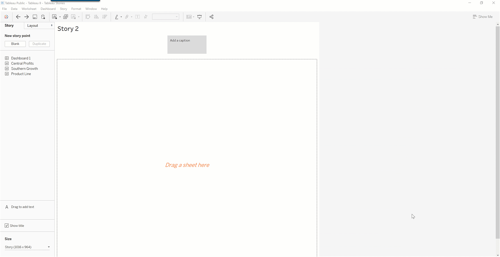
- Drag Central Profits to the worksheet area.
- Click on Add a Caption, and enter the text Binders are unprofitable.
Each worksheet in a Tableau story is called a story point. Create the next story point by following these steps:
- Click on the Blank button under the New Storypoint area.
- Drag Southern growth to the sheet area.
- Add an appropriate caption that says something like Technology is volatile.
- Consider adding some comments. To do this, click Drag to add text and drag your text below the chart.
Following this process, you might end up with something like the following chart:
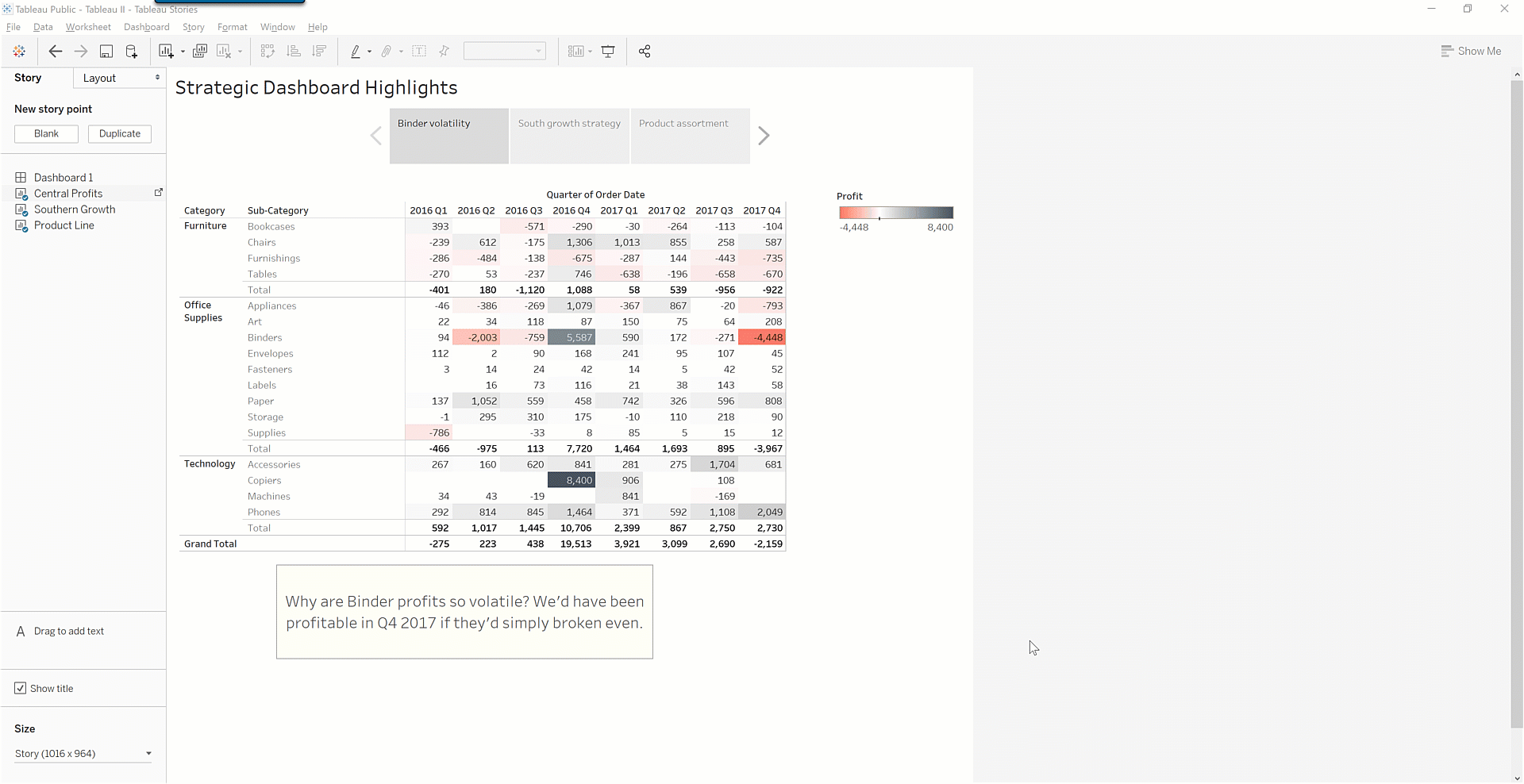
Compare your story workbook to this completed workbook. Note that you can toggle between worksheets in a story by using the left and right arrows on the top of the page. There is also ample room for providing commentary about the visualizations.
Practice ✍️
Now, it's your turn! Practice storytelling with data and creating stories in Tableau. Start by looking closely at the data. Find three insights related to one or more business questions or areas. Create a story in Tableau using the same process you practiced throughout this checkpoint. Provide your "director's commentary," complete with visualizations and notes.