21.7 Challenge ⭐
To complete this module and to test your mastery of Tableau, you'll create a series of visualizations. This challenge will be based on a new workbook containing data from Crunchbase about different companies' fundraising, investments, and acquisitions.
This challenge is required. It is up to you to assess whether you've mastered Tableau. This software tool will give you an advantage in both the job search and your PM career, so it is worth investing the time now to get this right. If you find that you need to, return to some of the previous checkpoints, or spend more time practicing and troubleshooting.

The challenge
Work through the steps listed below. Note that you'll need to create calculated fields to create the required visualizations.
Download this Excel workbook of raw data. Don't worry about whether or not you have Excel. You are only downloading this file, you won't be working on it, and Tableau is capable of interpreting Excel files regardless of whether you have Excel on your machine.
Create a new Tableau workbook, and connect to the Excel workbook as your data source. You should start with the Companies tab. Use a left outer join to connect Investments and Rounds to Companies. (It's not necessary to import Acquisitions.)
Change Founded Date to be a date instead of a string.
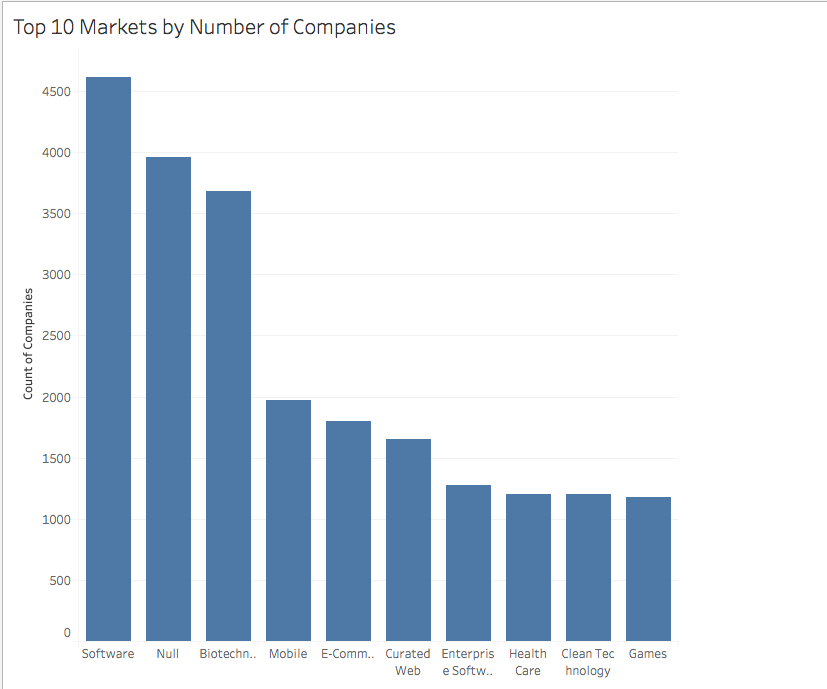
Create a visualization called Top 10 Markets by Number of Companies. It should be a vertical bar chart that looks like the one below. Hint: you'll need to create a calculated field that generates a count of unique companies by the Market dimension. You'll then use that to filter out the top ten markets and sort your data.
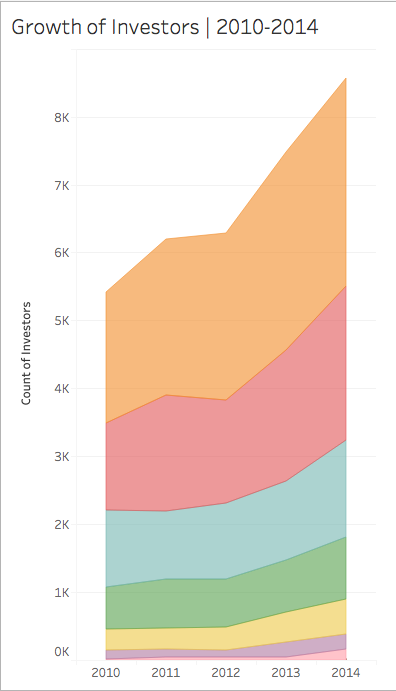
5. Create an area chart that shows the growth of the total number of unique investors between the years 2010 and 2014. This chart should be color coded to depict the funding round of the investments. But it should exclude instances in which the *Funding Round Code* value is null. Check your result against this sample answer:
6. Create a map that shows the highest amount raised for each country, referencing the *Raised Amount* field. But it should *exclude* the US. Your chart should look like this:

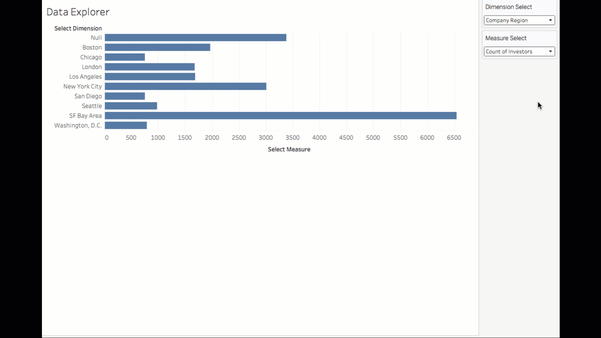
7. Create a horizontal bar chart that enables exploratory data analysis. Make a selectable drop-down menu that lets the user choose between three specific dimensions, which should form the rows for the chart, from the *Companies* subset of the dimensions data. The three dimensions should be *Region*, *Market*, and *Category List*. 8. There should be a second selectable drop-down menu that lets users choose between the following three measures—*Raised Amount*, *Count of Companies*, and *Count of Investors*. Those should form the columns for the chart. (Note that the last two measures should have been created in an earlier task in this assignment.) 9. For whichever combination of parameters the user selects, the chart should display only the top ten items. The chart should look and behave like the one below. (Note that this animated GIF demonstrates the drop-down menu behavior, too.)
When you're done, submit a link to your project on Tableau Public in the respective slack channel. Brainstorm ideas for how you could do more in Tableau to both expand your newfound skills and demonstrate your Tableau knowledge to potential employers. And don't forget to add Tableau to your list of skills in your resume and LinkedIn profile!
Submission
Submit your links in the slack channel #assignment-15