21.5 Aggregation
In this checkpoint, you'll focus on common calculated fields that you can set up when preparing data for analysis in Tableau. You'll continue working on the Superstore dataset. This topic includes the concept of aggregation, which you should remember from SQL.
Here's a quick reminder: When learning SQL, you used the JOIN operation to aggregate data from different data sources. The concepts in this checkpoint follow the same logic, but with a slightly different path to the end result.
By the end of this checkpoint, you should have learned how to do the following:
- Create calculated fields in Tableau
Watch out for joins
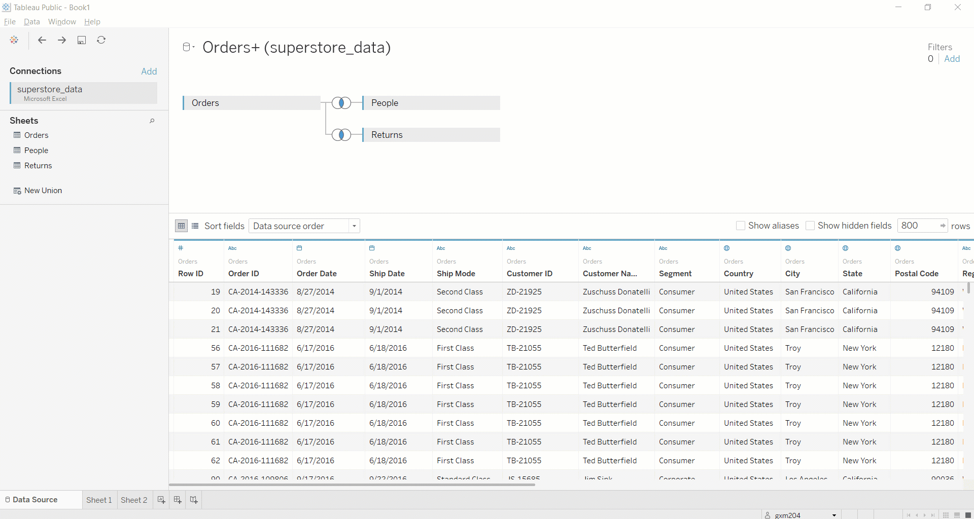
If you're starting this workbook from scratch, make sure the workbook looks like results below. If it doesn't, head back to the Data Source sheet of the workbook and double-check the joins. You want the left outer joins to connect Orders to People and Orders to Returns. Tableau makes these be inner joins by default. This means you'll get only records with a returned item in the Order ID. To change this, click inside the two Venn diagrams, and change the join types from Inner to Left:
Aggregation in Tableau
Most chart types in Tableau require some form of aggregation. For example, the GDP by region horizontal bar chart that you created in the previous assignment aggregates country-level GDP data. In other words, it adds together the GDP values for each country in the region. This is sum aggregation, and it's the default aggregation type in Tableau.
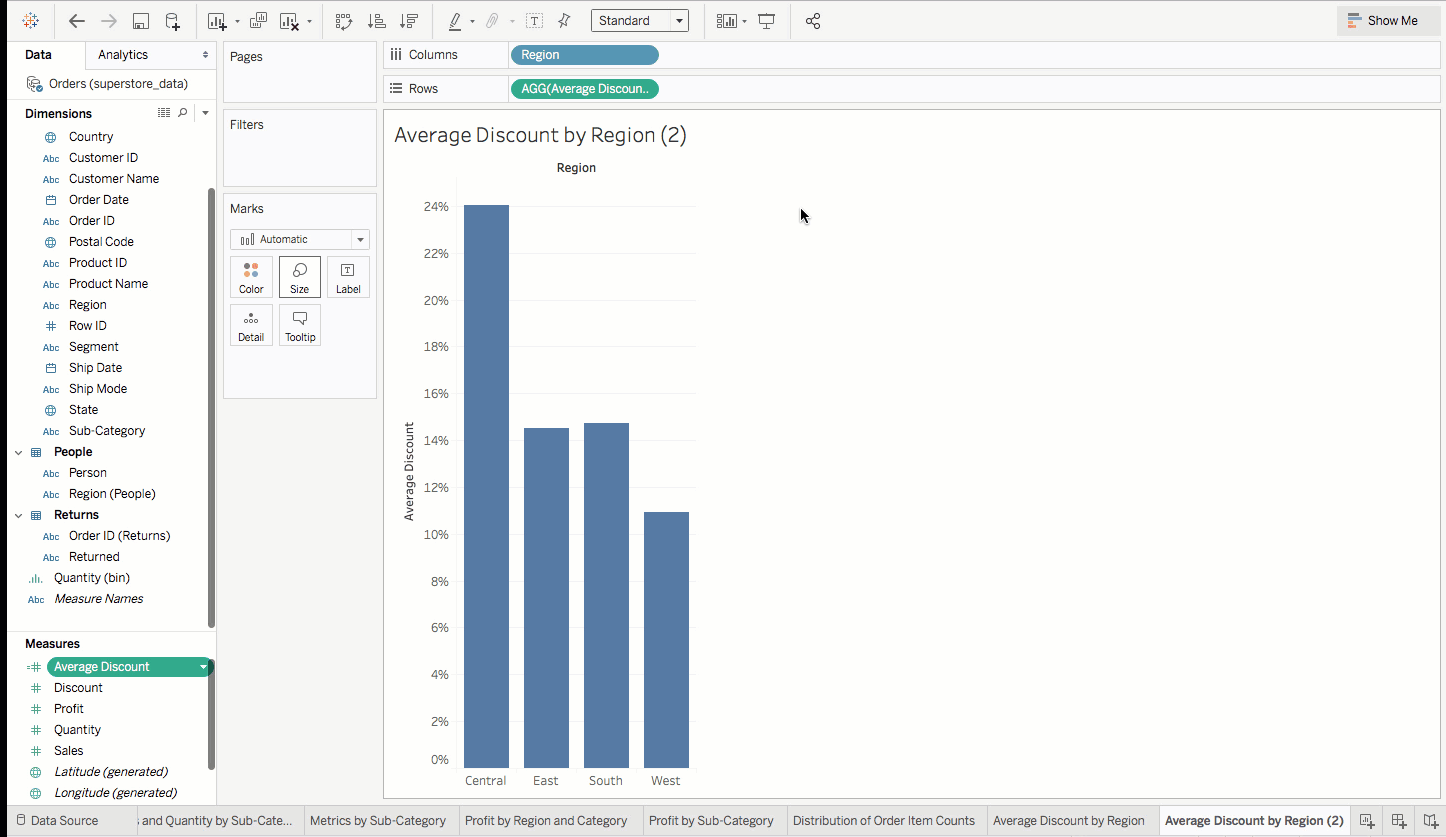
However, this default behavior is not always what you're looking for. Say that you want to see the average discount percentage by region. In this case, you want to know what the average discount is when there is a discount. So you'll want to omit orders that don't receive a discount.
Create a new worksheet. Then, drag Region to the Columns shelf and Discount to the Rows shelf. You should see something like the following chart:
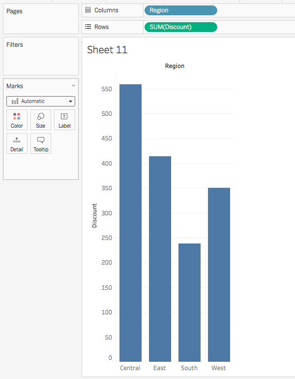
Take a moment to think about what this chart is showing you. What questions do you have?
You can see that the Central region has what appears to be the highest discount amount: a little more than 550. You can also see that these values are being aggregated by sum by default. Notice how Tableau displays SUM(Discount) in the Rows shelf.
There are some key questions you should be asking here. What is the unit of analysis for the discount axis? What exactly is that number measuring? Does it even make sense to sum up the values for that measure?
To answer these questions, you need some context about the discount measure. On the top-left corner, click on the View Data icon. It looks like this:

This will open up a window that shows a table of the raw data. Scroll to the right until you get to the Discount column, and take a look at the several rows of values. As you examine this data, you'll likely notice what's going on. It's apparent that this is percentage data, stored as decimal values. Close out of the data view.
Now you're in a position to answer the questions asked above. You know that the Discount field indicates the percentage discount an order received. It probably doesn't make sense to aggregate this measure by summing up discount percentages. What would make more sense here? In this case, you'd be better off aggregating this measure by averaging it.
To do that, choose the Discount menu in the Rows area. Then, select Measure > Average. Now, you can see the average discount percentage per region.
You can further improve this by displaying your percentage values as percentages instead of as decimal values. To do this, click on the Discount menu in the Rows area. Then, select Format. On the left-hand side of the interface, the formatting options for this axis will appear. Under Scale > Numbers, switch to percentage. Decrease the number of decimal places to zero. Now this chart is looking much better!
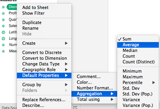
Go ahead and rename this worksheet Average Discount by Region and then save. The approach you just took alters the aggregation mechanism for this measure in this specific worksheet and chart. Note that it's also possible to change the default aggregation for the measure for any worksheet or chart it's used in. This can be done by right-clicking the Discount field in the Data pane under Measures and selecting Default Properties > Aggregation > Average. Go ahead and change the default aggregation method to average for Discount.
Note that Tableau features 12 distinct aggregation methods. Here is a list of these methods:
- Sum
- Average
- Median
- Count
- Count Distinct
- Minimum
- Maximum
- Percentiles
- Standard Deviation
- Standard Deviation of a Population
- Variance
- Variance of a Population
Calculated fields
A calculated field is a new field that is derived by creating a formula that somehow manipulates existing source data. To get a sense of how this works, you can jump right in and create some calculated fields. In doing this, you'll use some, but not all, of the various built-in functions that Tableau provides. For full documentation of the available functions, you can consult Tableau's official documentation. Note that some of these functions might only apply to Tableau Desktop.
Numeric functions
AVG
Short for average, the AVG function returns the mean of a field. Using this function works like calculating a field by its average in Google Sheets.
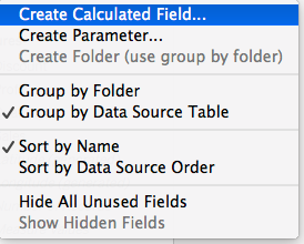
First, right-click on the bottom of the Dimensions area or on any white space in the Measures area. Then, select Create Calculated Field. You can also click on the drop-down triangle next to Dimensions, or select Analysis from the home menu to find the same option:
A new window will pop up. The cursor is initially in the field for naming the calculated field. Enter "Average Discount" here. Then, in the calculation area below, delete where it says [Discount]. Replace it with AVG(Discount). Click OK. Average Discount should now appear in the Measures area. Like in SQL, NULL values are not counted.
Note that it's possible to add comments in calculated field formulas. This provides a way of adding documentation for yourself or others that explains how a calculated field works, describes what it's meant for, or provides other helpful information. Consider the example above. You could add a comment to the calculated field, like the one below:
// Average Discount computes the average discount value
// more explanation....

AVG(Discount)
Note that you should use // at the beginning of a line to turn it into a code comment.
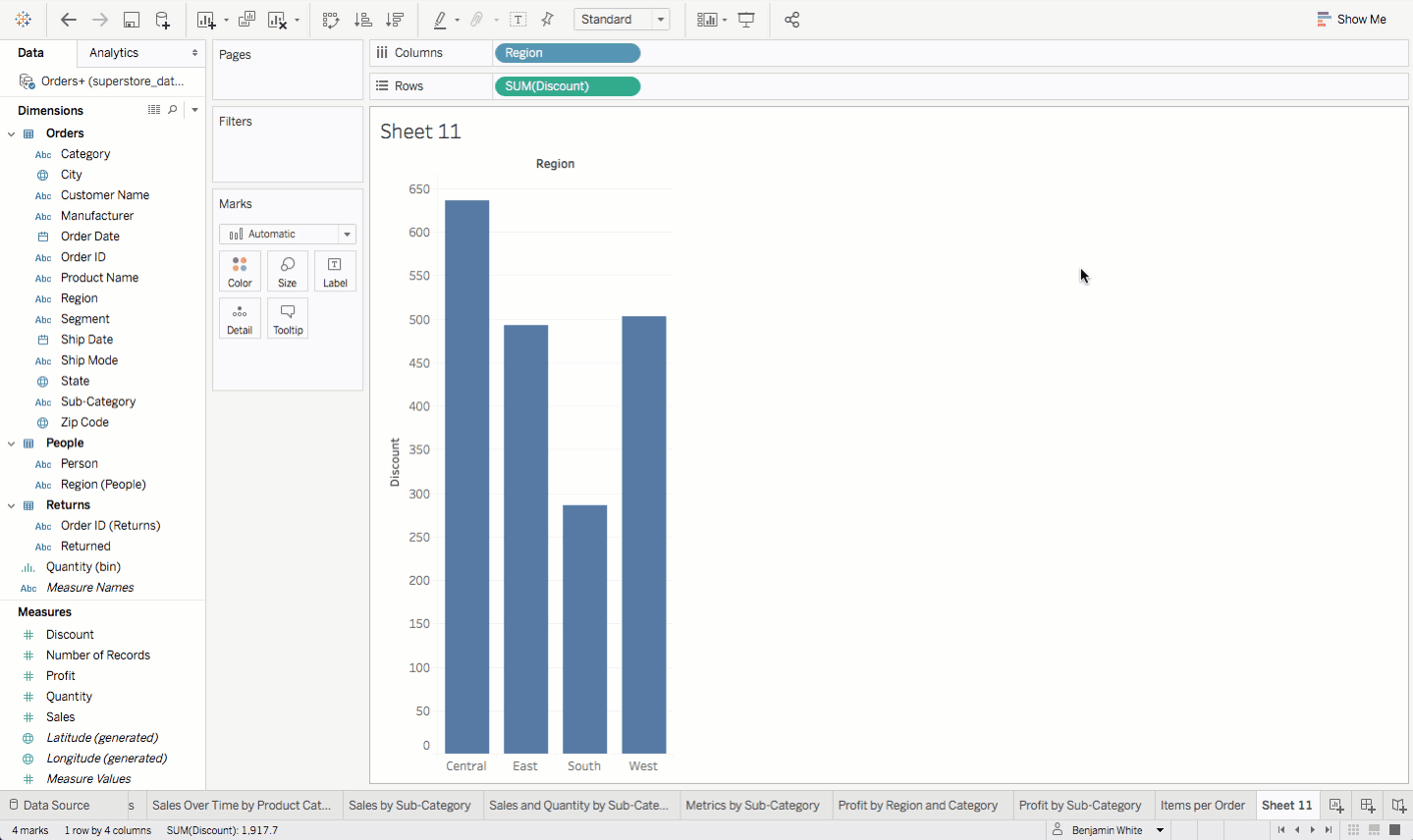
Next, try out your calculated field by recreating the Average Discount by Region worksheet you made earlier. This will prove that the calculated field gets the same result. Name this worksheet Average Discount by Region (2).
Drag Region to the Columns shelf and your new Average Discount measure to the Rows shelf. Finally, update the default number formatting for Average Discount. Click Average Discount in the Measures area, then click Default Properties > Number Format. Then, switch to Percentage, and set decimal places to 0. Your new chart should look like the chart below:
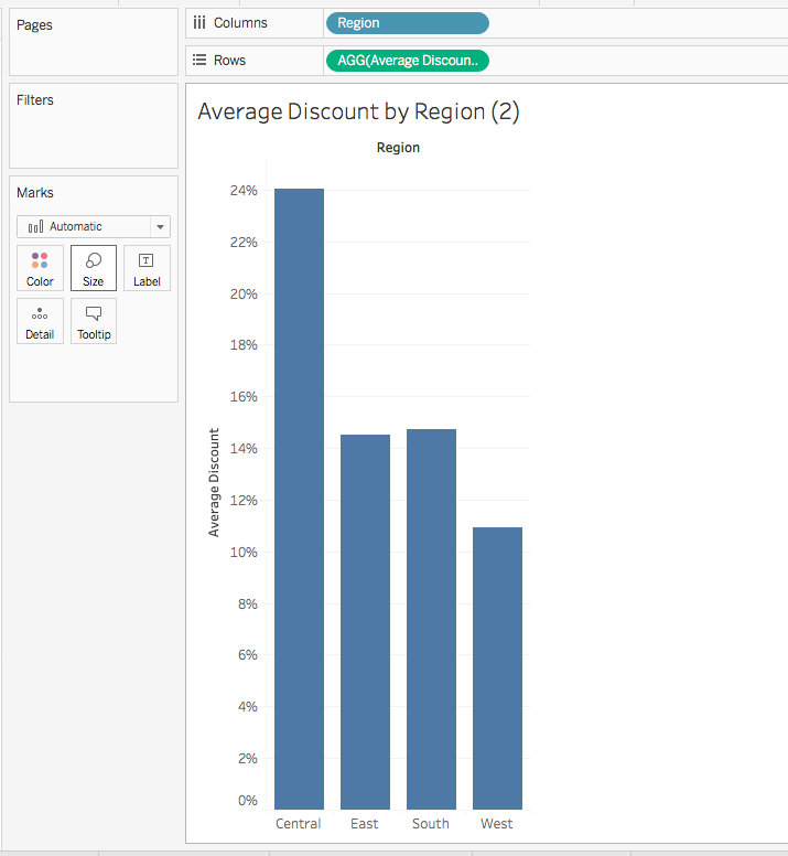
Compare the new chart with the previous chart you made (Average Discount by Region). They should be identical.
COUNT
This function returns the count of the items in a group. Like for AVG, NULL values are not counted for COUNT. This function can be useful in many contexts. You can walk through an example of creating a calculated field to count the number of returns.
Create a new calculated field, and name it Count of Returns. Next, in the formula area, start typing COUNT. As you start typing, Tableau will offer suggested functions. When you see COUNT, you can click it, or you can type it out on your own. Then, inside the count function, start to type Order. You'll get a few suggestions. When you see [Order ID (Returns)], select it. Ultimately, you should end up with the following formula:
COUNT([Order ID (Returns)])
Now, you can use this calculated field to generate a bar chart depicting the raw number of returns by region. It might look something like the chart below:
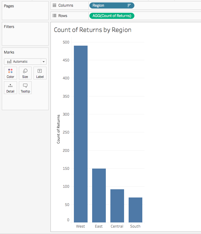
You should note one peculiarity about this calculated field and chart. It might have been premature to label it Count of Returned Items by Region. The truth is, this chart and calculated field actually depict the total number of returned items. In your dataset, entire orders are returned–not a subset of items within an order. That means that for each order ID that shows up in the returns data, you're counting a return for all items in that order.
COUNTD
The count distinct function returns the number of distinct items in a group. NULL values are not counted. Each unique value is counted only once. This is similar to the distinction between SELECT COUNT and SELECT COUNT (DISTINCT) in SQL.
You can take a look at two examples. First, a unique count of customers. Create a new calculated field and call it Count of Customers. Then add the formula below:
COUNTD([Customer ID])
You could initially use this field to get the number of unique customers. To do this, you would create a new sheet. Then, you'd drag Count of Customers to the Text box in the Marks card. If you do this, you should see 793 as a result.
Or say that you wanted to see the distinct number of customers for each product category. Recognizing that customers might order items from more than one product category, you could create a new bar chart with Category for columns and Count of Customers for rows.
Now return to your previous dilemma. You could use COUNTD to create a calculated field that counts the distinct number of returned orders. You learned in the previous section that you'll get an entry for all items in a returned Order ID when you COUNT returned Order IDs. You can update that calculated field to use this new approach.
Click on the menu for the Count of Returns field in Measures, then choose Edit. Then, update the calculated field formula, changing COUNT to COUNTD. Save your changes. Then, in a new sheet, drag Count of Returns into the Text box of the Marks card. You should see a result of 296, which is the number of returned orders:
Arithmetic in calculations
Sometimes you need to use arithmetic in your calculations. For example, you might want to create a calculated field for profit ratio. In other words, you want to see the total profit divided by total sales. Give it a try. Create a new calculated field and call it Profit Ratio. Add the following formula, then save:
SUM([Profit])/SUM([Sales])
Calculate the total profit ratio for this dataset. To do this, you can drag Profit Ratio to the Text box of the Marks card in a new worksheet. You should see 0.1247 as the result.
You could use this metric to get a comparative view of profit ratio by region. First, you'd want to update the number formatting for this measure to percentage. Then, you'd drag Region to the Columns shelf and Profit Ratio to the Rows shelf. Finally, sort regions in descending order by profit ratio.
That would give you something like the chart below:
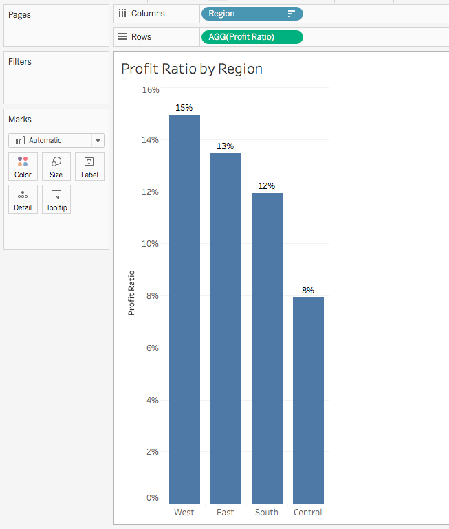
Notice that this field is using the following equation:
SUM([Profit])/SUM([Sales])
This is different from the calculation below:
[Profit]/[Sales]
The former correctly computes your profit ratio. If you want to confirm this, you could open the source data in a spreadsheet app and divide the sum of the Profit column by the sum of the Sales column. The latter, however, will compute what is arguably a nonsensical number.
This stems from how Tableau performs these calculations. Consider the following table of values:
| Order Number | Profit | Sales | Profit/Sales |
|---|---|---|---|
| 1 | 42 | 262 | 0.160 |
| 2 | 220 | 732 | 0.301 |
| 3 | 7 | 15 | 0.467 |
| 4 | -383 | 958 | -0.400 |
| 5 | 3 | 22 | 0.136 |
| 6 | 14 | 49 | 0.286 |
| 7 | 2 | 7 | 0.286 |
| 8 | 91 | 907 | 0.100 |
| 9 | 6 | 19 | 0.316 |
| 10 | 34 | 115 | 0.296 |
| 11 | 85 | 1706 | 0.050 |
| Total | 121 | 4792 | 1.997 |
If you were to create a Profit/Sales calculated field for this data, Tableau would return the value 1.997. This would be the result if you dragged this measure to the Text box of the Marks card. To get that value, Tableau would divide profit by sales for each row, then total up these values (seen in the bottommost cell on the right in the table above).
When computing SUM([Profit])/SUM([Sales]), however, Tableau gets the total sum of profit, 121, and divides that by the total sales, 4792. This would give you the correct profit ratio value of 2.5%, which is what you want for the data above.
Don't mix nonaggregates with aggregates!
When using calculated fields, you must aggregate the entire expression. Or you can leave it nonaggregated and calculated at the row level. You cannot do something like the equation below:
[Profit]/SUM([Sales])
Tableau will return an error for this calculation. This is because part of the expression is aggregated and part of it is not. If you wanted to compute the row-level profit divided by total sales for each row, you'd need to use FIXED level of detail. This is a key Tableau topic that will be covered later. But regardless, be consistent with aggregations. Aggregate either all, or none, of your calculations.
Date functions
Tableau offers several date functions that can be used in calculated fields. In the examples below, you'll explore use cases for a subset of these. But if you want to see them all, refer to the official documentation.
DATEADD
The DATEADD function adds a specified time period to a given date. This can be helpful if you want to calculate new dates based on another date, or if you want to create date-based dynamic filters in your dashboard.
DATEADD uses three factors: the type of time period to add (for example, "day"), the number of this date type to add (note that negative values are also possible to subtract), and the field to apply this to.
One use case for this might be to calculate an expected shipment date based on when an order was placed. Imagine that you expect all orders to ship three days after they are placed. Create a new calculated field called Expected Shipment Date, then use this formula:
DATEADD('day', 3, [Order Date])
DATEDIFF
DATEDIFF calculates the time between two given dates. Again, this can be useful in creating new fields based on existing dates in your dataset. The function returns an integer value calculated by subtracting the start date from the end date. DATEDIFF uses three factors: the date unit ('day'), start date, and end date.
You could use this if you wanted to calculate the days it takes to ship an order. Create a new calculated field and call it Days to Ship. Here's the formula you want to use:
DATEDIFF('day', [Order Date], [Ship Date])
With that field, you could compute the average days to ship by dragging Days to Ship to the Text box in the Marks card. Then, you should change the measure to average. That would give a figure of 3.958.
String functions
Tableau provides several string functions. This checkpoint will discuss only one—CONTAINS—as it's one of the most common ones.
CONTAINS
The CONTAINS function searches for any sequence of characters–which are referred to in Tableau as a substring–within a searchable string. The CONTAINS function returns a Boolean value of true or false, depending on whether that substring was found inside the string.
Suppose that you wanted to determine the count of iPhone-related products in your data. You could do that by creating a new calculated field with this formula:
CONTAINS([Product Name], 'iPhone')
Conditional logic functions
Remember how you used conditional logic in SQL? You can also use it in Tableau.
IF
The IF statement is a logical function that lets you test IF, THEN, and ELSE conditions. It will return the portion of the data that meets the specified conditions.
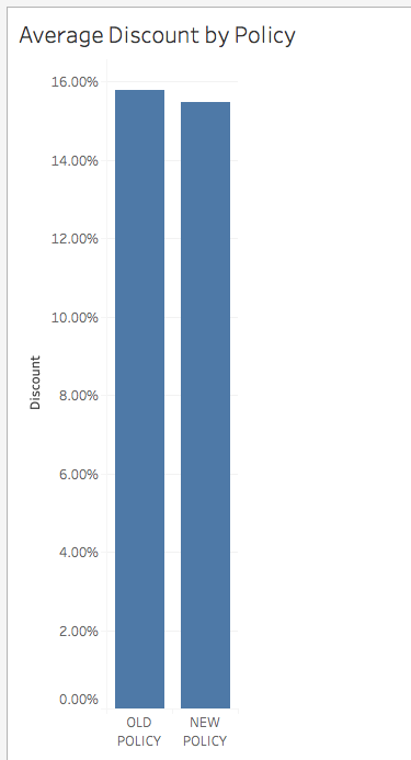
The Superstore dataset spans the years 2014 through 2017. Imagine that on June 1, 2016, there was a significant change to the discount policy for orders. You could use a calculated field with an IF statement to categorize the orders as being before or after the policy change.
To try this out, create a new calculated field. Call it Discount Policy, and enter the following formula:
IF [Order Date] >= #2016-06-01# THEN 'NEW POLICY'
ELSE 'OLD POLICY'
END
Note that there are three distinct parts to this. First, you have the IF condition. You're saying, "If the order date is on or after June 1, 2016, call it 'New Policy.'" The use of # lets you make comparisons–such as less than, greater than, etc.–with a date. Second, you have your ELSE clause. Here, you're saying, "If the first condition isn't met, call it 'Old Policy.'" Finally, the entire statement must end with END.
When you've created this calculated field, you can create a new visualization by dragging Discount Policy to the Columns shelf and Discount to the Rows shelf. With a bit of sorting and number formatting, you can get the chart below. This reveals that average discounts went down slightly after the new policy was enacted.
CASE
Next up, you have the CASE function. With CASE, you indicate a single field or expression that you're interested in. Then, you lay out a series of cases for that value. For each case, you indicate a value that should be returned. Each possible case is indicated by a WHEN value along with a THEN value, which gets returned if the case is true. If no match is found, then a default return expression, specified in an ELSE clause, is returned. If no ELSE clause is supplied, no match was found and NULL gets returned. The entire CASE clause ends with the END keyword.
Note that it's possible to replicate CASE functionality using IF, ELSEIF, or ELSE. But CASE is preferable because it's easier to use and more legible. Imagine that you wanted to map the Ship Mode variable using a smaller number of labels: Priority, Standard, and Other. To achieve this, you would create a new calculated field. Call it Shipping Class, and supply the following formula:
CASE [Ship Mode]
WHEN 'First Class' THEN 'PRIORITY'
WHEN 'Same Day' THEN 'PRIORITY'
WHEN 'Second Class' THEN 'STANDARD'
WHEN 'Standard Class' THEN 'STANDARD'
ELSE 'OTHER'
END
AND
Like conditional logic statements in SQL, the AND statement in Tableau allows for multiple expressions to be combined and evaluated within a single calculated field. If the expressions on either side of an AND statement evaluate to TRUE, then the entire statement is considered to be true. It works the same way for FALSE.
Suppose you wanted to flag products that were experiencing a high dollar amount of sales and contain a large discount. You could do this by creating a calculated field called Sales and Discount Check. You'd use the following formula, which uses AND:
IF SUM([Sales])>10000 AND AVG([Discount])>.1 THEN 'REVIEW'
ELSE 'OK'
END
You now know some of the common functions in Tableau. You'll be revisiting the idea of calculated fields as you build out dashboards in future checkpoints. To see a complete list of calculations that Tableau supports, you can create a calculated field and click on the arrow at the right side of the box. You'll see the image below, where you can review all supported formulas.
Practice ✍️
Revisit the Olympic History data that you worked with earlier. Open your workbook in Tableau Public. Use Save As to save a new version with a unique name, such as "PMcademy | Olympic History | Checkpoint 4.
Open up your workbook, and create the calculated fields described below:
Create a calculated field that counts unique participants. Then, use this calculated field to create a chart that plots the number of participants for each year in the dataset. Does the result bring up any questions? Do you have any ideas why you are seeing the pattern that emerges? (If you're not an Olympics history buff, you can find a helpful hint here.)
Create a calculated field that indicates whether or not someone is a medalist. If someone won a bronze, gold, or silver medal, the field will be called Medalist. If they did not win a medal, the field will be called Not medalist. Next, use this calculated field to create a table that shows the total count of medals for each sport in the Sports field. Hint: you'll need to use Medalist in the Filters shelf to achieve this.