8.1 Interaction Design 🎯
This section includes an Activity 🎯
Whether you have a UX team or you're designing features yourself, you need to understand the basics of good interaction design. You might think it's easy to throw some buttons and links on a page to make an app, but it's actually very complex and difficult to create an experience that's intuitive and easy to use.
Thankfully, there are a few basic principles that can quickly improve your design skills. This module will focus on developing these skills, including implementing design psychology, creating forms, and crafting interactive prototypes. By the end of this module, you will be creating and submitting a fully functional interactive prototype of a product.
In this checkpoint, you'll start by learning more about the principles of interaction design and the basic elements that make up digital experiences.
By the end of this checkpoint, you should be able to do the following tasks:
- Describe several major principles of interaction design
- Identify the major interaction components of a web page or mobile app
Open Bootcamp provides a affordable UX & UI bootcamp at uxuiopen.com that you can try if you are keen on learning more about UX & UI with a community and live mentorship.

What is interaction design
Interaction design is the design of product interfaces and services that allows users to achieve their goals. The interactions users have with your products are determined by a variety of elements, including visuals, motion, and sound. Interaction design is about ensuring that all of these elements help users achieve their interaction goals easily, rather than hinder them from doing so.
Great design is a requirement for modern products. In the past, design could differentiate your product from others. Today, designers are involved in creating nearly every product, and most companies—and more importantly, customers—treat design as a fundamental aspect of a product. Any product with lackluster design will likely be panned or ignored because the expectations of users are so high.
Principles of interaction design
There are many valid lists of design principles online. The principles described below are inspired by the ones published by Usability.gov—the US government's guidelines for digital design. They're a good starting point for your education on interaction design. The list is also useful when evaluating existing designs.
Define how users can interact with the interface
In general, people will interact with your product in a way that you've already pre-defined with the buttons, links, and forms that you've provided. Before you create your design, it's important to consider a few factors. You need to think about which items are more important to emphasize than others, how the interaction varies based on the platform (such as mobile or desktop), and how your users' capabilities (such as low vision or mobility challenges) will be affected. You must also consider how elements outside of your product can affect it, like copying and pasting text or hitting the back button on a mobile device.
Give users clues about behavior before actions are taken
Design elements, like color and shape, are indicators of what your product does. Symbols carry meaning; 🛑 or ⚠️ indicate something very different than 💡 or ❤️. Your product needs to include appropriate instructions, confirmation, labels, and other information that helps users anticipate what will happen when they take an action.
Anticipate and mitigate errors
People mess up all the time, so your product should make it easy to undo actions or correct problems. Make sure that your error messaging is helpful and that it makes it clear to users how to correct the problem—and doesn't just point out that there is a problem. As a best practice, use error-checking features to prevent people from making a mistake in the first place. For example, your developers can force a phone number field to only accept numbers (not letters) and only numbers that match phone number formats with 10 total digits.
Consider system feedback and response time
People expect digital products to be fast and responsive, and they get upset when they aren't. Your product should have ample feedback to indicate when it's in the process of performing an action as well as when it's completed the action. If a task is going to take a long time to do, make it clear to the user that it's going to be slow. Some designers use the time users are waiting for an action to be completed as an opportunity to display their creativity. You should carefully consider the context, however, when deciding whether or not a playful approach will be well-received by your users.
Strategically think about each element
Page elements, like buttons and menus, have common conventions, and you should use those conventions as often as possible. Size, color, and position are tools you can use to ensure that people notice the right elements first and the not-so-necessary ones later. When possible, include fewer elements in a page or hide infrequently used ones under menus or another out-of-the-way location. Less is often more.
Simplify for learnability
People often say a product is easy to use or has great design when they really mean is that it's easy to learn. Figure out the lessons that people need to learn to be successful using your product, then design a path that leads users to quickly and effortlessly learn those lessons. If you need to train people, make sure they learn just enough to get started while providing ways for them to level up their skill later. Getting to value fast is essential. Simplify the rest of the experience as much as you can; the less a user needs to learn, the faster and more enjoyable their experience will be.
App and page elements
You've probably noticed that many different websites and mobile apps have a similar look and feel. Many follow the same patterns as the system apps that come built into the operating system. Other apps copy familiar patterns from well-established sites like Facebook.
Google's Material Design is an example that shows text, buttons, and other conventions used in many Android applications:
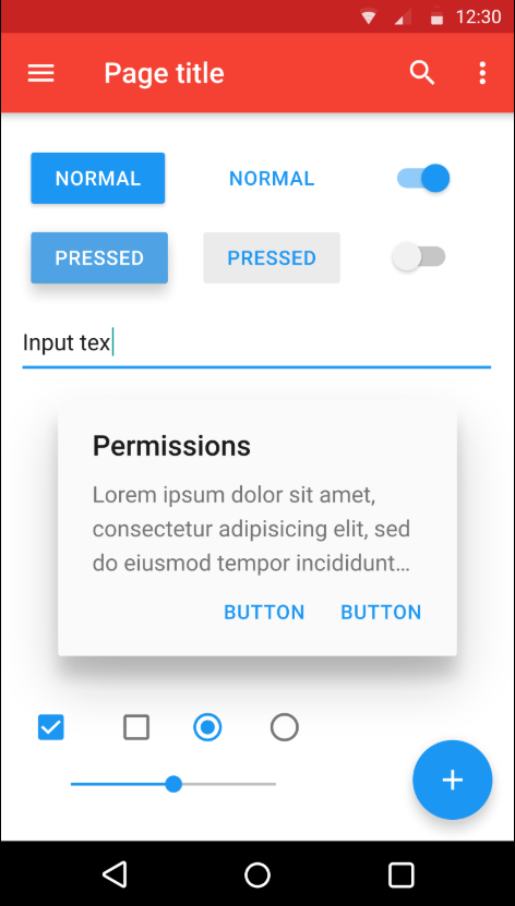
Overall, the elements included in app and web pages are remarkably similar. This is no accident. People find familiar interfaces intuitive. It's really easy to learn how to use the next social networking platform when it looks and feels a lot like Facebook.
When you start making your own designs, the best advice is simply don't reinvent the wheel. It's perfectly acceptable to base product design on other products that are attractive and easy to use. Conventions are there for a good reason; you should be familiar with them to be a better designer. Below, review some of the most common conventions in web and app design.
Navigation
Most apps have menus, tabs, or other means to get from place to place. The primary navigation is the set of menus or navigation bars that usually appear on the left or top row of a screen. (This is true for left-to-right languages like English or Spanish; in right-to-left languages, like Arabic or Hebrew, the navigation is usually on the top or right.)
Whether you're building a website, mobile application, or desktop application, the left or top of the screen are the most common places for the navigation to appear, making them the most common places for people to look for the navigation.
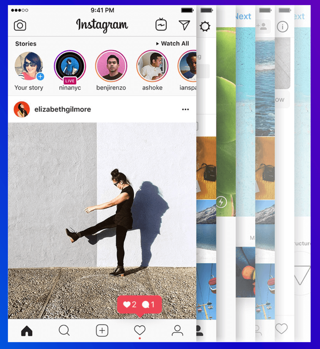
Mobile apps vary a bit in their navigation. Because mobile screens are smaller, many apps hide their navigation under a menu button, which expands when a user clicks on it. Some apps also use a bottom navigation, like you might see on Instagram:
Other navigation tools
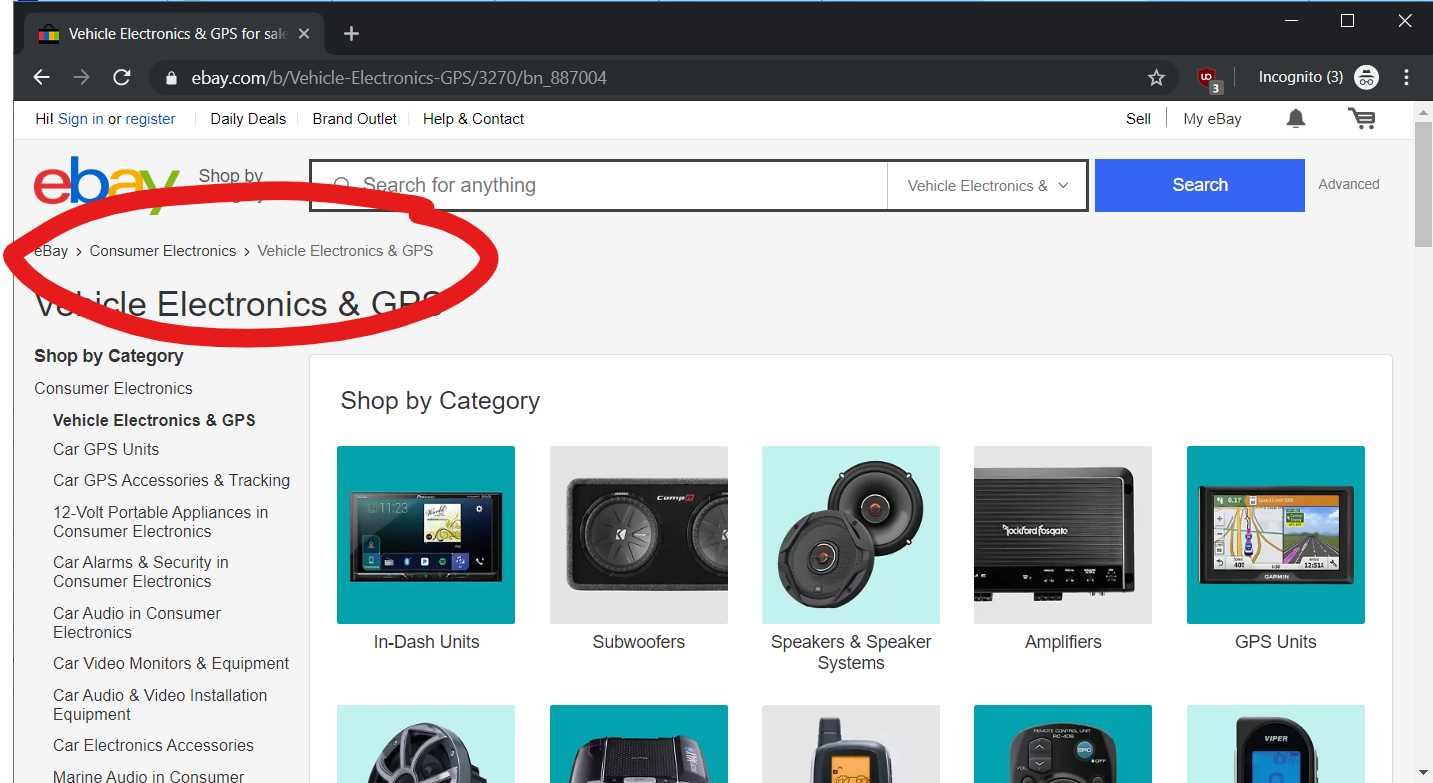
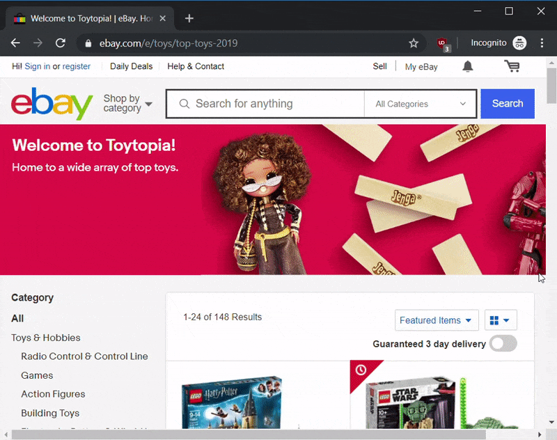
When you go through an app, it's easy to lose your place. Breadcrumbs are a handy trick to keep track of where you are. A breadcrumb is a list of where you are in a hierarchy, and you can click on any of those list items to go up or down that hierarchy. This is common on e-commerce websites to help you keep track of where you are, like on eBay below:
Specific platforms have navigation conventions that they want you to use. For example, compare the screenshots of Facebook on iOS and Android. They have the same navigation links, but these appear on the bottom on iOS and on the top in Android:
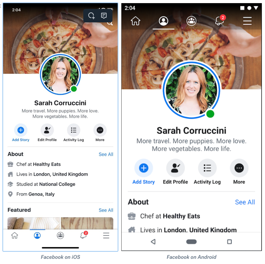
That's because Facebook is following the guidelines for those platforms, and those guidelines dictate different placement of the menu. Both apps are very familiar, though; if you use Facebook on iOS and were to switch to Android, you could easily make the change.
Sometimes the navigation changes depending on the context. If you're looking at your direct messages in Instagram, the navigation will change from the default to a search bar and back button. This contextual navigation is only in effect for this one page:
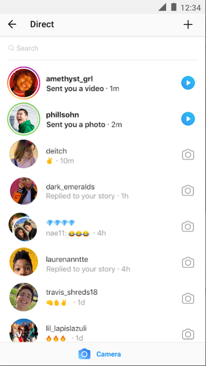
It's a good pattern to use when you need to offer users specific features for one interaction, like adding archive and delete buttons when a user is looking at an individual email.
Lists
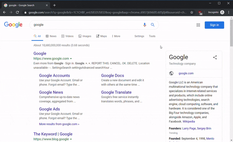
A list is a common interactive element that apps use to display data. If your lists have many items, you need to provide a way for users to get to the next set of items. Pagination is a series of links that let people go from one set of list items to the next. This is most common on desktop websites where people go from one page of search results to the next, like on Google's desktop search results:
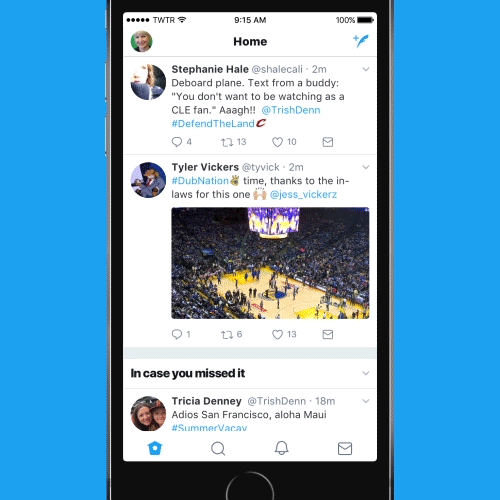
An increasingly popular way to show new list items is to use infinite scrolling. In this pattern, new list items are loaded beneath the existing ones once you get to the bottom of the list. Check out how Twitter does this once you get to the bottom of the page. The list goes on forever no matter how far you scroll down:
Items in a list typically have some action associated with them. If you click on a Google search result, you'll go to that page. If you click on an email in your inbox, your app will open that email. Make sure that the action of a list item is contextual to the list.
Finally, lists have tools—most often sorting and filtering. Sorting lets you choose which items come first, and filtering lets you decide what items should or shouldn't be included. This is common on shopping sites that let users sort by price or filter by qualities of the products, such as "new" and "used" on eBay. Like navigation, the convention is to show these tools above or to the left of the list:
On mobile, sorting and filtering options may be hidden under a button to save screen space.
Screen actions
Digital products use toolbars, buttons, links, and other methods to give users ways to interact with apps and take meaningful actions.
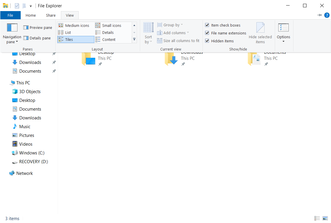
Many apps use toolbars that contain action buttons, checkboxes, and other options to help use their tools. Desktop applications especially make use of rich toolbars, such as the ones in macOS Finder or Windows File Explorer. Apps can have multiple toolbars as well:
When an app wants users to notice something, it will use tools like dialogs, modals, and notifications. A modal is a window that shows up on top of everything else; the user can't get rid of it until they make a choice. Modals are often used for confirmation, especially if an action can't be undone, such as when deleting a file:

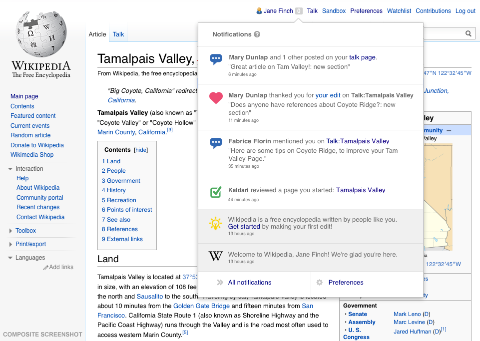
Many apps use notifications either in the app or by using the operating system's notification system. Every app is vying for users' attention, and once in an app, there are specific places the app attempts to direct users. Notifications usually have some indication of how many are unread and which specific ones are unread:
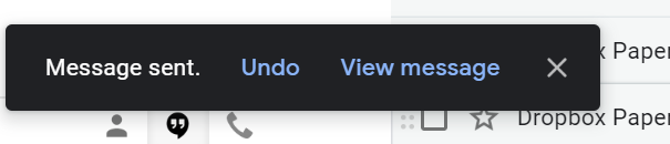
A toast is a temporary message that appears then disappears. These are most often used to inform users about something unimportant, or as a confirmation for an action that they took, like the Gmail app letting you know a message was archived, deleted, or sent:
When choosing the type of notification to use, you should think about whether or not the user needs to take action and what the conventions are for the platform you're using.
The fold
At some point, you'll most likely hear the term above the fold or below the fold. The fold is typically used to refer to the bottom of a web page; it's the dividing line between what's seen and what's not seen. The part of the page that's above the fold is visible on the screen when it opens by default. Because it's so prominent, it's where important functions and messages should appear. People may not scroll down a page to see other content, which is why advertisers are especially keen to be above the fold—ensuring their ad will be seen right when a page loads.
However, the fold is really a myth because most people scroll down a page. And if someone doesn't, it usually means that they've landed on a page that wasn't relevant to what they were looking for. For example, maybe someone had been searching for baby clothes and ended up on a baby clothes photographer's website. They hit the back button right away, and so the fold never really mattered in the first place.
The answer to the fold question is to, therefore, always make sure your content is relevant and appealing at first glance. Focus on creating the best experience possible for visitors to your page. This will ensure that any stakeholders who are concerned with the fold will also be satisfied with that above-the-fold experience.
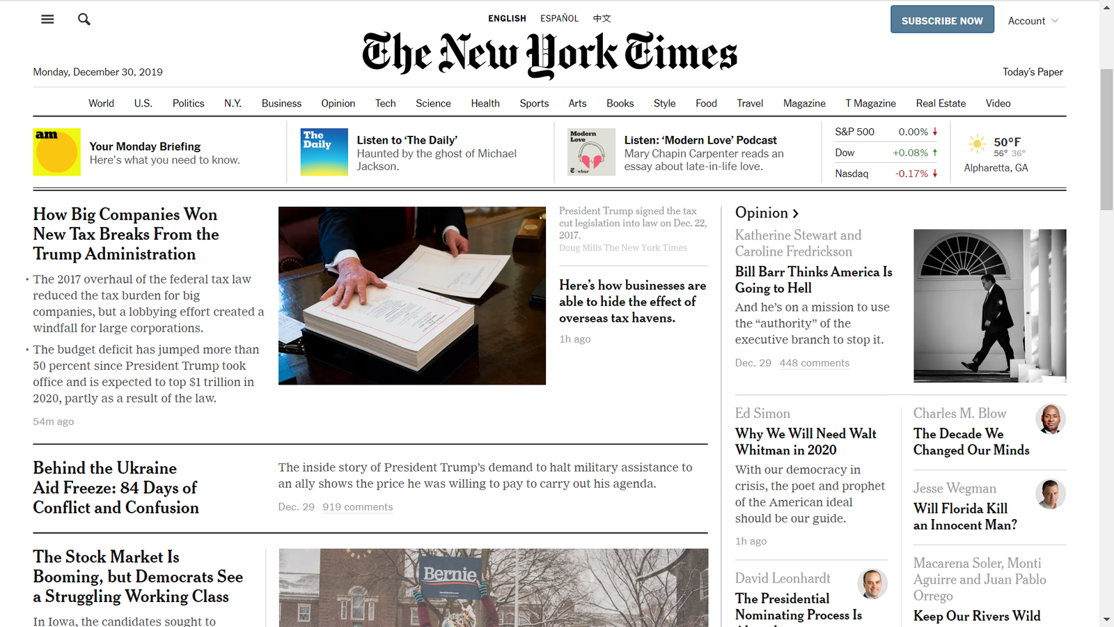
The New York Times exemplifies the fold in a very interesting way. It uses the concept to highlight what it perceives as headlines, while the less urgent content requires a scroll:
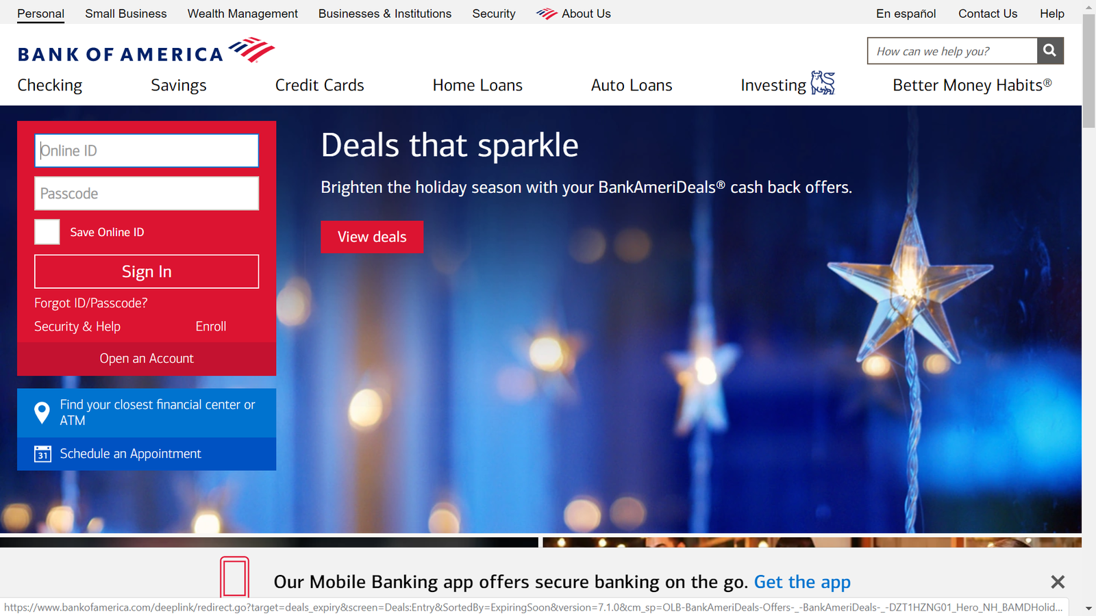
Bank of America's website, on the other hand, allows users to log in (arguably the most important reason someone would navigate to their site) and takes the opportunity to market additional services:
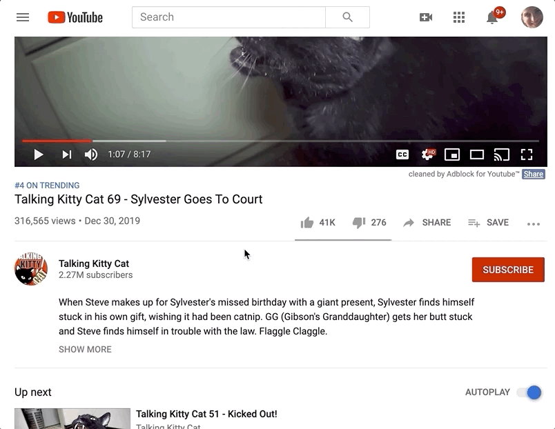
On platforms for user-generated content like Facebook or Youtube, the above-the-fold area would represent the part of the description or post that is visible without requiring additional actions, such as clicking "read more":
Whatever the fold may mean for your product, it represents another example of the need to think about the experience from your users' perspective, with the aim of simplifying the flow of information and emphasizing the most helpful elements first.
Activity 🎯
Go to the following pages in these websites and apps:
- Amazon home page
- Orbitz home page
- New York Times mobile app
- One other website or app of your choice
For each of the four sites or apps, take screenshots and annotate them, identifying the following interaction elements:
- Navigation (primary and secondary)
- Screen actions
- Lists
- Any other relevant parts of the page
The following are the tools you can use to capture and edit screenshots.
- For Windows, use this snipping tool.
- In macOS, use the built-in commands to capture screenshots then open the image in preview mode to edit it.
- On Android, hold the power and volume down buttons down together to take a screenshot. You can then edit it on your phone with an appropriate app or email it to yourself to edit it on a desktop.
- On iOS, see these instructions for the right way to take a screenshot on your device. You can use an app to edit it on your device or share it to a laptop/desktop for editing there.
Paste your annotated screenshots in your notebook/notion page or a shareable doc.