8.2 Interaction Flows 🎯
This section includes an Activity 🎯
Now that you are able to identify the individual page elements that make up interaction design, you can start paying attention to the way they come together into more complex flows. Certain user flows have common conventions. You should incorporate these conventions if you can; the familiarity of them will make it easy for users to understand and follow the flow.
In this checkpoint, you will dive into some specific commonly used flows, like registration forms and search functions. You will also learn about flow best practices, the use of user interface (UI) libraries, and how to make products accessible to users of all abilities.
By the end of this checkpoint, you should be able to do the following:
- Describe common interaction flows and the best practices for designing them
- Explain the accessibility considerations PMs must be aware of
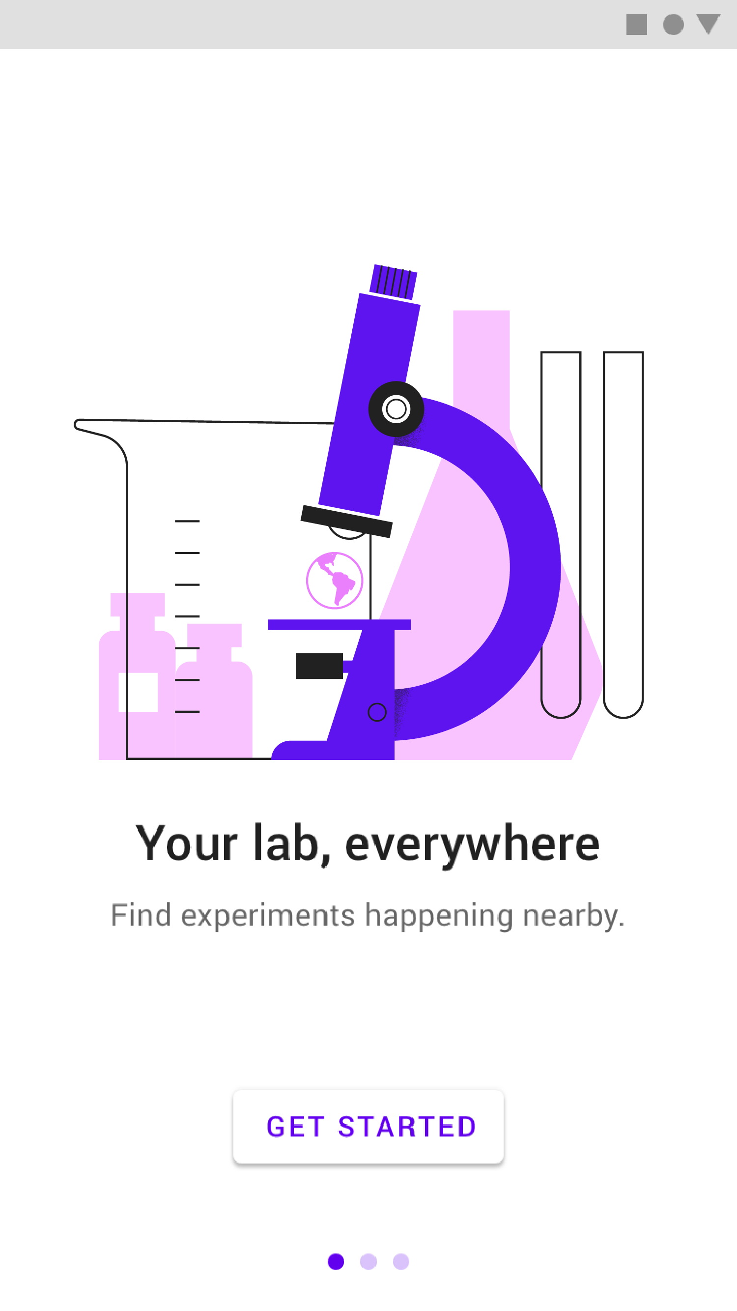
Registration and sign-in
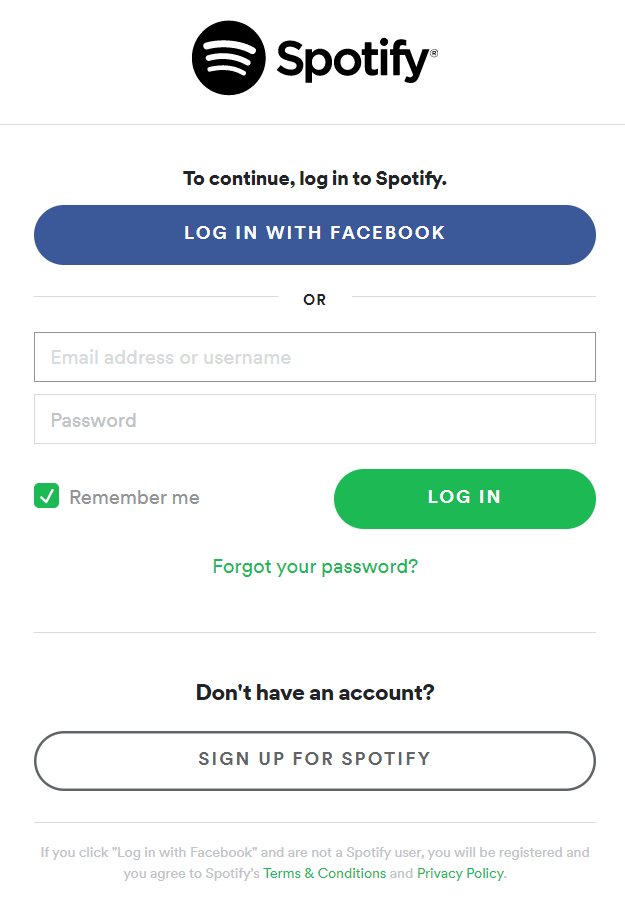
Many apps have a registration experience where you either sign in or sign up for their service. Most common is to have a sign-in form that gives users a method of signing up if they don't have an account. You can also offer one-click sign-in buttons via a Google or Facebook login if appropriate. (If you have a B2B app, you shouldn't offer a Facebook login.) Spotify offers a typical example of this pattern:
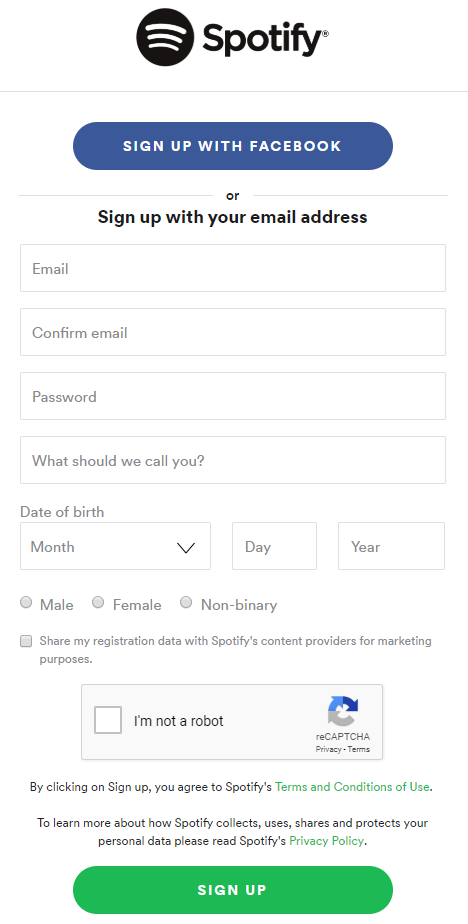
Sign-up forms also have conventions; they usually ask users for a name, email address, password, and just enough other information to get them started using the experience:
Always keep in mind that longer forms have lower conversion rates, so ask for as little information as possible. If you need more details about a person, you can ask for more later.
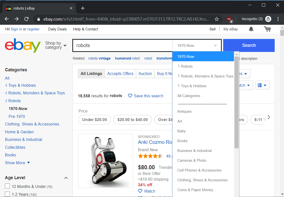
Search
Search is more than a feature; it's a process that users go through to find a result they need. Searches have their own conventions like listing the items searched for, autocompletion when entering search terms, and methods for filtering. When designing a search experience, you should especially consider what the type of the search result should be, what actions users should be able to take, and how users would most likely want to filter their results.
Onboarding
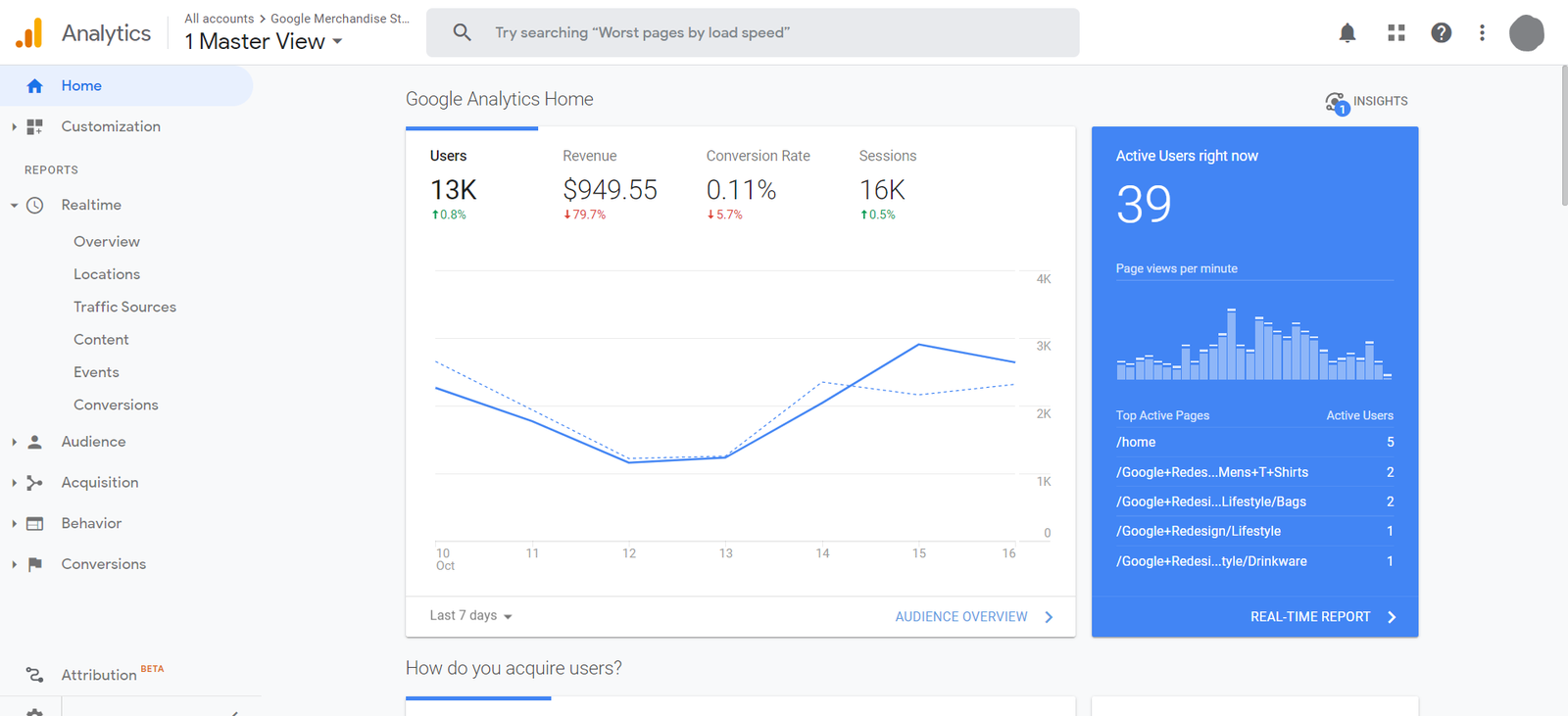
Some products are familiar enough that users don't need additional training to use them. For example, e-commerce sites don't vary much from one to the next. Some products, however, do require explicit training. Perhaps they're complicated, have deep setup processes, or are unfamiliar to most users. Many analytics applications, like Google Analytics, are not beginner-friendly and require significant setup in order to be useful.
Sometimes onboarding—training users on using the product—is built right into an app and begins immediately after the user signs in. You've seen lots of these, especially in mobile apps. They make the user take a tour or scroll through a few panes to understand what's happening. Similarly, you can use modals to walk people through an application.
Onboarding doesn't end after sign-up. You should also think about what it takes for someone to be successful when they have been using your application for a while. For example, Facebook famously said that they know users will be hooked on their product if those users can find 10 friends in their first 7 days. In fact, Facebook very aggressively asks users to import contacts in order to help them find those friends via notifications and other means. Similarly, LinkedIn would love to connect their users to people via their email contact book:
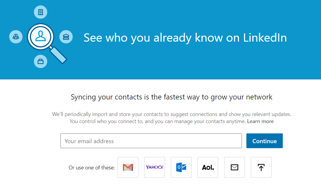
The goal of onboarding is to get your users to the point where they're using the product successfully and getting value out of it. In the case of these social networks, that point would be when the users are finding connections.
Finally, onboarding can be ongoing. Apps often use modals and other notifications to let their users know that they've launched new features. It's a best practice to let your users know about new items that are available to them.
Wizards
A wizard is a step-by-step process for walking people through a complex or intensive process. You should use a wizard when it's easy for users to make mistakes or when the feature is complicated, unfamiliar, or infrequently used. By contrast, you don't need wizards to walk a user through a simple task or if the user is very experienced. For example, Wikimedia wants to ensure that you follow specific steps when uploading media. So it's reasonable to use a wizard here because each step has detailed instructions, and the process is not intuitive:

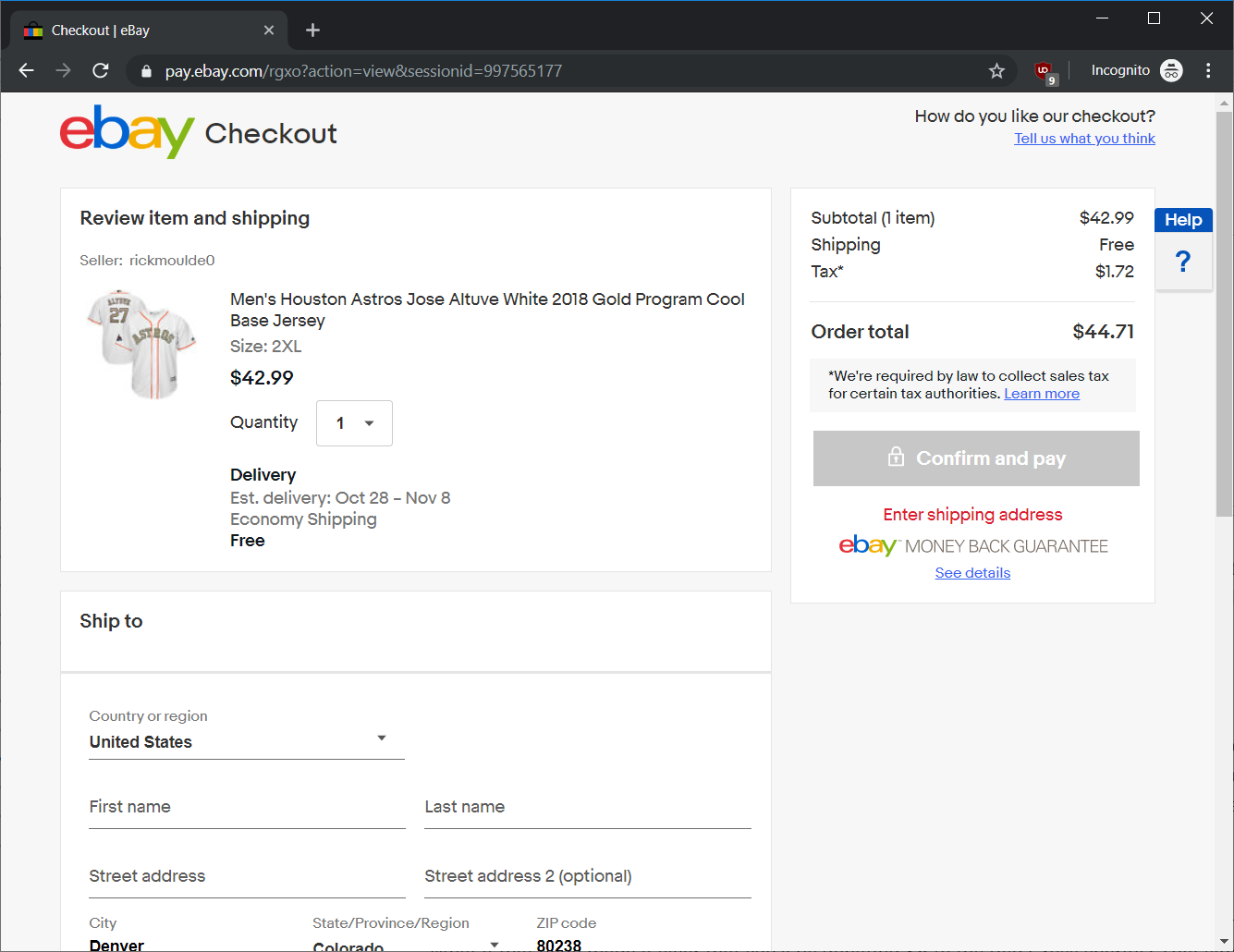
Checkout
In e-commerce, checkout flows are a standard experience of entering payment and shipping (if applicable) information and confirming the purchase. In fact, a checkout is a special kind of wizard that is used extremely often. And it is worth calling out as it has its own special flow. As a best practice, always give the user a final chance to confirm their purchase. Then send a purchase confirmation by app and email once the purchase has been completed. If you need to collect extra information, make sure the form is easy to fill out and includes the proper instructions.

Flow best practices
Below you'll find a few simple rules that will help you design better flows and experiences. Keep in mind that each product, website, and application is different. The rules below are more like guidelines and less like hard rules. They will help you keep good, intuitive design in mind so that your product is appealing to the largest possible audience.
One clear goal
Every page and interaction should have one clear objective. If a user is in their email client inbox, the goal is to get them to a specific email. When they're on the Facebook news feed, the goal is for them to engage with friends and their content. If it's unclear what you're trying to get users to do, then redesign the flow to have one clear goal. Clarity about your goal will help keep your designs focused. Everything else that isn't part of the goal should be minimized or lowered in priority. A great example of this is the checkout process. The next time you purchase something online, notice how the flow is keeping you focused on the checkout process—all the navigation features and other extra content are gone.
Provide all the info they need
When a user needs to complete a task, make sure they're equipped to do it. If you're asking someone to compose an email, but they don't know the recipient's address, how can you help them get that information? Is there an easy way for them to search for the address? Similarly, if it's a complicated task, make sure the instructions are clear enough that even a first-time user can complete the task without confusion.
Show what will happen next
If you received a link to a page that only asked you for your credit card number, would you submit it? What if that page made it clear that you'll be donating $5 to the Red Cross charity? That simple bit of extra context makes a huge difference in getting users to complete the actions you are directing them toward. Always ensure your experience makes it clear what will happen when the user pushes that button or submits that information.
Analyze products you like
In interviews, you'll often be asked to explain why you like a certain product. Your interviewer will probably ask you to explain what makes that product good from a design point of view. Start preparing to answer these questions right now by taking the time to pay attention to the design details in the products you like and use most often. What elements are emphasized? Are there any diversions from the common conventions? How is the design supporting the user in completing their tasks? Are there wizards, breadcrumbs, or modals in place? Not only will learning to identify and discuss these help in your interviews, but you'll also grow your design palette for when you start designing these features yourself.
UI libraries
When designing interactions, it's a lot easier to reuse common elements like form fields or buttons. When you do that, you're upholding the conventions that make it easier for users to use your apps. It also makes it easier for your designers and developers who can save time and effort reusing old designs and code to build the next product or feature. These reusable elements are contained in UI libraries that you can pull from to create new designs.
Typically, you'll use two kinds of UI libraries. First, many platforms have platform-specific design guidelines. For example, Apple, Android, and Microsoft all publish design guidelines that cover how apps should look and feel on specific devices and operating systems. Many apps follow these guidelines because it ensures that their users will already be familiar with the interactive elements and flows they use.
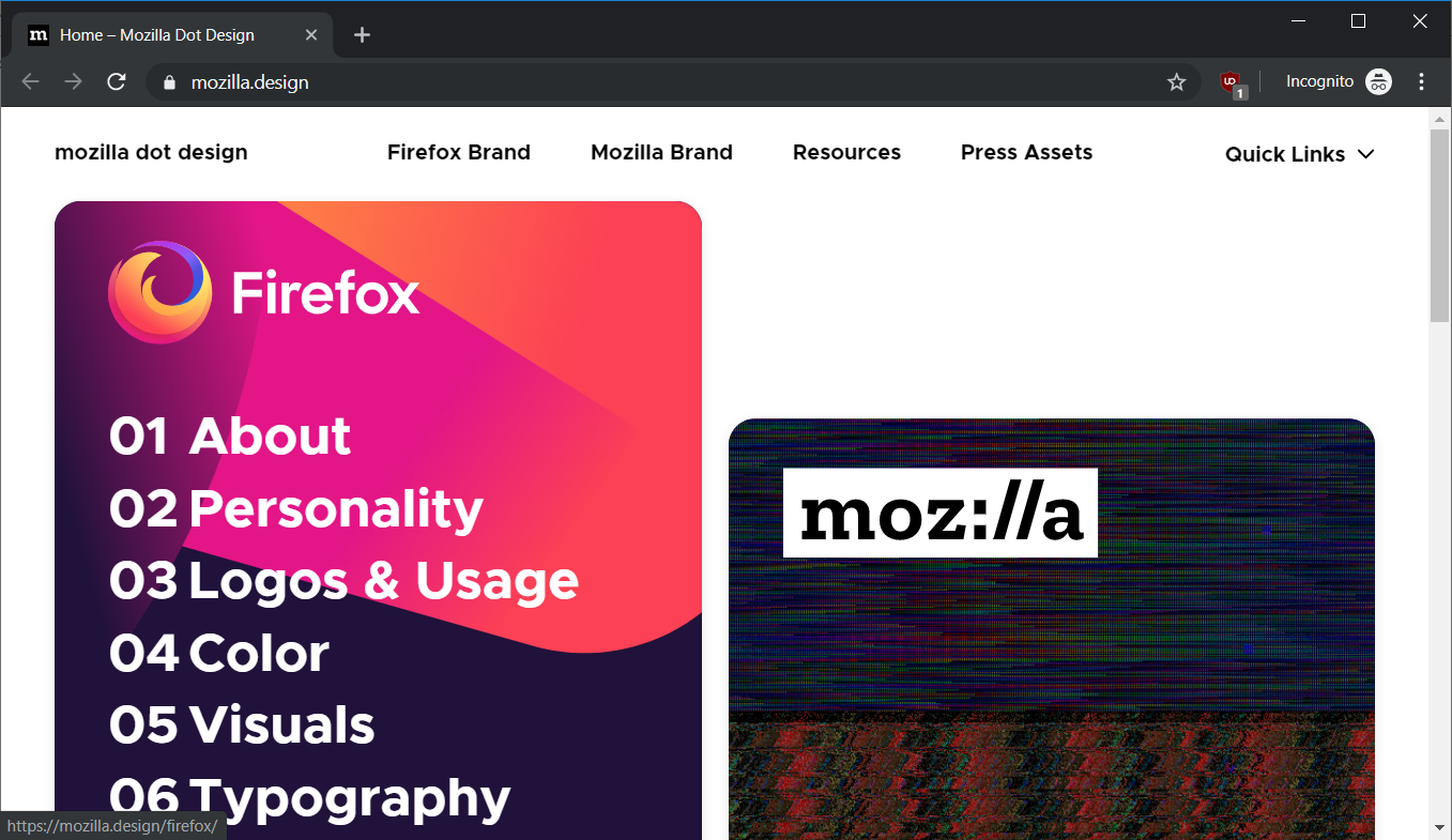
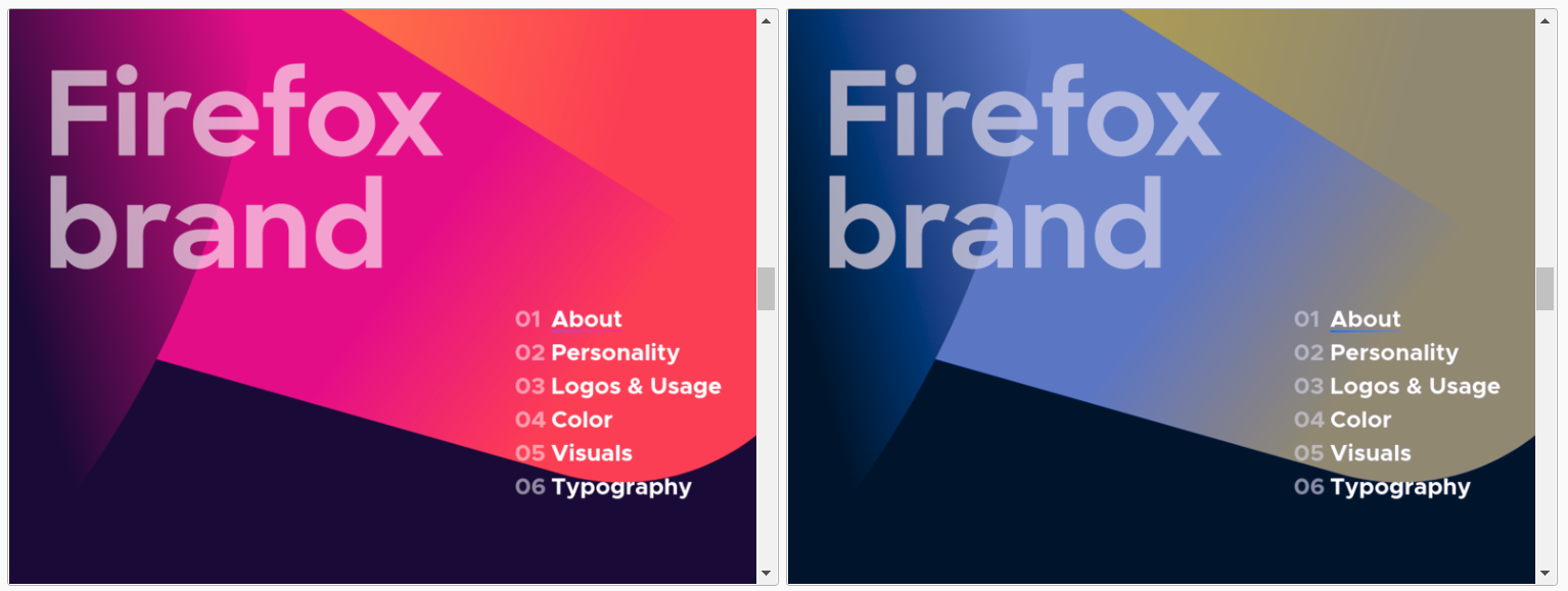
Similarly, many companies develop their own style guides to help ensure a consistent look and feel across platforms and products. These are usually made in conjunction with your design and marketing teams so that your company has a consistent look and brand identity. For example, Mozilla maintains a robust design guide that covers everything from color and visuals to personality and typography:
Accessibility
As this policy toolkit explains, accessibility refers to "the extent to which the product is usable by people with the widest range of capabilities." Buildings or public transportation facilities must often provide accommodations like elevators or wide passageways to be accessible to people with disabilities. Similarly, product managers need to consider the accommodations that may be necessary to serve the needs of users with a wide range of physical, visual, and auditory abilities.
For example, elderly people may have difficulties with fine motor control, so any application that has small buttons or that requires precise movements may be unusable by that group.
Accessibility considerations can have implications for your design choices. For instance, about 10% of the population is color-blind. Will your design still be usable by color-blind users, or does it rely too heavily on color? To illustrate, here's an example from the Firefox design guide of the design choices as seen from a regular point of view and from a red-green color-blind point of view:
Furthermore, users who have low or no vision will be using specialized technology, such as screen readers, to access your content. You will need to work with your engineering team to build your products in a way that integrates flawlessly with these screen readers.
Depending on your industry, some of these accommodations might be mandatory and will need to be incorporated into your product. Even if not currently required, such accommodations may become necessary in the future and are worth planning for. If you design your applications with accessibility considerations in mind, you'll be able to support all users right from the start with little to no impact on your design and development.
Activity 🎯
This activity has two parts.
Part 1
Explore products you use often, and download or visit a few new ones. Find an example of a flow for each of the following:
- Registration/login
- Wizard
- Search
- Onboarding
In your notebook/notion page or other shareable doc, write a short analysis for each of these flows in one of the products you explored. Which of the best practices (such as one clear goal or showing what happens next) are evident? Is there anything that can be improved?
Part 2
Use the accessibility features of your phone as if you had a visual impairment. Turn on your mobile device's screen reader. (Find instructions for how to turn on the accessibility mode here: on iOS and on Android.) Try to post an update to Facebook, Twitter, or some other social network. Attempt to do this without looking at your screen. If you can, record a video of your attempt. Then write up your observations on the experience in your notion page.