8.3 Design Psychology 🎯
This section includes an Activity 🎯
Modern product design is about more than creating buttons and form fields. It's also about the psychological and emotional aspects of humans interacting with technology. In the same way that modern marketing uses messaging and imagery to make products appeal to potential customers, designers can apply their own practices to make their products more engaging and desirable.
In this checkpoint, you will learn about the psychological insights designers apply when creating digital products. You'll also think about ways of applying these insights in your own work.
By the end of this checkpoint, you should be able to do the following:
- Analyze the way digital products apply psychological principles
- Apply concepts from psychology into product decisions and designs
Product psychology
A big part of designing modern products is convincing people that they should continue using your services. In a world with multitudes of old and new products vying for users' attention all the time, it takes something special for an app to stick. Average use stats show that nearly a quarter of all apps are opened and used only once; only around 30% of people who download an app will end up using it more than 10 times.
As a product manager, you'll track conversion rates and monitor your apps' user adoption and user attrition—users leaving or discontinuing use of your app. A few principles from the field of psychology can help you better understand how to design your products to appeal to users and find the magic that will make it stick. Poor use of a psychological principle is not the equivalent of a broken link or missing button. Applying or neglecting to apply product psychology can, in fact, make or break your product. It's that powerful.
Beginner to expert
When using a product, users gradually gain more experience and comfort. They start as beginners, move to an intermediate level of skill, and finally become experts. As a PM, you need to consider the needs of users throughout these stages.
When they start using a product, users are beginners. But this stage is inherently time-limited. Users are beginners for only a little while—long enough to learn the product basics and to decide whether or not the product is right for them. Beginners need education and support to ensure they can achieve their goals, find value, and—as a result—adopt the product.
Most people using your product are intermediates. They know just enough about your product. They're familiar with all the basics, they might know more about one or two parts in particular, and they don't have a strong desire or need to learn more. They often get upset if you make big changes to your product. They're used to the way it is, and they don't want to spend time relearning how things work.
Your expert users are the most advanced and dedicated. They've taken the time to master all the features of your product, often in ways you'd never expect, and they are very passionate about giving feedback to improve the product. Your coworkers are experts on your products, too, so you should heed their feedback the same way you do for that of your top users.
The support a product offers users will depend on where the users are in the cycle of beginner to expert. For example, beginners may rely on toolbars and menus to format and color their text. Intermediate and expert users have taken the time to learn the keyboard shortcuts or have memorized them from repeatedly seeing the keyboard shortcuts in the menu.
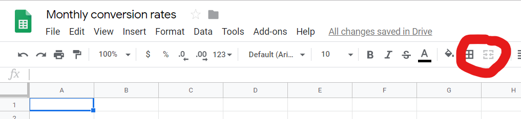
Note how the text formatting options in Google Sheets appear both on the toolbar and in the format menu, thus supporting users of various skill levels:

This is closely related to the concept of flow by Mihaly Csikszentmihalyi. We perform at our best when the difficulty level of a task is just hard enough for our level of skill. It's your job as a PM to ensure that your users learn what they need to know at the right time to have the best experience. Making your product too simple or too difficult at the wrong point in time could ruin your users' experience and cause them to abandon the product.
The feedback you'll receive from these different groups may pose challenges. For example, a beginner may be upset that learning how to use the filtering options in Google Sheets is really hard. An expert may complain that there aren't enough filtering options for their needs. Whose feedback do you value more? How do you prioritize these requests?
Laws of UX
Understanding these 19 Psychological Principles will help you in your PM career
Hick's Law
Hick's Law simply states that people have a harder time making decisions as the number of items they can choose from increases. In products, you'll have more and more features that you'll need to organize and make available to users. Showing all of these features at once would be overwhelming to the user. So how can you balance functionality with usability?
One way you can interpret Hick’s Law is to keep your designs as simple as possible so as not to overwhelm your users with choices. Reduce the number of items you make visible, and use size, proximity, and other visual emphasis cues to draw your users' attention to the right places. For example, compare the toolbars in Microsoft Excel and Google Sheets. How are they grouped together? Which features are emphasized over others?
Here is the toolbar for Google Sheets:

And here is the toolbar for Excel:

Cognitive load
As intelligent as humans are, our attention is very limited. In general, we can focus on one task at a time, and we handle interruptions very poorly. We become overwhelmed with too many choices (see Hick's Law), and we struggle when we don't have enough information. The concept of cognitive load refers to these limited cognitive resources—the more we need to think about, the higher the cognitive load of the task.
Overall, any amount of additional cognitive load will negatively affect your users. Products don't always pay attention to that. Confusing error messages and too many distracting notifications are two examples of what can keep users away from the real work that they need to do. It's just too much sometimes.
As a best practice, your product should help people manage their cognitive load by reducing the amount of information needed or by ensuring that the information is designed in a minimal way. This applies to interactions like notifications, error messages, pop-ups, or anything that can distract someone from their core tasks. Always ask yourself: are you interrupting the user with the interaction? Are you providing just what they need and nothing more? Is it easy for a user to get back to where they were before you interrupted? Is the interruption necessary?
Chunking and spacial memory
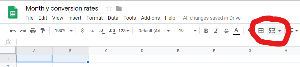
When users interact with an app or website, they are likely to remember it as a visual snapshot of where features are or are likely to be. This is why it's important to keep groups of similar elements together. For example, if a user knows where the text formatting tools are in the toolbar but can't remember exactly how to change the format to subtext, they could just look near the other formatting tools and will probably find it. Imagine the confusion of your users if the subtext option was hidden under the Help menu. (Note the importance of great information architecture.)
You can take advantage of this tendency for spacial memory by keeping the locations of items consistent and by grouping them together where applicable. This is also why it's useful to keep items visible but disabled when they don't apply in an immediate context. Doing this will help users remember the items' location better. Note how the Merge Fields toolbar button is disabled when only one cell is selected but is enabled when two or more cells are selected:
Familiarity (Jakob's Law)
Jakob's Law (as in Jakob Nielsen, who was discussed before in the context of heuristic evaluations) says that people like tech products that work like products they already know. This is why e-commerce sites all look and feel very similar—they want you focused on finding the right product, not relearning how to browse a website. When the next e-commerce site works for the user just like the last one they used, the user can focus on their shopping.
There are good reasons for breaking this rule, primarily if your new design is much better and is very easy to learn. A great example of this is seen in this video where Steve Jobs demonstrates how to unlock the original iPhone. Using a touchscreen like that was completely original at the time, so it was unfamiliar to people. But it was trivial to learn, so it quickly became familiar. Again, think about the training that people need to be successful when using your app.
Mental models
A mental model is the way in which users internalize how an app or experience works. But users' beliefs about how your product works may not match up with the reality of it. For example, many products have autosave to record work along the way in case there's a crash or other failure. A user may still manually save their document every few minutes because of one bad experience they had with a different autosaving app that failed them years ago. In this case, the user's mental model is of manual saving, even while your product is employing the autosave function.
Users have many gaps and misconceptions in their mental models. They may confuse which features are in your app and which are in the browser or operating system. Or they may misunderstand which pieces of app data are stored locally and which are saved in the cloud. Some differences don't matter, but others could be significant enough to impair someone's use of your app. For example, a user may think their Gmail documents are only available locally, while cloud saving is a key feature of Gmail.
The best ways to address gaps in mental models are to either improve your app's education and training flow or change your app to conform to users' expectations better. If you're unsure what mental models your users are working with, a usability test is a good way to uncover these insights. You will learn more about this kind of test in one of the lessons ahead.
Color
Color can make big and small differences in your application. There's a famous story that Google once tested 40 different variations of blue to see which one would encourage users to click the links the most. It might have only increased clicks a tiny fraction of a percent, but at Google's scale, that's still a huge number. The lesson is that you should always choose appropriate colors for elements to indicate their purpose. Hyperlinks, for example, are recognizable because of their color.
But, psychologically speaking, color is not a neutral element. Color has important meaning in specific contexts and cultures. For example, red in the US and Europe generally signifies a warning or urgent request. In China, however, red is generally seen as positive, representing happiness and fortune. If your big, red "Purchase now" button isn't getting clicks, cultural perceptions of color could be a cause. Always test your designs to make sure that the colors are perceived in the intended way in all your markets.
Loss aversion
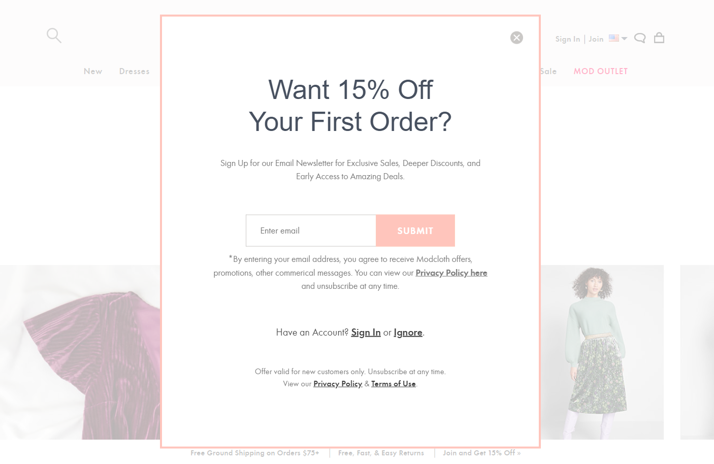
Humans have an aversion to losing what they already have. Losses feel twice as impactful as equivalent gains, so telling your users that they can "Save $20" with a coupon may be less effective than a message of "Don't lose your $20 discount." This is also why you see so many e-commerce sites offer users a coupon if they look like they're going to leave—people don't want to lose their opportunity to get a discount like this from ModCloth:
Loss aversion also plays into the decision of whether or not to stick with or leave a product. For example, a user might have put dozens of hours into creating and curating their Instagram feed but is now overwhelmed with the daily commitment and is thinking of quitting. In this case, the sunk costs—the amount of effort, time, or money already invested—act as a barrier, making users hesitant to lose their investment. Understanding these mental processes allows you to come up with the right messaging to prevent user attrition.
Gambling
Many products are built on the psychological principle of novelty: promising something new and different will happen when a user enters the product daily. This is largely a negative pattern—simply trying to get your users addicted to the cycle of checking for something new. Besides the always-new content in social media apps and news sites, you see this play out in games with features like daily quests or randomized rewards. They're trying to keep users hooked by creating strong loops of behavior—checking for rewards, getting rewards, waiting for the next reward.
These habits and loops can be a positive force when used for good, as in the example of keeping someone regularly exercising via a fitness tracker and motivational platform. On the other hand, this psychological tool can be a negative force when it's used just to keep users going through the motions of the daily use of an app. Be careful with these kinds of designs—they can create problems for your users as much as they can solve problems for you.
Social proof
One of the main ways you learn about products is from other people who recommend them. This is because of the power of what's called social proof. Humans are social animals and tend to be influenced by the attitudes and actions of their friends or community members (people who are like them). It's likely you started using Facebook or Instagram because a friend told you about it, and you continue to use it because other friends do. If all your friends left a social network, there's a good chance you would too. Many product pages feature typical users using the product; it's a way of creating that sense of social validation to push additional users to take action.
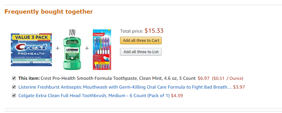
This psychological principle is also at work in e-commerce—evident in the "people who bought X also bought Y" portions of those sites. You bought a tube of toothpaste and—check it out—other people also bought new toothbrushes and mouthwash. I should get those, too!
Status quo bias
People don't like making decisions—they are difficult and often unsatisfying—so when given a choice between changing something or staying the same, people often stick with what they know. In other words, people have a bias towards the status quo—the way things are—because change always brings some level of difficulty and doubt.
Many businesses use this psychological principle when trying to get users hooked on their products. They try to create lock-in—locking users into their panoply of proprietary services (their ecosystem, if you remember), making it very difficult to leave or change purchasing and usage habits. Not only is there a heavy price to pay in money, time, or effort to move off those services, but psychologically it is also more satisfying to just stick to what you know rather than face the fear of change.
Applying psychological design
How can you apply some of these psychological principles to design more effective products? First, think about the goal you want to accomplish. For example, maybe you want to increase your conversion rate for new registrants. Using tactics like social proofs in your product information or using language that will trigger loss aversion can help get people through a sign-up process they might not complete without that additional nudge. You could even combine the two principles—let your current users invite others to use your app (social proof) and offer both current and new users a reward when the new person signs up (rewards or loss aversion).
Check this video out
Facebook used many of these principles as they grew and developed their product:
- Facebook began as a product just for university students. It leveraged social proof as the main means of growth—you signed up for Facebook because your friends did too.
- Facebook uses random rewards to keep you hooked to the app—frequent updates from your friends, notifications to inform you about interesting content, and the ability to create conversations to keep you coming back.
- There are few alternatives (to Facebook) that are used by as many people. This keeps you hooked—even if you want to leave, you know so many people, groups, and businesses who continue to use Facebook that it's hard to leave it behind.
Some of these aspects may have been intentionally designed, while others were simply a side effect of other decisions made by the creators of Facebook. Regardless, the psychological impact of these decisions can be seen every time you use Facebook. Simply being aware of it can help you overcome these effects or help you design better experiences yourself.
Ethics of psychological design
An understanding of human psychology can be used for good or bad purposes. And sometimes you may create something with the best intention, but end up having a negative psychological impact on your users. For example, many mobile games depend on whales who provide the majority of revenue for those companies in return for randomized rewards. Those apps capitalize on the gambling tendencies of individuals, which can present ethical dilemmas.
You'll learn more about the ethical issues of product development in a future checkpoint. For now, keep in mind that you should try to use psychological principles in a way that creates positive outcomes for users.
Activity 🎯
This activity has two parts.
Part 1
Review the list of products below. For each product, analyze which psychological principles are at work. Write up a short paragraph on each product, describing the psychological principles it uses, how it uses them, and which one is most important:
- Twitter (Now X.com)
- A voice-activated assistant (Alexa/Siri/Google Assistant, etc.)
- Spotify
- Amazon Prime
- Any Wikipedia article
Part 2
If you were going to design the products listed below, what psychological aspects would you want to focus on? What are some ideas of features that apply these concepts?
- Referrals for dog walkers
- Home cleaning on demand
- A travel service that creates cheap flight and hotel bookings based on your needs
Write these answers in your notion page.