8.4 Sketching & Wireframing
In order to create engaging products, you will need to lead your team in the planning of all the detailed interactions that your users will experience. But great interaction designs don't come on the first try. You might go through a dozen iterations before settling on the details of the designs that you will eventually build.
In much the same way that MVPs are used to test out product hypotheses, designers use sketches and wireframes to help test design concepts. In this checkpoint, you will learn how to use these techniques to quickly express and test design concepts.
By the end of this checkpoint, you should be able to do the following:
- Explain the purpose of sketching and wireframing
- Practice creating wireframes and sketches of existing products
Why sketch and wireframe?
Sketches and wireframes help quickly test out design ideas. They take much less time and effort to create than a pixel-perfect image or a functioning prototype with interactions and animations. These low-fidelity designs (also known as lo-fi) are less detailed versions of the final designs. They may include only some of the key design and content elements, and their interactivity might be limited—perhaps even achieved, for example, by a person flipping a paper prototype to the right page after a user "clicks" a button.
Sketching out or wireframing a design helps preview what a final design might look like when complete. A lot can change during the design and product discovery process. Low-fidelity tools allow you to easily make changes to design, iterate, and adapt as you test out ideas.
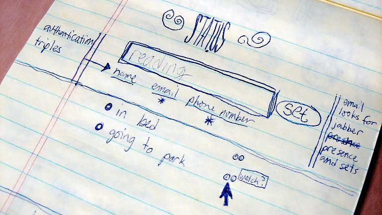
You may recall from the MVP checkpoint this 2006 sketch of Twitter by Jack Dorsey:
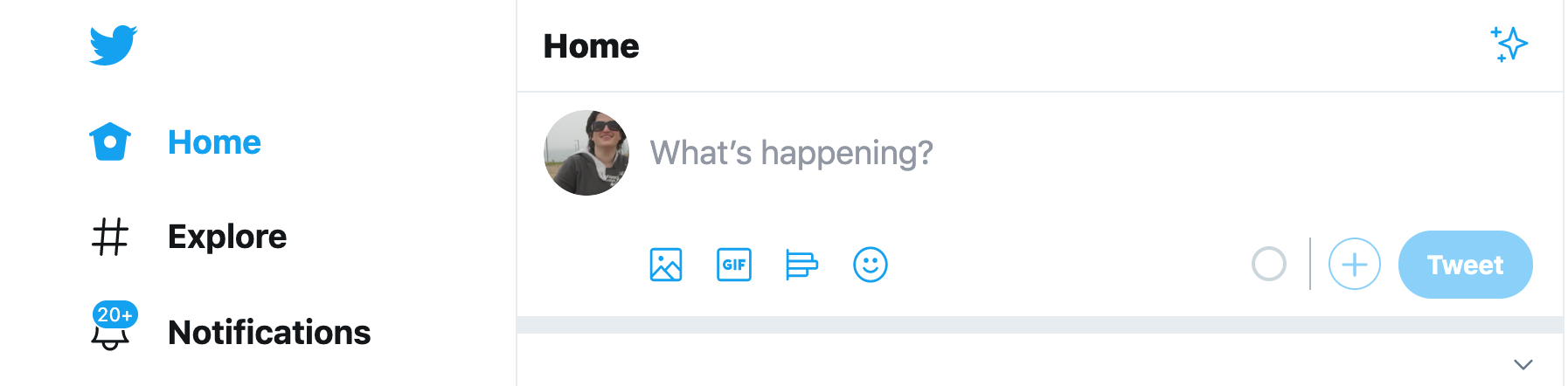
What starts as a rough sketch of a web page structure eventually becomes a product:
In a way, sketches and wireframes are a form of MVP—put them in front of users quickly and often to see what works and what doesn't work, even if they're not completely fleshed out. Today's modern wireframing tools make it easy to create interactive prototypes right from your wireframes, so you can test how your users interact with your product without investing in any engineering work. That's quite an advantage.
Sketching
A sketch is simply a hand-drawn version of a digital product. It's as simple a design as you can create—just outlining the most important elements of a page so that you can see its basic structure. For example, a very naive sketch of the Google mobile home page may look something like this:
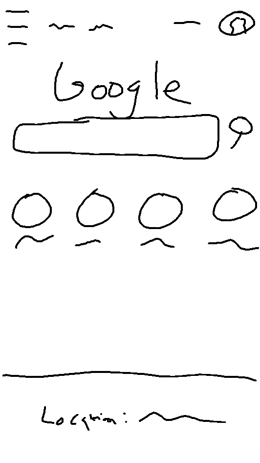
It seems simple enough to do—just start drawing what a page might look like. But keep in mind that sketching is meant to be a tool for rapid exploration. That means your designs should focus on just the key interactions. It's okay if some of the details are missing or ambiguous—it's better to go fast. Your lines can be wiggly, you can ignore text details, and you can even leave out trivial parts of the interaction. A sketch should be messy, but the most important components of the page should be obvious.
Sketching as brainstorming
Because it's fast, cheap, and easy, sketching makes a great activity if you're trying to generate ideas from your peers. For example, maybe you're considering an easier way for people to report objectionable content in Yelp reviews. Gather a few people, have each one sketch and present their ideal solution, and leave with several great ideas after a short time investment.
The sketching participants will love having their input heard, and they'll be more likely to support your final decision if they've had a chance to participate in the process. People tend to think of solutions as features—"Oh, there should be a button right here that reports the post"—so getting them to sketch out their ideas is an effective way to explain their ideas.
The best way to approach this process is to set up a meeting and inform attendees what you'll be sketching about. Usually, you will focus on a new feature or a redesigned one. Give your attendees the prompt a couple of days in advance so they can come up with good ideas.
At the meeting itself, make sure there are sketch materials for everyone—sheets of paper and pens and pencils. Give everyone the prompt again, and provide any other context they might need. Give everyone five minutes to sketch out their idea. Remind them that it doesn't need to be pretty, just clear enough so they can explain it to someone else.
Have each person pitch their idea sketch for 1-2 minutes, and follow each pitch with a short discussion (2-3 minutes). Only constructive feedback is welcome at this point. If you don't like something, just stay quiet. Thank your participants, and explain how you will continue working on this problem and communicating with them on the results.
After the meeting, you can pick and choose among the best ideas. Often, mixing and matching elements from several pitches could lead to the best solutions. If there were no clear winners, you could try running the sketch session again with new people.
Wireframing
A wireframe is the next step up from a sketch—a more realistic rendition of what a page or digital experience would look like. Wireframes are still abstract and might use filler text, such as lorem ipsum instead of actual information, but they reduce the amount of imagination you have to use when evaluating options. Not everyone can look at a sketch and imagine the actual experience; it's a lot easier to do that with a wireframe instead.
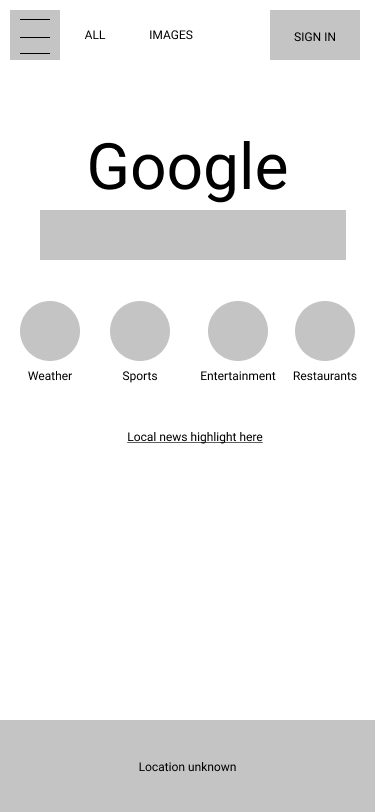
Turned into a wireframe, the sketch of the Google mobile home page from earlier will look something like this:
When you're sure you're on the right track to building a feature, it's a good idea to start working through the wireframes. In particular, wireframes are good for assessing the details of your designs—making sure everything will fit, identifying potential problems in how elements interact, and verifying the feasibility of your designs with your developers. If your wireframes are good enough, your developers could even use them as a template when they start building the feature.
Creating a wireframe
Many modern tools make it easy for users with varying skill level to create wireframes. Popular wireframing and design tools include Sketch, Axure, and Balsamiq. In a pinch, you could use Google Drawings or even Microsoft Powerpoint as a wireframing tool.
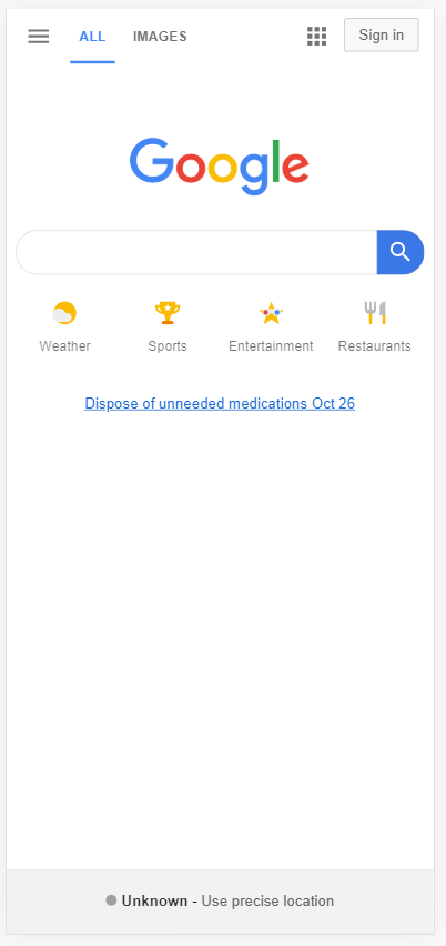
For the purpose of this checkpoint, you will recreate the Google home page on iPhone using Figma—a popular collaborative tool for creating and testing wireframes. This is the page that you will be wireframing (scroll back up to review it as need be):
First, go to Figma and sign up for a free account. You can then go through the built-in tour. It will cover some of the basics and end up on a new drawing.
Watch the video below to get started with wireframing in Figma.
Follow along with the actions in the video, adding page components until your wireframe starts to look recognizable as the Google Search page. Use components to keep things organized. If you make a mistake, it's easy to delete any unneeded shapes or undo an action. You can also quickly hide a shape by clicking the eye 👁️ icon when hovering over the item in the layers list. It will turn the shape invisible and make it easy to imagine the page without it.
And that's it—you've made a wireframe! You can go the extra mile and use better colors or images instead of the filled-in grayscale shapes, but keep in mind that wireframes are meant to be quick and easy. Once you have the design details figured out, you will be able to start work on higher-fidelity mockups, with all the bells and whistles.
Mockups
A mockup is a generic term for any sketched or wireframed UX, but it most often refers to a high-fidelity (or hi-fi) design of a web page or mobile app. While wireframes and sketches are mostly intended to communicate layouts and hierarchy, hi-fi mockups communicate the design details—all of them.
At first glance, the hi-fi mockup should be visually indistinguishable from the final version. These are the blueprints your developers will use as the basis for the products they build.
Many hi-fi mockups are pixel-perfect—that is, they match the final version pixel for pixel. That makes it easier for your developers since they can focus on exactly reproducing the mockup rather than interpreting it or making time-consuming guesses—and often mistakes—in adapting the mockup to the real thing.
The design process
In general, a project will use some combination of sketches, wireframes, or mockups during the design phase, and usually in that order. It helps to start with low-fidelity versions first since they're fast and easy to produce. Once there's enough agreement about the sketches, your designer can work on wireframes and—eventually—final mockups.
A mature UX team will have a library of assets they can use in their wireframes and mockups, which will make designing new features easier. Many design teams build and iterate on a single set of designs that evolve in step with the product as a whole.
In practice, most teams have very ad hoc methods of incorporating these design tools in the product process. Since you'll be the manager running these projects, you can work with the design and engineering teams to decide on a standard way for the design team to deliver their final designs to the engineering team. It may vary a bit from project to project, but having some process in place is better than having none.
Practice ✍️
Learn how to wireframe and sketch by trying it out on your favorite websites. Start by reviewing the home page of your favorite website or app. Then do the following:
- Build a wireframe of it in Figma (or a similar app).
- Sketch a redesign of that page (pen and paper), then take a photo of that sketch. Ask yourself: if I were going to keep the same functions but design it differently, how would I do it?
- Create a wireframe of your redesigned sketch in Figma (or a similar app).
- Paste the images of all your wireframes and sketches into your notebook/notion page or a shareable doc.
You can practice describing your process to a peer or your mentor and asking for feedback. Make sure you link design decisions back to your user experience.