8.6 Forms 🎯
This section includes an Activity 🎯
Forms are some of the most common interactive elements you'll lead your team in creating as a product manager. Even though you might think forms are pretty trivial and boring, they are, in fact, some of the most complex pieces of user experience design that you can create.
Badly designed forms can frustrate users and increase the abandonment rate. Applying the best practices you will learn about in this checkpoint will ensure your forms are clear and effective. When users are able and motivated to complete your forms, your products will be successful as a result.
By the end of this checkpoint, you should be able to do the following:
- Explain the importance of forms in various products
- Design a sample form for a product
Forms best practices
Forms are everywhere. From the search box on Google to the status box on Facebook to enrollment at PMcademy, you constantly encounter forms in digital products. They're probably the most common interactive design element you use. You might not be conscious about what goes into designing a good form; most of us stumble through those fields unconsciously. But as you make the switch from consumer of digital products to creator, it is essential to be familiar with best practices in creating and designing forms. Here are a few.
Ask for a few, relevant items
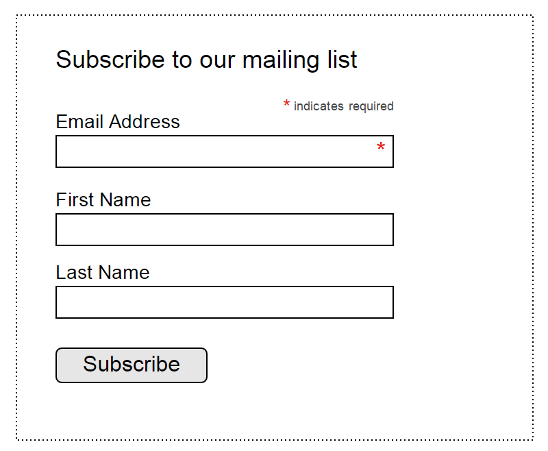
You should ask for as little information as you can at any point in time. For example, if you have a sign-up for a newsletter, all you really need is someone's email address. Asking for their email address and birthdate may cause people to abandon your form. Ask only for what's appropriate and expected on a given page. A lower-than-expected conversion rate is often the result of a field that's been included that doesn't make sense, confuses users, or makes them give up.
Pre-fill if you can
Pre-fill whatever you can. If you have a logged-in user on your e-commerce site making their second order, you should already know their address and possibly even billing information. Don't make them type this info again in the checkout form. The less work your users have to do, the more likely they'll be to finish filling out your form.
Many browsers support pre-fill based on data that the browser saved, like logins, payment info, and addresses. Make sure to use the right technical conventions that allow browsers to identify and pre-fill these fields in your forms. Work with your engineering team to support these technical best practices and ensure a smooth experience for your users.
One way to combine pre-filling with asking for fewer items is to use progressive disclosure. On their first visit, ask users for only a few pieces of information. When they come back, ask them for a couple more, then a couple more the next time, and so on. In this way, you can collect lots of information from your users without discouraging them from filling out your endless forms.
Use focus on desktop and mobile
Focus in technology is the action of interacting with a specific element on a page. For example, when you click on the search bar in your browser, that bar now has focus, and anything you type will go into that bar (and not in any other input fields on your page).
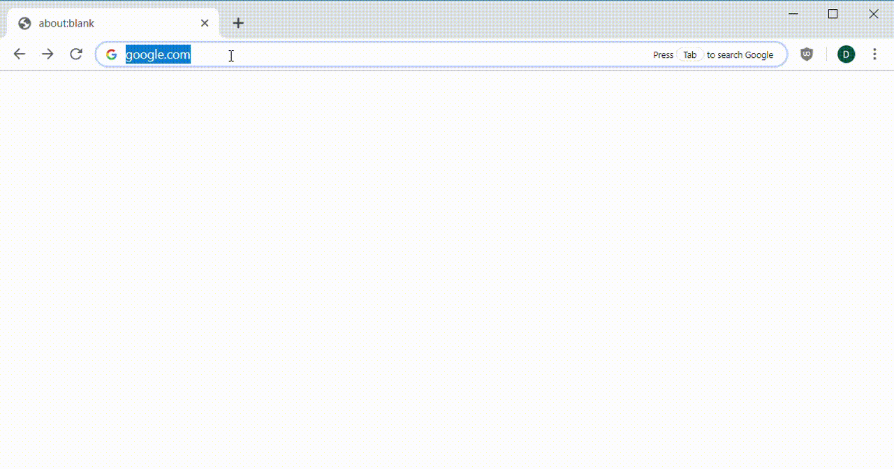
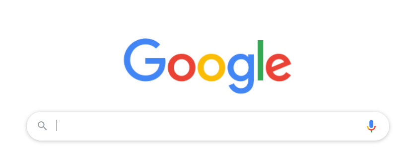
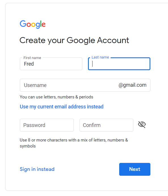
On desktop, if your page has a single form, which is the main interactive element on that page, give that element focus by default. You can see this behavior in action on Google—after the page loads, any text you type goes right into the search box even though you didn't click on it. Note how the cursor is blinking in the search box showing that it has focus:
Keep in mind that this is a best practice only for desktop. On mobile, giving an input form focus by default will trigger the keyboard pop-up, which makes for a jarring user experience. Instead, make sure that the field receiving input is always visible above the keyboard. Mobile users should always be able to see which field has focus in their screen.
Paginate long forms
In some situations, forms will need to be really long, like when completing tax forms online, signing up to be an Uber driver, or listing a car for sale on Carvana. It's tempting to just make it one really big form that is easy to build. But that won't lead to the best user experience. It's hard to keep track of so many answers at once, layouts get complicated with columns of form fields, error messages pop up all over the place, and computers may crash while a user is filling it out.
Instead, paginate your form so that people fill out only a small part of the whole thing at a time. Don't use multiple columns of form fields, make sure to save whatever the user filled in at every step, and let them go back and forward through the pages as needed. This will help users get through all the fields that you need them to complete.
Notice how in the sign-up form below, each page only asks for one piece of information at a time. This is a very simple example, but even with just two or three fields per page, this form wizard is easy to understand and quick to complete:
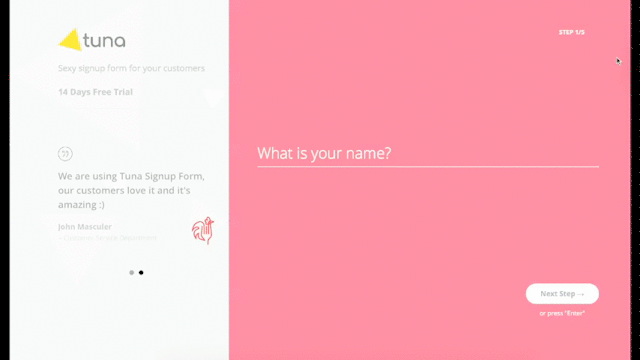
Image source: Tuna Form Wizard
Error validation and prevention
Some fields in your forms will need specifically formatted data or will require extra checks to make sure the information submitted is appropriate. Some checks can be done in the app or browser—like making sure a phone number is only digits or an email address is properly formatted. If the form catches a user's error, make sure to indicate the error and make clear what needs to happen to correct it. The best practice is to indicate this as soon as you detect it—even before submission.
It's better to catch these errors before a user submits the form because it can be hard to find the location of an error among a dozen form fields. Besides error checking, one way to reduce errors is to use a pulldown of values where appropriate—like when selecting the name of the state in a shipping address field. That way, you'll know you're getting the right value, and you don't have to worry about silly rules for formatting state names.
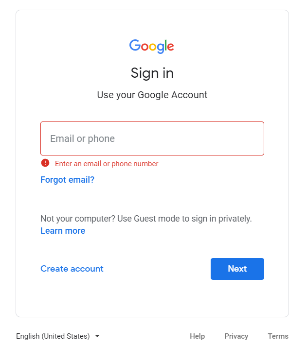
Note how Google's sign-in form (above) clearly indicates what the error is and how to fix it, using red frames, red text, and a warning symbol.
Field size = expected input
The size of your fields is an indication to the user of how long you expect that field's answer will be. A zip code field only needs to be long enough to store 5 to 10 characters, while a street address field might need a hundred or more characters. This should be enforced in your form's error checking. You can use the size of the field to hint at what you're expecting.
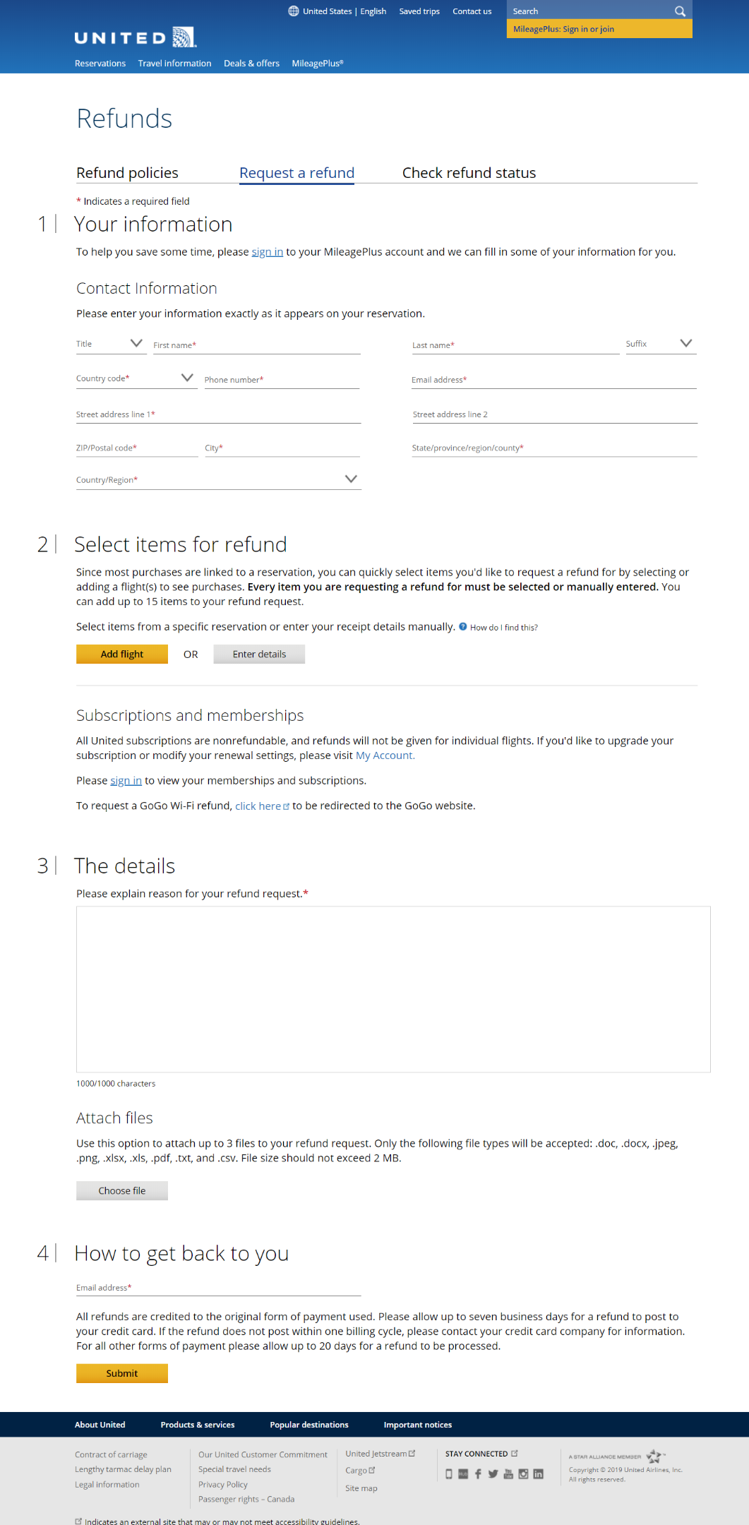
Imagine you're creating a form for requesting refunds for United. How long should you make the box where the customer enters the description of their support issue? What other pieces of information should they provide? And how much space should each field take up?
Take a moment to make these decisions, then scroll to the image below to see how your guesses match up to United's site:
Use appropriate labels
One of the most challenging things about filling out a form is figuring out what information needs to go into each field. Your goal in designing a form is to reduce that tension for your users. Each field should have a label that clearly indicates what's expected in that space. If the field needs special formatting, like a phone number or email address, make sure to provide explicit messaging to show which field needs what formatting.
A label that might seem obvious could actually be confusing to your users. For instance, if you have a field for an email address on a site, should it be a personal email address? A business one? A throwaway account? Something else? Be as specific as can be because you won't be there to answer your users' questions when they're filling out the form.
The exchange
Users don't fill out forms just for fun; they're filling it out to get something. You always need to explain what the person filling out the form is getting in exchange for their effort. Sometimes this is easily understood, like when a user is finishing a checkout process on an e-commerce site. But, even then, you should make it easy for the buyer to confirm what they're paying for.
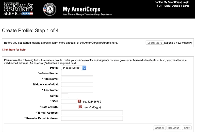
It's important to make sure you're explicit about what's going to happen with their data and what happens after the form is completed. This is especially important if you're asking for sensitive information, like a birthdate or SSN. Maybe you are asking for a birthdate when users are signing up for a loyalty program so that you can give them a special discount on their birthday. But if the user doesn't have confidence in why they are filling it out, they may be reluctant to provide the information.
Be clear about why users are asked to provide specific information and what will be done with it. Many forms use expandable question mark symbols placed near specific fields a user can click on to see an explanation of why that information is needed. See an example of this on an application to join Americorps. The SSN and DOB fields have question mark symbols next to them, which, when clicked, open up a new tab with related information:
Form fields and how to use them
There are only a few conventional form field types, and you need to be familiar with them and understand which to use when. Below, find a rundown of the most common field types.
Text
A text field is any blank space where you expect a user to type in a response. This could be for something short like a zip code or something long like an explanation for why you had to cancel your trip.
Text fields can be free-form, like when a customer is providing their cancellation explanation. Or they can be restricted to a certain kind of input, like credit card numbers or an email address. And, as discussed earlier, they can have different sizes and lengths to accommodate and indicate whatever you want entered.
Pulldown/drop-down
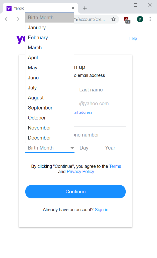
A pulldown field (sometimes referred to as a drop-down) is a place where users choose from among specific options. These are often used in cases where text input could be ambiguous, and the developers want the answer in a specific format.
Months in dates are a good example of this. If the area is left as a text field, the answers can be entered in many different ways—a user may enter August, Aug, AUG, 8, or 08. Each is valid, but it's easier for developers to handle just one type of answer. That's why dates are often presented in a pulldown field in forms; it's easier for both users and developers.
Pulldowns can become unwieldy once there are too many options because users then have to scroll and find the one option among many. Keep them to a reasonable length and sort them appropriately (dates by time, others alphabetically). And if they are especially long, add filtering to make it easier for users to find what they're looking for.
Radio buttons
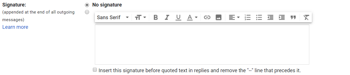
A radio button is similar to a pulldown in allowing users to choose one value from a given set of options. The difference is that all the values are visible at once without clicking to "pull down" the list. This is most common when there is a small, fixed set of values for a field. Once the list of values gets too long (six or more options), you should use a pulldown instead.
You generally shouldn't use radio buttons if it's a yes–no option—that's what checkboxes are for. The exception is when you're choosing incongruent options, like whether or not to add your signature in Gmail. One option is to not use a signature; the other is to choose the signature to use:
Checkbox
A checkbox is a simple yes-or-no control on a form. If filled in, it means yes, otherwise, it's no. When trying to decide between a checkbox or radio buttons for an option, ask this: is the choice a simple yes–no choice? If so, a checkbox is fine. If not, use radio buttons. If you're unsure, using radio buttons is usually better than a checkbox.
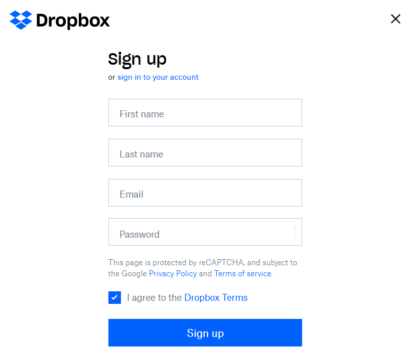
The Dropbox sign-up form uses text fields and a single checkbox to confirm that users agree to the terms of service:
Dates
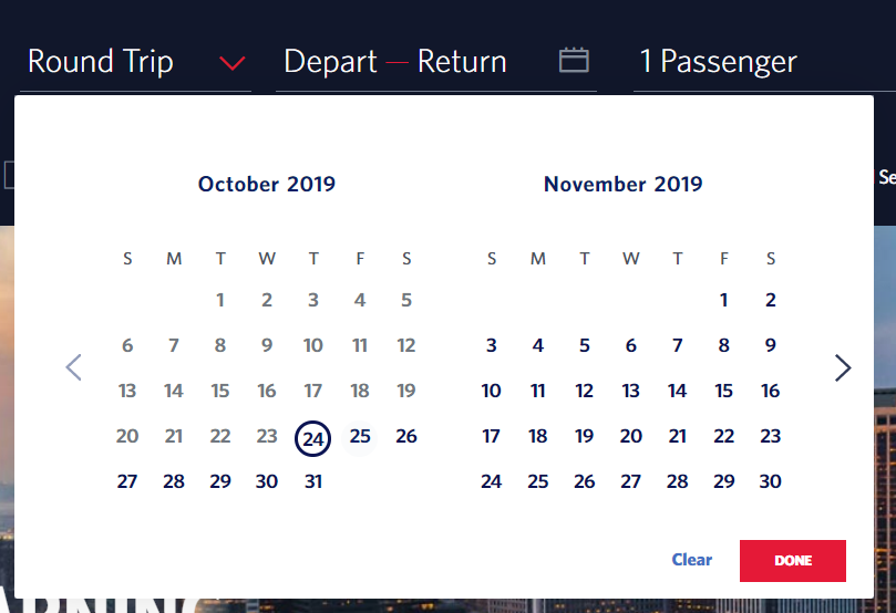
Many forms use a date selector, like the one below from Delta, where users can choose their travel dates while purchasing airline tickets. Most forms use a calendar UI for selecting dates because it's easier for the developers to program those over a free-form date entry field:
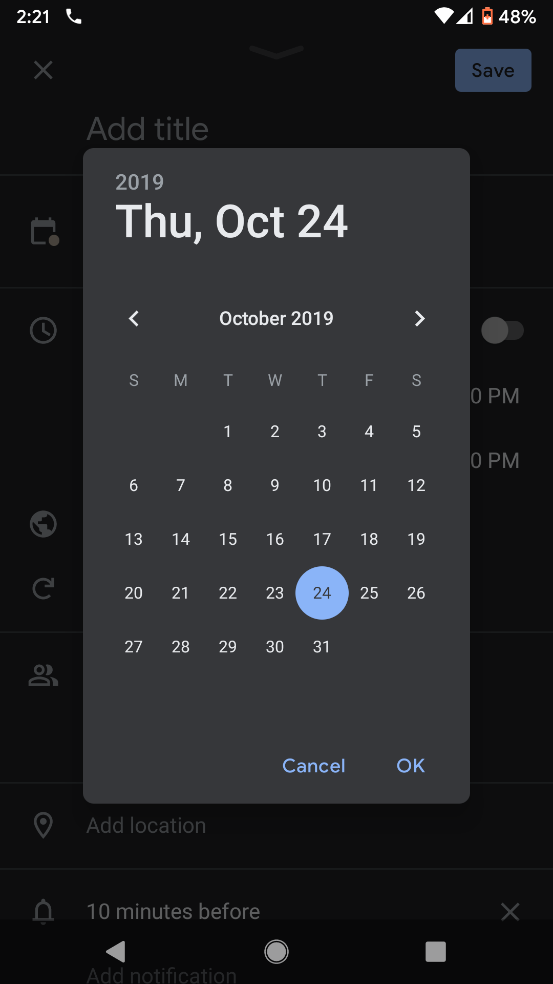
Android and iOS devices have built-in interfaces for date selection. If you're building applications on those platforms, you should use those:
Select and multi-select
A select list is one where users see all the options listed out and can click directly on the option they like. These lists often let users select multiple options at once by holding down the Control or Command key while choosing—a multi-select list. This is an anti-pattern, and you should avoid it. Pulldown lists are generally better for choosing one of multiple items. And if you need to offer multiple selections, you can use multiple pulldowns or a list of checkboxes.
Form formatting and alignment
While there are lots of ways to format the fields, labels, and error messages on your forms, a few best practices will go a long way toward making your forms easier to fill out.
Labels
Place labels in a consistent position for all fields. If you want to place the label inside the field, make sure that you move it to an appropriate place if it has focus or is filled in. See the Google sign-up form below as an example. Blank fields have the label in the input box. When filled in or focused, the labels are on top of the field:
Field labels should be directly above, beside, or inside the fields they are labeling. It's more common these days to see labels inside or above the fields because it saves space on small mobile screens.
Columns
Use one main column for your form. It's acceptable to put some fields side by side if it makes sense, like with first and last name or birthdate fields. But it's not acceptable to have one column for your name and contact info and a separate column for your address. Users have a hard time keeping track of all the fields to fill out when they're spread out over a page. Enforce a top-to-bottom order through good interface design:
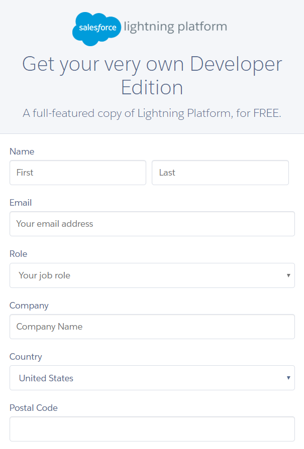
The Salesforce developer form above has lots of fields stacked vertically for easy filling in. Note that all the fields are the full width, which gives the form a consistent look and feel.
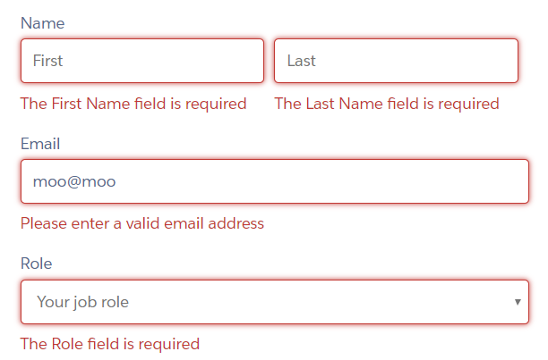
Make the error states obvious
To reiterate, make sure error states are easy to spot and correct. Below are a few blank fields and a bad email address in the Salesforce developer sign-up form. It's pretty clear why those errors are showing up and what a user needs to do to fix it. The use of the color red helps emphasize the fields that need correcting:
Activity 🎯
Create a wireframe of a registration form for a new alcohol delivery app for a mobile device. First, come up with a list of the data that the registration form should collect. Then create the wireframe in an empty state and in an error state. Use Figma or your favorite sketching app.
Before you submit, evaluate your own work using these criteria:
- Did you only request the information that is absolutely necessary?
- Is every field clearly labeled?
- Did you think of ways to encourage users to complete the form? (Hint: It's never engaging to have one long list to fill out.)
- For the error states, which fields need error states? What message should appear if there's an error for that field?
Add the links to your wireframes in a your notion doc