8.5 Mobile vs Desktop ⭐
This section includes a mandatory Assignment ⭐
For a long time in computing history, desktops and laptops were the only platforms. When you were designing experiences for them, you could make reasonable assumptions about the speed of their processing, the resolution of their screen, the use of a keyboard and mouse, and other details that would dictate the user experience.
When mobile devices came along, everything that applied to designing applications had to be reinvented. People interact with their phones very differently than they do with their laptops or desktops—holding it in their hand rather than interacting with it on a table, using their fingers on a touch screen rather than using a keyboard and mouse. There are also differences in speed, power, and other variables. And these interactions keep evolving, with recent editions like the swipe movement or hand-free motion gestures.
These differences between platforms are very important to understand when designing experiences. The design techniques that help create great desktop experiences may not work if you bring them to a mobile phone, and vice versa. In this checkpoint, you will focus on understanding the different constraints and best practices of different devices.
By the end of this checkpoint, you should be able to do the following:
- Explain and apply design best practices and constraints for desktop and mobile
Why mobile versus desktop matters
As a product manager designing interfaces, you'll need to think about how your users' experience differs on desktop and mobile devices. In some product management jobs, you'll manage a set of features across a variety of platforms—mobile web, mobile app, desktop web, and desktop app—and you'll have to make decisions about how those should stay similar or differ.
In other jobs, you might be responsible for only a single platform, like all the features in the Android version of your app. You'll work with other product managers to keep your features in sync with each other, and you may have to change your designs or features to accommodate features only available on one platform but not on another.
Even if you only manage a website, you need to consider how mobile and desktop browsers will have different experiences. Mobile devices are slower and less powerful than desktops or laptops. Data use is also a big concern for mobile; you don't want to overtax someone's data plans, or your app will get quickly uninstalled.
Understanding the specific considerations of mobile versus desktop is a big part of being knowledgable about technology and being able to make sound product decisions.
Mobile (hands and fingers)
When designing interactive elements on mobile devices, remember that they need to be sized appropriately so that you can manipulate them with your thumbs and fingers. Make them too small and people won't be able to hit them exactly; make them too large and they'll take over the screen, leaving little room for anything else.
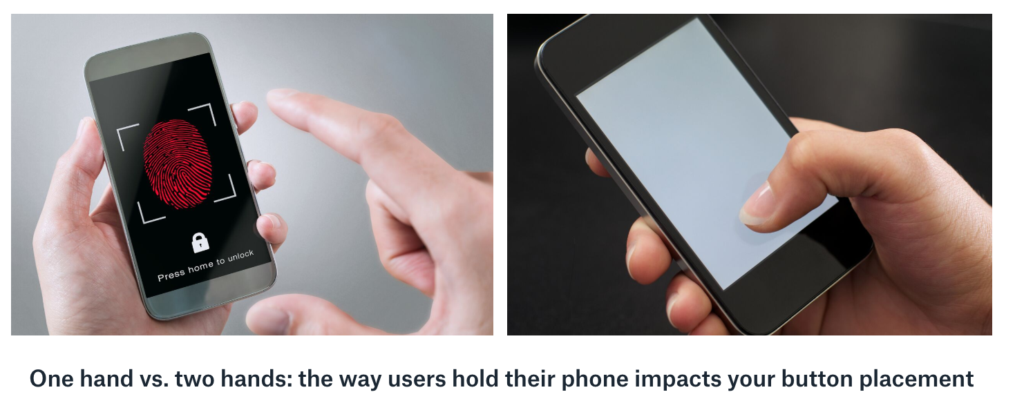
Also, keep in mind that many people are only using their thumb to manipulate the screen, which limits their mobility and accuracy. In general, people hold their phones in one of two ways—in one hand or in both hands—and this impacts how they use the interaction on the screen.
If they're holding it with one hand, users may be using their same thumb to manipulate the screen, or they could be using their other hand. If they're holding it with one hand and using that same thumb to poke the screen, they can't reach very far across the screen. Usually, they'll be able to reach just the bottom two-thirds of the device. If they want to use controls that are placed higher on the screen, they may have to change their grip. Read more about how thumb-reach issues may have affected Facebook's failed Paper app in this article by Scott Hurff.
Similarly, a person's grip can affect what is or isn't visible. Take the two-handed holder. The left and right sides of the screen could be partially covered by their hands. Even holding with one hand, parts of the bottom right and left will be covered by their hand (and will be unreachable by that thumb). All of these physical considerations could affect your product's success and should be on your mind in the design process and testing plans.
Screen size, resolution, and rotation
The reach problem is magnified when you also consider how screen sizes, resolution, and rotation come into play. As the screen gets larger, people's ability to reach across it using the phone in one hand starts to decrease. As the resolution gets higher, your ability to fit more onto a screen increases, but you need to make sure the buttons stay large enough to prevent people from hitting the wrong one. And if the screen is rotated, your product needs to change its orientation and layout to match the change.
The important principle here is that your screen needs to handle these issues gracefully. Mobile apps and websites use different layouts that are chosen based on the device's screen size, resolution, and rotation. You only need two or three different base layouts to cover the majority of devices.
Data use
You should be mindful of the amount of data your mobile app or website uses because some of your mobile users will be using their own data plans to access your site. Not only will they be paying to use your product, but they could also get hit with both a data bill and a slower experience if your app demands a lot of data. (Remember, cell phone data is generally slower than data over Wi-Fi.)
Some data usage is reasonable and expected. You can work with your engineering team to optimize your experience over mobile data. The best rule of thumb is to use as little data as necessary and preload whatever you can on installation or over Wi-Fi. Your product will load faster, and your users won't get hit with huge bills for data use.
Battery and speed
If you play games on your mobile phone, you might have seen your phone struggle with performance and noticed those games eating up your battery. The same issue can happen in the products you own. It's fun to create flashy introductions that use background videos or huge animations to welcome people to your products. However, these don't work as well on mobile devices for a few reasons: they hog more data, they make your phones do more (sometimes unnecessary) processing, they slow devices down, and they burn through the battery faster.
As a best practice, you should use few or none of these kinds of effects because they'll lead to a bad experience on mobile. Phone services, like accessing exact location or using the camera, can also drain a battery quickly. You should use those features only if necessary and only with the user's permission.
Voice input, gamepads, and more
There are lots of novel ways that you can create interactions with a phone. For example, Google Maps orients itself to the north based on the way you rotate your phone using a phone's compass and gyroscope. Other inventive inputs include voice inputs, video, gamepads that attach to a mobile device, and even proprietary technologies like iOS 3D touch.

These are all neat ways for users on mobile to interact with your product, but they come at a price. Some rely on camera use and drain your battery. Others use voice input, which usually requires an internet connection or battery-draining processing. Using gyroscope and gamepad as input for mobile is rare and often doesn't make sense in some specific contexts like gaming.
If you're considering any of these input methods, you'd need to consider the value and drawbacks carefully. Say you want to add voice control to Google Maps directions. You think it could be useful when driving. Think through all the repercussions of that decision:
- What can you only do with voice input that you can't do with other forms of input?
- What will users need to learn or understand to be successful using voice input?
- Is voice input good only for mobile, or is it good for all platforms? If it's only for mobile, is it so important that it's worth investing in?
- (Last, but not least) Is this solving a real problem your users have in a delightful way?
Keyboard
Keyboards are one of the most important forms of input. They're a straightforward method of entering your thoughts into a computer as text. On desktops, keyboards give you the ability to create keyboard shortcuts like pressing Control+i (or Command+i) to make text italicized.
Shortcuts are mostly for your expert users; they save time over hunting for commands in menus and toolbars. At the same time, if you have a function for italicizing text, it should use Control+i for the shortcut since that's a convention that spans across text editing apps.
If you do have keyboard shortcuts, make sure they're well-documented and easy to find so your users can learn them. Either make them available in a help section, or list the keyboard shortcut on the menu where buttons that could be mouse-controlled are found. Many menus show the command on the left and list the keyboard shortcut on the right.
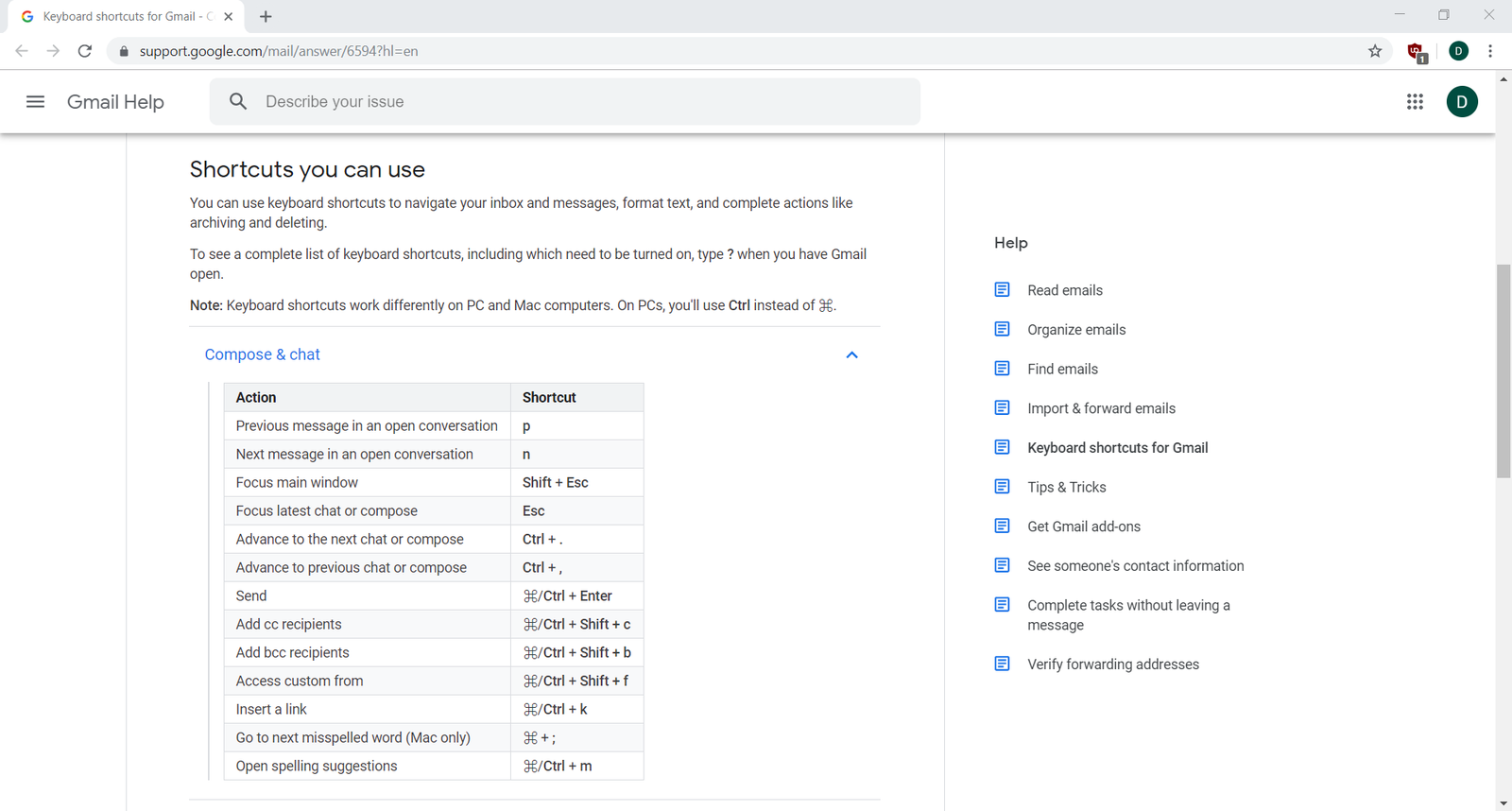
Gmail, for instance, has extensive keyboard shortcuts for navigating folders, composing emails, and managing your inbox—all of which are listed clearly in the help section:
Mouse
A mouse is a necessary device for using a laptop or desktop computer because it gives you fine control over selecting, scrolling, and manipulating content. Many laptops these days also have touchscreens or touchpads as an alternative to using a mouse.
The best advice when considering mouse controls is to make sure that your buttons, fields, and drag targets are large enough to make it easy for people to use them. The smaller the controls are, the longer it will take for someone to accomplish the precise movements required. Sizing controls appropriately will ensure that they're usable and readable.
Managing multi-platform products
At some point in your product career, you'll have to deal with the problem of managing a product that runs across multiple platforms. There are a few principles you can keep in mind that will help you make better decisions about designing and prioritizing your features.
Mobile first
Mobile first is a product philosophy that approaches designing and building your products as if mobile was the only platform. Other devices and platforms, like desktop browser and apps, are considered secondary or even non-targets. Many apps started their life as solely a mobile app, like Uber or Instagram—their desktop browser versions are limited in comparison to their mobile apps.
As a more general principle, mobile first means you should not feel obligated to put every feature in every platform. And if that feature would not appear in your mobile product, you should not build it solely for your desktop users.
Always in sync
Some products have specific needs to make sure that all the versions of your product stay in sync across every product line. This is especially important for B2B companies who have other businesses as customers, like Salesforce. Your products need to work everywhere all the time, so having some users on different versions of the same product could jeopardize your business.
In practice, keeping your products in sync across all features and versions is difficult. You'll have multiple development teams trying to synchronize their shipping schedules. On mobile, you'll be at the mercy of Google and Apple's app approval teams who may not have the same schedule you do. Finally, not every feature can be replicated across all platforms. For example, if your expense tracking app requires a picture of a receipt, does it even make sense to support that on a Windows app when many of those computers don't have a camera?
If staying in sync is important, you can try one of two best practices. First, plan your schedule so that all your apps are complete months before your public launch date. This will help avoid problems that might occur due to schedule slips or platform approval processes.
Second, keep your apps in almost sync—there might be one or two features that don't work identically on Android as they do on iOS versus a web browser. In turn, you can choose a preferred platform, like desktop browser, which has all the features of every platform just in case your users need it. In this case, you're treating your mobile platform as a subset of your desktop one.
Use-based prioritization
A simple method of deciding how to prioritize your multiple platforms is to look at what platforms people are using to access your product. If a majority of your users are using mobile devices, then you should prioritize mobile devices over other platforms, and vice versa.
This approach is useful but could lead to some wrong conclusions if you're not careful. For example, if you're only managing a web-based marketplace and you see 75% of your traffic coming from desktop computers, you could be well justified in prioritizing desktop first. However, you could also reach the opposite conclusion—if you expect the amount of mobile traffic to be higher than what you're seeing, you'd prioritize mobile, hoping that improving it will be a strong source of growth.
There are two keys to remember when thinking about priorities in this way. First, make sure you have good tracking systems in place so that you can tell if there are issues with your products on specific platforms. If mobile traffic is down, it could be due to a bug that only affects mobile. Second, set goals by platform so that you can measure how well your product is doing on each platform. Both of these keys are easy to do if you have good product analytics—a topic you will learn more about later on.
Assignment 07 ⭐
Practicing UX/UI
Imagine you're a Product Manager for Starbucks Coffee and are working on their new home page. The home page needs to include all the features listed below. Build a wireframe for both the desktop and the mobile, above-the-fold area of the home page. Use Figma, Whimsical or your favorite sketching app.
Paste images of the wireframes into your notebook/notion page or other document, and write short answers to the following questions:
- How did you handle the difference between the desktop and mobile versions?
- What data would you want to know that could help you make these decisions?
Features to include:
- Store locator
- Search bar for shopping online
- Invitation to join the rewards program
- A spot for a featured seasonal drink or other promotion
Submit your wireframes and written answers with a link below.
Submission
Submit your links in the slack channel #assignment-07